CIBC is a short name of the Canadian Imperial Bank of Commerce, which was established in 1961 in Toronto. Today the bank is considered to be one of the largest and most reputable in its country and provides such services as banking and financial consulting not only in Canada but all over North America.
Meaning and history
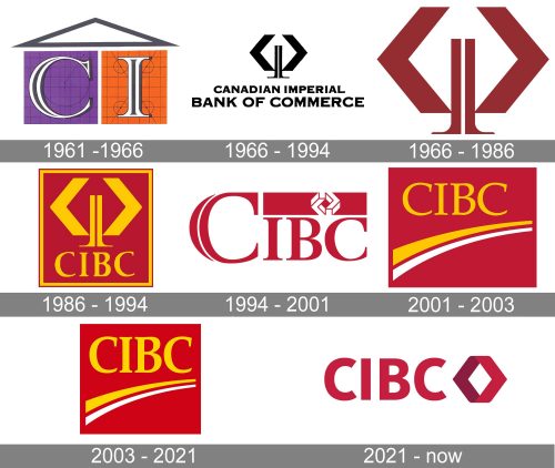
The visual identity of CIBC has been redesigned several times throughout the years and the latest version is completely different from the initial one, introduced in 1961. Although there has always been one element, which can be called common for all the emblems of the bank — the logo always included at least one interesting geometric element.
What is CIBC?
CIBC is the name of the North American banking company, which was established in Canada in the middle of the 20th century. Today the bank operates globally and has almost 12 million clients across the world.
1961 — 1966
The original CIBC logo, designed in 1961, was a graphical representation of how the bank was formed. It was a merger of two financial institutions — the Canadian Bank of Commerce and the Imperial Bank of Canada. So the logo featured two squares — a purple and an orange, placed under the white triangular roof in a dark gray outline. On the purple square there was an elegant serif letter “C” in a serif typeface, and on the orange one — the letter “I” in the same style and colors.
1966 — 1994
The redesign of 1966 brought a completely new image to the visual identity of the bank. It was an abstract composition in a calm dark burgundy color placed on a white background. The image was formed by two sharp “C”-like elements, opening to the center, and two vertical elements, resembling the letter “I” or thin tall columns with the “legs” slightly elongated from the center of the badge. This simple yet interesting composition and it’s royal and noble color palette looked timeless and elegant, representing the values of the company and its approach.
1966 — 1986
The second badge, created in the same 1966 year, featured the same graphical composition, but in a black and white color palette. And on this version, the symbol was placed above a two-leveled inscription, with the “Canadian Imperial” in smaller letters on the top level and “Bank of Commerce” in a larger size, set on the bottom line. All parts of the inscription were set in the uppercase of a bold and modern sans-serif typeface, which looked strong and confident.
1986 — 1994
In 1986 the logo becomes brighter and more memorable. The long wordmark was replaced by the “CINC” abbreviation in the uppercase of a bold serif typeface with very small triangular serifs. The geometric composition was now drawn in yellow and placed on an intense burgundy square with a double yellow and burgundy frame. As for the inscription, it was also executed in the same shade of yellow.
1994 — 2001
The redesign of 1994 brought something new to the bank’s image. The yellow color was replaced by white, while the burgundy remained the main shade of the logo palette. The logo was composed of the uppercase “CIBC” lettering with the first letter enlarged and stylized. The burgundy letters were placed on a white background and “covered” by a horizontally oriented burgundy rectangle with a white geometric symbol drawn on it. The symbol was composed of two “C”-like figures with sharp triangular shapes, as on the previous emblems.
2001 — 2003
The new logo was designed in 2001, bringing back the yellow and burgundy color scheme. The solid burgundy square had a thin and fine yellow uppercase “CIBC” in sans-serif, underlined by two smooth yellow and white diagonal arches, which were getting thinner from left to right. It was a dynamic and timeless badge with bright colors, which made it memorable and intense.
2003 — 2021
The redesign of 2003 was more about the refinement of the lines, rather than anything else. The lettering became bolder and brighter, and the color of the background was elevated to a more delightful shade. The logo started looking more balanced and chic.
2021 — Today
The iconic geometric emblem from the 1969s was brought back to the CIBC visual identity in 2021, getting a modernized shape and sleek color palette. The refreshed logo of the company features a slightly narrowed yet bold sans-serif inscription in burgundy, placed on the left from the solid emblem — a rhombus in two shades of burgundy with the top and bottom angles flattened. Simple and strict shapes look professional and evoke a sense of confidence, while the renewed color palette represents attention to the customers and the perfect reputation of the Bank.


