Casio is a Japanese company that, for several decades has been one of the world leaders in the market of consumer electronics. The company was named after the family that founded it and chose the production of calculators and wristwatches as the brand’s core business. Today, in addition to this, the company produces electronic dictionaries, electronic musical instruments, digital cameras, credit card terminals, printers, and much more.
Meaning and history
The Casio visual identity the whole world is familiar with today was adopted by the brand at the beginning of the 1970s and stayed unchanged for more than forty years. Though it was the second emblem created for the company, the iconic blue logotype became something really significant for modern branding history. A great example of simplicity and laconic approach, representing the brand at its best.
1957 — 1972
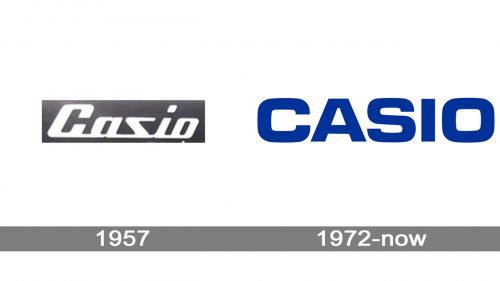
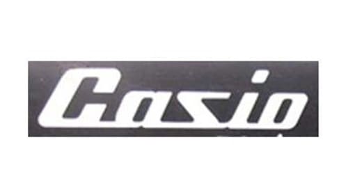
The initial logo for Casio was executed in a dark gray and white color palette, with the bold script logotype placed on a dark carbon background. The lettering could also be set in metallic gray, which looked more professional and progressive. The thick lines of the letters featured smooth angles and distinct cuts, and their inclination to the right added a sense of movement and energy to the whole image, while the strict color palette stood for confidence and seriousness.
1972 — Today
The redesign of 1972 brought us the emblem which became iconic in no time. The secret was in a perfect balance and solidness of the letters, executed in a bold modern sans-serif typeface, which is very similar to Microgramma Bold font. The capitalized inscription in a bright and intense shade of blue looks strong yet pretty light on a white background and evokes a sense of expertise and reliability. The Casio logo is also available in a monochrome color palette which is mainly used for official documents of the company.
Symbol
The wordmark is clear and upscale. There’s nothing more than the name of the brand and the registered trademark symbol.
Colors
The main color of the wordmark is blue (PMS 293), while the background is white. If the logo goes with the text “The unexpected extra,” then red is also used (PMS 186 for coated paper and PMS 1925 for un-coated paper).
Font
The square sans serif type used for the Casio logo resembles Eurostile Bold Extended, yet if you take a closer look you may notice that the “A” is somewhat different, more like the “A” from the Microgramma font, so it is very likely that the font featured on the wordmark is actually Microgramma.


