Cancer Research UK (CRUK) is a cancer research and awareness charity based in the UK. It operates without a proprietor since it’s a charitable organization. The charity conducts extensive research to beat cancer sooner and spreads awareness through campaigns and initiatives. With a strong presence across the UK, it has various centers, shops, and partnerships, working diligently to fulfill its mission.
Meaning and history
Founded in 2002 from the merger of The Cancer Research Campaign and the Imperial Cancer Research Fund, Cancer Research UK has since made significant strides in the fight against cancer. This UK-based charitable organization is at the forefront of global cancer research, having funded groundbreaking studies and innovative treatments. Some of their pivotal achievements include advancements in early detection, precision medicine, and improved survival rates. Today, Cancer Research UK stands as a beacon of hope, continually working towards a world where all cancers are preventable or treatable.
What is Cancer Research UK?
Cancer Research UK is a leading charitable organization in the UK dedicated to researching cancer, raising awareness, and funding groundbreaking studies to improve patient outcomes. Established in 2002, it has played a vital role in the global fight against cancer.
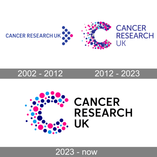
2002 – 2012
The “Cancer Research UK” logo elegantly melds simplicity with purpose. Rendered in a uniform blue hue, the typography is direct and unambiguous. Adjacently, a cluster of circles catches the eye, with each varying in size. Remarkably, one circle stands out in a vibrant pink, perhaps symbolizing hope, uniqueness, or the individual stories within the broader fight against cancer. The overall design speaks to unity, collective effort, and the significant role each entity plays in the battle against the disease.
2012 – 2023
The second variation of the “Cancer Research UK” logo takes an artistic approach. A swirl of differently-sized circles, ranging from navy blue to bright pink, converge to form a dynamic crescent shape. This design could represent the interconnected nature of research, patients, and the broader community, bound together in their shared goal. The bold, uppercase typography balances the artistic element, ensuring the message remains at the forefront. The logo is a dance of science, community, and hope, portrayed through vivid imagery.
2023 – now
This version of the “Cancer Research UK” logo captures the eye with its swirling vortex of circles. Each dot, varying in size and shade from muted blues to vibrant pinks, might symbolize the myriad elements involved in research: from individual cells to broader studies. The circles appear to be in motion, suggesting continuous progress and dynamism in the field. Contrasted against this lively backdrop, the brand name, displayed in a clear, bold font, grounds the design, reiterating the organization’s unwavering commitment to its cause.


