Caltex is an American oil company, which was formed in 1936 in Texas, and today operates in the Middle East and Asia-Pacific region, being one of the largest players on the market.
Meaning and history
Despite the fact, that the Caltex brand is widely known as the most popular petroleum company of the Middle East, it was born in America and its visual identity is a tribute to the company’s roots and history.
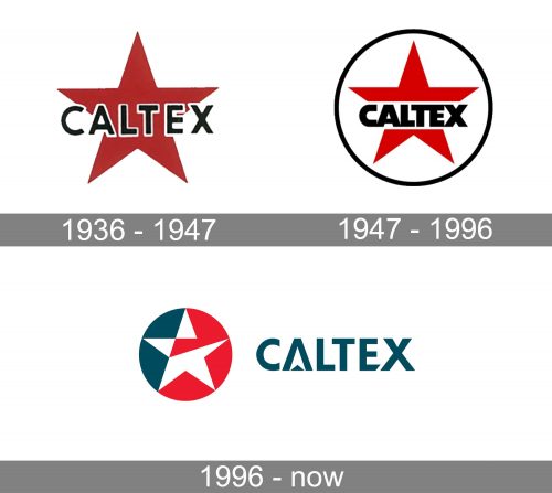
1936 – 1947

The very first badge for Caltex featured a laconic composition where the black sans-serif lettering in the uppercase was outlined in white and set on a dark blue five-pointed star. It was a traditional color palette implemented on traditional shapes and clean lines of all the logo elements.
1947 – 1996

The redesign of 1947 kept the red star and black lettering but emboldened and modernized their contours. The new structure was placed on a white background and enclosed into a thin black circular frame. The inscription was now executed in a stylized ExtraBold sans-serif with massive heavy shapes of the letters.
1996 – Today
The Caltex logo is composed of a wordmark and an emblem on its left.
The wordmark is executed in a custom typeface, using all the capital letters. There are two elements in the nameplate that make it unique — the letter “A” with an arrow inside and the diagonally cut lower bar of the letter “E”.
The Caltex emblem is a two-colored circle with a white star, which is segmented by a red triangle.
The star, as well as the brand’s color palette — red, white and blue — is a celebration of the company’s heritage and a tribute to the USA and to the forming company Texaco.
The Caltex logo is bright and remarkable, it looks modern and stylish, which is not usual for the petroleum industry. The color palette represents the brand’s professionalism and authority, as well as passion and energy.


