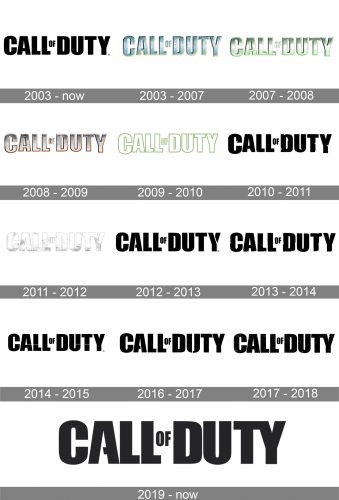
Call of Duty is an Activision video game, developed in 2003. The shooter was originally focused on the World War II period, and moved into modern times after 2007. Today the game has its versions for all the operating systems as well as for PlayStation, Xbox, and Wii consoles.
Meaning and history
The history of the Call of Duty franchise begins with a small studio “2015”, whose employees in 2002 released Medal of Honor: Allied Assault under the auspices of EA. Immediately after the release, part of the team created a new studio called Infinity Ward and left to develop new shooters under the wing of Activision.
The first part of the iconic shooter series was released by Activision in October 2003. And this is when the developers laid the foundation, which is used by the franchise to this day. Call of Duty differed from competitors in the genre with the advanced single-player campaign, during which it was possible to shoot not only for the American soldier, as many are used to, but also for the British and Soviets. The player was given three stories about different heroes, and this advantage in those years was the key.
The first Call of Duty version was designed only for computers, not the consoles, but starting the second edition, the situation was fixed.
What is Call of Duty?
Call of Duty is one of the most popular shooters in the history of computer games. The shooter series was launched by Activision in 2003, and by today there have been 18 volumes of the game released. Call of Dutyearns several billion dollars a year.
2003 – Today
 The strict and simple Call of Duty visual identity has always been text-based. The first version was created in 2003 and was composed of all-caps three-dimensional lettering in a traditional sans-serif typeface.
2003 – 2007
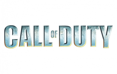
The logo, used by the game from 2003 to 2007 was a fresh three-dimensional badge, fully based on the original emblem, but in a cool gray and yellow color palette with an interesting uneven pattern of the glossy letters’ surface. The badge looked cold and resembled steel or iced.
2007 – 2008
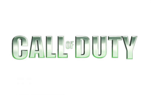
In 2007 the Call of Duty logo was redrawn in a new palette — green and white with lots of gradients. The letters looked transparent and very airy, though the green shades resembled neon lights and dark streets with banners. There was something mysterious in that version of the logo.
2008 – 2009
The redesign of 2008 introduced a darker and stronger version of the logo — in silver and copper. The letters got enlarged and their contours — emboldened. The new palette still looked cold and reminded of the sharp blade.
2009 – 2010
The version from 2009 was a flat white inscription with each of the letters outlined in a calm muted green. This moss-like shade looked peaceful but blurred. It also did not evoke any happy or kind feelings at all. The color scheme was still cold and dangerous, although the simplicity of shapes made it look stylish.
2010 – 2011

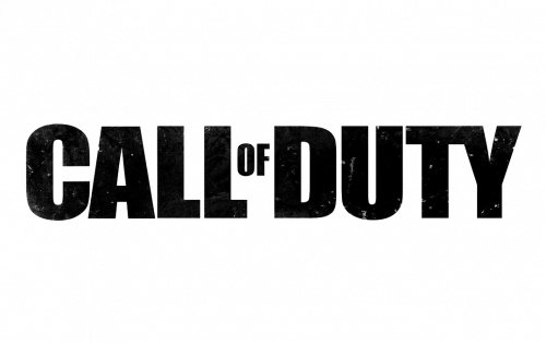
The black and white era started for Call of Duty visual identity in 2010. Starting this year the logo has always been executed in this strong and brutal color palette. The first version used black bold letters placed on a white background. Every letter had its borders torn and uneven.
2011 – 2012
The version from 2011 was more white with very thin black countering and some light gray details of the letters’ bodies. It was the light and blurred logo, which evoked a feeling of mystery and intrigue. It was the lightest of all Call of Duty emblems last ever created and only stayed for less than one year, until the following release.
2012 – 2013

The very first logo of Call of Duty was used as the base of the emblem from 2012. Just a few white lines (stencils) were added to a couple of letters. The inscription looked stable and strong, evoking masculinity and brutality and perfectly reflecting the essence and plot of the game.
2013 – 2014
The uneven edges of bold black letters came back in 2013. It was almost the same logo as the one, used in 2010, but it’s a more refined and stylish version. Now every detail was thought out, and all contours were modified and cleaned.
2014 – 2015

The logo from 2014 was all about clean lines. The original inscription was accompanied by a couple of thin horizontal lines in white. It was something new for the Call of Duty logo, although the style and character remained recognizable, and the small details only elevated the uniqueness of the badge.
2016 – 2017

The redesign of 2016 was just about three letters — U, T, and Y. The “U” had a pretty wide white space on its bottom border, while the two last letters of the inscription had their bars elongated and separated by a medium-thick white diagonal line.
2017 – 2018
The shapes of the inscription returned to the original, though the pattern of the black letters gained some white gradients, looking like a night sky. The mysterious spirit of the visual identity got elevated even more after this redesign.
2019 – Today

In 2019 the version from 2012 started being used as the official one. Along with the very first badge, this wordmark with a couple of white stencils looks brutal and distinct, and the black and white color palette is all about power and confidence.
Font and color
The narrowed and strict typeface of the uppercase Call of Duty logotype is based on one of the iconic sans-serif fonts, such as Impact Std Roman, Shelflife Expanded, and Impact WGL Regular. Although some lines were modified and some elements were added to the bodies of the letters, the contours are still very minimalist and classic.
The black and white color palette of the Call of Duty logo is all about strength, masculinity, and power. This makes it look bold and recognizable on any background and web icon.


