

![]() Cal Poly Pomona Logo PNG
Cal Poly Pomona Logo PNG
California Polytechnic State University, often referred to as Cal Poly Pomona, or simply CPP, is one of the leading universities taking a hands-on approach to learning in the United States. Located in Pomona, California, the university offers a wide range of undergraduate and graduate programs, as well as some doctoral programs.
Meaning and history
![]()
Cal Poly Pomona is one of two polytechnic colleges in the California State University system. Its history began on the south campus of California Polytechnic in 1938, and CPP earned the title of a top-ranked institution in 1949. Cal Poly Pomona’s campus is the second largest of any university in the system and prides itself on its expansive and diverse facilities.
Located about 30 miles east of Los Angeles, California State Polytechnic University in Pomona offers many areas of study in eight colleges, including master’s programs in business and political science.
Programs of study at Cal Poly Pomona include but are not limited to, the following areas of study: architecture, engineering, business, education, hospitality, agriculture, life sciences, and natural sciences. The university is known for its emphasis on Learn by Doing, which allows students to gain hands-on experience in their fields of study.
Cal Poly Pomona is known for its hands-on approach to learning. Students actively participate in laboratory work, projects, internships, and collaborations with industry, which contributes to their professional development and preparation for a real working environment. This university is ideal for those seeking to gain valuable practical experience in addition to theoretical knowledge in their chosen field.
What is Cal Poly Pomona?
Cal Poly Pomona is the name of a public coeducational university that was founded in 1938. The institution is located in Los Angeles County, Pomona, California. The institution is one of 23 campuses of the California State University system. The college has a total enrollment of about 25,000 students, is located in the suburbs, and has a campus area of 1,438 acres.
In terms of visual identity, Cal Poly Pomona is quite simple and distinctive. The university has only changed its logo once, in 2018, making it more readable and suitable for digital needs.
???? – 2018
![]()
The old logo of Cal Poly Pomona was executed in an intense green and white color palette, with the graphical part enlarged and the name of the university written in elegant capitals of a classy serif typeface. The emblem in the logo depicted a stylized triple arc with the erased right part, and a sophisticated green leaf, placed under it. Green is the color of growth and development, and these are the main aims of any educational institution.
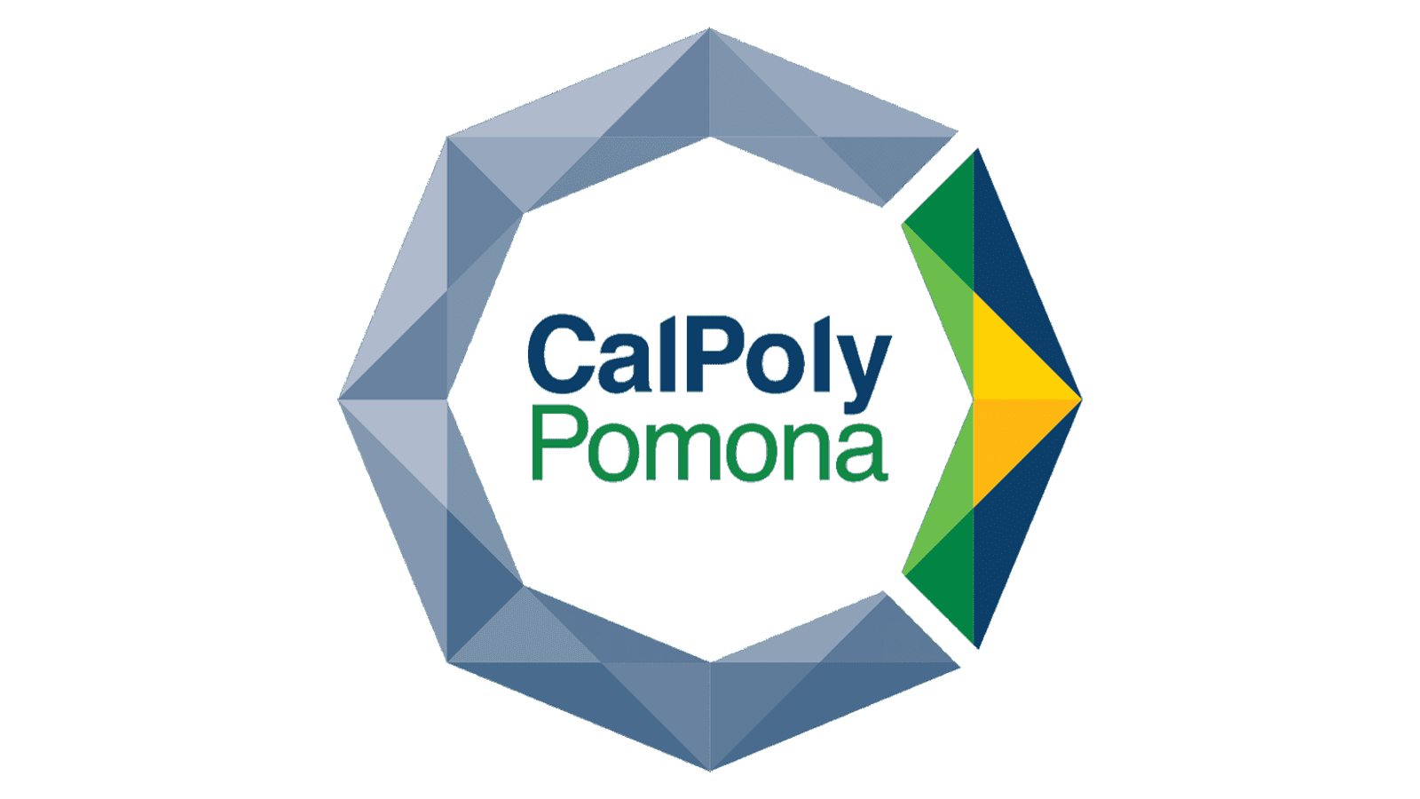
2018 – Today
![]()
After the redesign of 2018, the Cal Poly Pomona logo got simpler and more progressive. The new emblem of the university depicts a three-dimensional ring, formed by two elements with lots of angles. The largest segment, in grayish blue, repeats the shape of the letter “C”. As for the short part of the emblem, it is drawn in green, yellow, and blue. On the right from the graphical part, there is a title case lettering, written in two styles: the bold blue “CalPoly” and the lightweight green “Pomona”.
Font and color
The clean and distinctive lettering from the primary logo of Cal Poly Pomona is set in a modern sans-serif typeface with the diagonally cut tops of the “L”s. It is a modified font, which is based on one of the following: Helveticareg Hebrew, Sequel Sans, or Europa Grotesk SHtrade.
As for the color palette of the Cal Poly Pomona visual identity, it is composed of green, blue, and yellow, where green stands for education and growth, blue signifies reliability and professionalism, and yellow adds a touch of strength and energy to the image.


