Cactus Jack Logo PNG
Cactus Jack is the name of a brand, created by a famous musician Travis Scott in 2017. The American brand has two divisions: the record label and publishing company, which both are oriented on the young generation, and their tastes. The Cactus Jack Records works mainly with rap and hip-hop singers.
Meaning and history
Undoubtedly, the record label is the most famous and iconic part of the Cactus Jack brand, but the brand logo is fashionable to see not only on the album covers of young hip-hop stars. Travis Scott is a very important figure in today’s global music culture, and many brands collaborate with him, releasing limited-edition collections of products under a joint logo with Cactus Jack.
2017 – Today
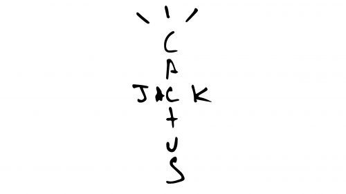
The unique and instantly recognizable Cactus Jack logo is a brilliant reflection of the Travis Scott character and style. Everything here was put in the right place and drawn in the right shape. The minimalistic monochrome logo features a crossed inscription: with the “Cactus” written vertically, and “Jack” crossing it horizontally in the upper part, sharing the second letter “C”.
Apart from the lettering, the logo features a modest yet playful complement: three vertical strokes above the first “C” in “Cactus”, like three cactus thorns. They also look like hair on the man’s head, how kids often draw it. With these strokes and the shape of the wordmarks, the composition reminds of a tall and thin cactus, but also resembles a mic stand, brilliantly showing the purpose of the brand and its essence.
Speaking of kids’ drawings, Cactus Jack also has a secondary logo, which depicts a very sloppy-drawn face of a person. Its eyes are replaced by two diagonal strokes, and the mouth is composed of one horizontal line, crossed by four verticals. The hair of that unhappy person also looks like a mess, being drawn with numerous black lines of different lengths.
Font and color
The custom handwriting of the Cactus Jack logo is what makes it truly unique. All letters except for the “T” (which looks like a cross, repeating the shape of the inscription) are set in the uppercase and have their bars smooth and bold, with uneven ends of the lines — some are thinner, some are shorter.
As for the color palette, the musician chose a timeless combination of black and white, which is always the best solution for the brands, offering a wide variety of products.


