BUNNINGS is the name of the Australian retail chain of hardware goods, which was established in 1886 and had its stores not only across Australia and New Zealand, but also in the United Kingdom, though by today the UK locations have been closed. The chain has over 30 thousand employees and is owned by Wesfarmers group.
Meaning and history
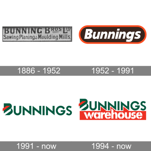
The BUNNINGS visual identity has always been pretty modest and simple. Built around the wordmark, the logo never used more than three colors and had an accent on the name as the main target.
1886 – 1952
This logo presents a simple and clear visual identity of the company. The “Bunning Bros Ltd” is printed in a larger, bolder, sans-serif font. The second line says “Sawing, Planing & Moulding Mills” in smaller font and with only the first letters being capitalized. The whole emblem is done in a Yet black and gray color palette, which is explained by the time it was created. The fact that the logo was used for over 70 years shows that simple logos have a more timeless look that does not require adjustments.
1952 – 1991
The logo, introduced in 1952, was created to celebrate the date when Bunnings became a public company. It was a horizontally stretched oval in a thick orange outline, with a dark gray background and white lettering on it. The inscription in a title case was executed in a bold italicized sans-serif typeface, where all the letters featured traditional shapes and thick lines:
1991 – Today

The logo was redesigned in 1991 and made the company’s visual identity fresher and sharper. The new color palette of Bunnings is based on green, white and red, and has its logotype written in clean and edgy lines. The only graphical element in the new logo is the letter “B” which is all green and has two diagonal lines on it — red and white.
1994 – Today
In 1994 BUNNINGS opened its first Warehouse and the new logo was designed especially for it. The logotype from the official aversion was complemented by a solid red banner with a white “Warehouse” inscription in the lowercase. The lettering is executed in a bold stencil sans-serif and looks massive and bright, welcoming the buyers and evoking a sense of power and professionalism.
Emblem
When the company opened its first Bunnings Warehouse in Melbourne, a special logo was developed for it. The word “Warehouse” was given in smaller letters in a similar style but a different typeface.
Font and color
The main logotype of the brand, “BUNNINGS”, is executed in a clean and modern sans-serif typeface where the letters feature sharp angles and straight lines. The typeface the brand uses for its visual identity is pretty similar to such fonts as VVDS Praliner Bold and Lemon Milk Pro Medium, but with some modifications. As for the “Warehouse” part of the logo, it has its stencils customized, but the massive and solid contours of the letters resemble such fonts as Helios Stencil Heavy and Halvar Stencil Breitschrift Black.
The green, white, and red color palette of the BUNNINGS visual identity is delightful and juicy. Making the logo remarkable, it evokes a sense of joy and energy, representing the main values of the company — growth, success, and loyalty.


