British Airways is the name of the main airline in the UK, which was established in 1973 and today’s headquarters in London. The airline has its flights to more than 150 locations across the globe and is a member of the international Oneworld Alliance. The company has almost 300 aircraft in its fleet, including Boeing and Airbus planes.
Meaning and history
The visual identity of the famous airline has always been modest and minimalist. Its first version was a little amateurish, but the next two brilliantly reflected the company’s essence, representing a powerful and reliable world’s brand.
1973 – 1984
The very first version of the British Airways logo was created by Negus & Negus agency right after the company’s foundation, in 1973. It was composed of a simple logotype, set in two levels, with “British” in red, written in the title case, and blue “Airways” in the lowercase. The dot above the “I” on the lower level was removed, which actually imbalanced the logotype.
The inscription was executed in a bold serif typeface, which is pretty similar to Aldine 721 Std Bold, a sleek and elegant font with smooth lines.
1984 – 1997
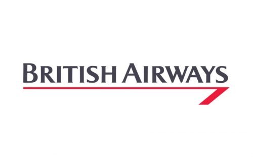
The completely new approach to the visual identity design was brought in 1984 by Landor Associates. It was a sting and modern inscription in gray, placed over a red line which was curved like an arrow on its right.
This line got the name “Speedwing” and became an essential part of the company’s visual identity for more than ten years, representing the speed, power, and freedom.
As for the color palette, gray and red represented passion, progress, and stability, evoking a sense of confidence and professionalism. The airplanes of the company featured also a blue color, a symbol of air and flight, showing the reliability and loyalty of the brand to its customers and adding a sense of protection and balance.
The inscription was executed in a modern and strict typeface, with all the letters capitalized and “B” and “A” enlarged. The font looks pretty close to LuMarc Std Bold with its almost invisible delicate serifs.
1997 – Today
The current logo version of the airline was designed in 1997 by Newell & Sorrel bureau. The inscription got a new color, while the emblem was completely changed. The Speedwing was replaced by a smooth curved line in red and blue, placed in the upper right corner of the logo. The ribbon got the name “Speedmark” and is placed on all the company’s airplanes, representing the speed, power, and safety.
The use of the Union Jack color in the logo is complemented by the tails of the aircraft’s pained in the pattern of the British flag, which looks patriotic and reflects the company’s value of its roots and legacy.
Font
The blue wordmark in all capitals is executed in an elegant and sophisticated typeface, which is very similar to Majesty Medium font, with fine and delicate serifs and clean neat contours of the letters.
The inscription is perfectly balanced and makes the whole logo look timeless and confident, evoking a friendly sense and representing a professional and reliable company.


