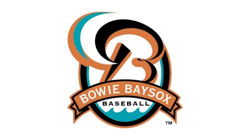
As of 2018, the Bowie BaySox compete in the Eastern League and are the Double-A affiliate of the Baltimore Orioles.
Meaning and history
While the history of the team goes back to 1987 when it started playing as the Williamsport Bills, the current name was chosen during the “Name-the-Team” contest in 1993. The word “Bay” is a nod to the Chesapeake Bay located to the east of Bowie.
1993 — 1999

The initial Baysox logo, designed in 1993, stayed with the club for a bit more than five years. It was a bold stylized inscription with the club’s name, placed on two schematic waves in light turquoise color. The wordmark was executed in bold black uppercase letters, with the white and orange sail overlapping the “A” and a baseball in the same palette replacing the “O”. The whole composition was placed on a white background and outlined in a thin orange frame, which was repeating the contours of the badge.
2000 — 2001

The redesign of 2000 introduced a darker and more powerful badge in the same color palette. It was a horizontally oriented solid black oval in a thick orange frame with a white and black outline. In the center of the medallion, there was a fancy bold orange letter “B” sitting on a white and turquoise shave and outlined in turquoise. The white and orange sail was overlapping the letter in its left part. The black “Baysox” inscription was written in a traditional square serif font under the badge, with its upper line arched from the center, repeating the shape of the medallion.
2002 — Today

The focal point of the Bowie BaySox logo is a large letter “B.” Its generous curves seem to have been inspired by the ocean tide in the Chesapeake Bay. The core of the letter is black and orange with white and teal elements. The “B” is placed inside an ellipse. There’s also an orange banner with the text “Bowie Baysox” in white. The ocean theme continues in the wavy pattern below the banner.
Cap emblems
One of the cap insignias features the “tail” of the “B” logo against the black background. There’s also the name of the team on an orange banner below. Another version of the cap insignia sports the “B” with the white filling and black background.
Colors
The color palette of the Bowie BaySox logo looks somewhat unusual among other baseball logos. The color scheme is based on the contrast of teal and orange, which was possibly inspired by the bright sun and ocean.


