Blockbuster is the name of an American company, that in the mid-2000s owned one of the largest video rental networks in the world. Blockbuster was founded in 1985 as Blockbuster Videos and changed its name several times throughout the years.
Meaning and history
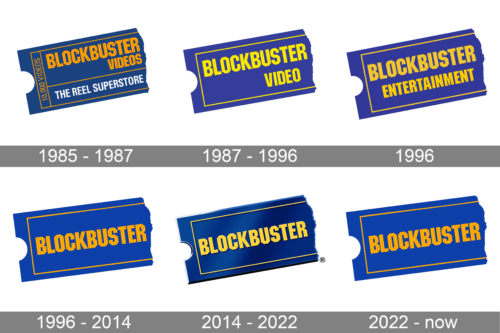
Blockbuster is not just a brand, it was a legend of the 2000s, with almost ten thousand stores, and one of the most impressive acquisition prices: in 1995 it was sold to Viacom for 8,4 billion USD.
Although all the main operations of the company ceased in 2010, some of the stores stayed open until 2014, and the Blockbuster brand is still alive today, as has one single location left — in Bend, Oregon, USA.
What is Blockbuster?
Blockbuster is the name of a defunct American company, which was at the top of the movie rental segment for more than two decades, starting at the beginning of the 1990s. The company was established by David Cook.
In terms of visual identity, the American company, engaged in the movies and video games rental services, has always been very consistent, despite the pretty impressive amount of logo redesigns, held throughout the company’s history.
1985 – 1987

The very first Blockbuster logo was introduced in 1985 and stayed untouched for a couple of years. It was when the company’s name was “Blockbuster Videos”, so this wordmark was written over the main part of the badge, in bold yellow capitals against a solid blue background of a stylized ticket, placed diagonally.
1987 – 1996
In 1987 the name of the company was changed to Blockbuster Video, and the logo was slightly redesigned, with the new name of the brand written in a new shade of yellow, closer to a lemon-yellow shade. The composition of the badge was simplified, with all the additional lettering completely removed from the logo.
1996
For just a few months in 1996, the company was renamed Blockbuster Entertainment, with the inscription on a solid blue ticket replaced, but keeping its original style and color. Although, compared to the previous badge, the shade of yellow, used in the new one was brighter and more intense.
1996 – 2014

A few months later, the company got its current name, Blockbuster, and the badge had to be changed again. The lettering on the solid blue ticket was now composed of just one word, set in the same bold geometric sans-serif font and an intense yellow shade, which started looking more orange now. The thin internal frame of the badge featured the same shade of orange as the inscription.
2014 – 2022

The Blockbuster logo was redesigned again in 2014, with the style and shapes of the elements kept in their original state, but the color palette switched to a more vivid and glossy one, with the addition of gradients and slight metallic shades. The new logo looks voluminous and dynamic, maintaining the traditions and representing the roots of the brand.
2022 – now

Blockbuster has stayed very consistent with its logo and has changed only very minor details in the last almost forty years. The usage of the same blue cinema ticket and yellow lettering allowed to preserve the visual identity. This time, the logo created back in 1996 was brought back with an unchanged look. This version has been successfully used by the company for almost twenty years and can continue to be a great representation of the brand.
Font and color
The bold uppercase lettering on the primary Blockbuster badge is set in a slightly narrowed yet still stable geometric sans-serif font with angular contours of the glyphs. The closest font to the one, used in this insignia, is, probably, ITC Machine Medium and Winner Sans Compressed Extra Bold, but with slight modifications.
As for the color palette of the Blockbuster visual identity, it has always been composed of a combination of blue and yellow, with the hues of both colors changing throughout the years. The current version is the coldest one, although the contrast between the elements now looks more distinctive than ever.


