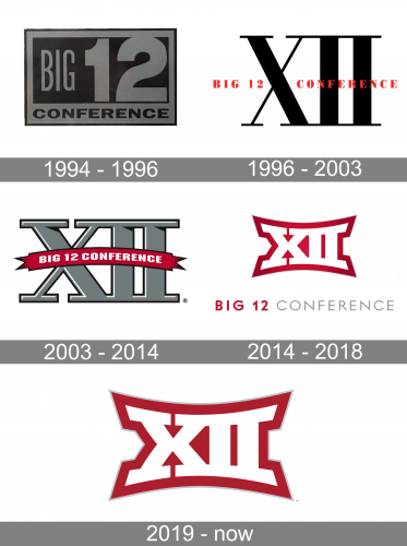
All the logos the Big 12 Conference has had so far have been based on the number “12” written with the help of Roman numerals.
Meaning and history
The Big 12 Conference, a notable collegiate athletic conference in the United States, was founded on February 25, 1994. It emerged from the merger of the Big Eight Conference and four Texas institutions from the Southwest Conference. This significant fusion marked a new era in collegiate athletics, offering a broad range of sports and gaining a strong foothold in the NCAA Division I landscape.
Throughout its history, the Big 12 Conference has achieved several remarkable feats, particularly in sports like football, basketball, and baseball. It has been known for its competitive spirit and high level of play, often sending numerous teams to bowl games and the NCAA basketball tournament. The conference has produced several national champions, especially in football and women’s basketball, solidifying its status as a powerhouse in collegiate sports. The contributions of its member schools in fostering talented athletes and competitive teams have been instrumental in these achievements.
In its current position, the Big 12 Conference continues to be a significant player in NCAA Division I sports. It has evolved to adapt to the changing dynamics of college athletics, including conference realignment and the introduction of new regulations. The conference maintains a strong presence in major collegiate sports, upholding a tradition of excellence and competitiveness. Its ability to adapt and thrive in the ever-changing landscape of college sports underscores its resilience and enduring appeal in the realm of collegiate athletics.
What is the Big 12 Conference?
Big 12 Conference is the name of the conference of collegiate athletic programs from 19 American universities. The men’s and women’s sports teams compete in NCAA Division I in various sports disciplines, such as Basketball, Soccer, Swimming, Gymnastics, and many more.
1994 – 1996
The original 1994 logo depicted a rectangle. Some space along the edges was a lighter grey, but the center was occupied by a similar form in a darker shade. Here, word ‘Big’ was written in tall, capital letters on the left half. On the other – there was a big number ‘12’ in bold digits. The word ‘Conference’ was placed right below in the lighter grey section.
1996 – 2003

The very first logo, designed for The Big Twelve Conference in 1996, featured a very simple and even naive badge, composed of an enlarged “XII” in Roman digits, set in medium gray, without any outline, in a white background. The “Big 12 Conference” was written in the middle of the badge in bold red, using a classy serif typeface for its uppercase letters.
2003 – 2014
 On the previous emblem, the lettering was light grey with black trim. The numerals looked in a regular way and the lines were straight. You could see an arched maroon banner, though, housing the text “Big 12 Conference.”
2015 – 2018
The redesign of 2015 introduced a refreshed modern badge, executed in a dark red and white color palette with gray as an additional color. The Roman “XII” was stylized and written in white with a thick red outline and its bottom line slightly arched from the center. Under the emblem, there was an uppercase serif “Big 12 Conference” lettering with the first part executed in bold red letters, and the second — in thin gray.
2019 – Today
On the current Big 12 Conference logo, the lettering “XII” is given in white with maroon trim. The lines on the top and the bottom of the letters are not straight but rather form a curve or an arch.


