Berkeley is the name of a former British automaker, which was specialized in the production of affordable microcars. The company was established in 1956 and lived for only four years, ceasing all the operations in 1960. Despite its short life, Berkeley managed to introduce ten various microcar models.
Meaning and history
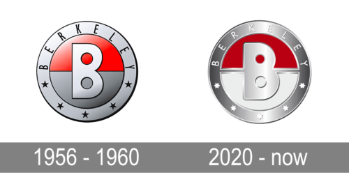
Berkeley brand lived for only four years, so it is understandable, why the company’s visual identity history is short and modest. Only one logo was designed for the brand in 1956, and it was placed on the bonnet of each car Berkeley’s manufactured.
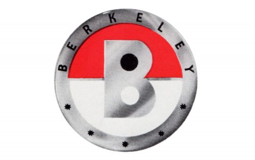
The logo of the British automaking brand featured a circular shape and a bright color combination, which looked sleek and powerful and made the smooth lines of the emblem stronger and more distinct.
The Berkeley circular badge featured a wide silver frame with the lettering placed on its upper part, arched above the inner circle of the emblem. The bottom part of the framing was embellished with five five-pointed stars, which were drawn in black on the printable version of the logo a turned silver on the car bonnet.
The inner circle of the badge was horizontally divided into red and gray segments and had a bold white letter “B” placed over it. The “B” had two circles on both the upper and bottom part, which made the whole composition unique and balanced the main contour of the logo.
For an official document, the logo of the brand was executed in a monochrome color palette, with red replaced by black, and other parts in gray and white.
What is Berkeley?
Berkeley is a discontinued automaking brand, which was established in Great Britain in. 1956, and was focused mainly on the production of microcars. The life of the company was pretty short, and all the operations ceased already in 1960.
1956 – 1960
2020 – Today
Font and color
The wordmark, placed on the upper part of the Berkeley’s emblem’s outline, was executed in a narrowed sans-serif typeface with its capital letters placed far from each other. This made the neat and modest shapes of the inscription look modern and stylish, and added air and lightness to the whole composition.
As for the color palette of Berkeley’s visual identity, it was composed of silver-gray, white and red, traditional colors reflecting strength, style, and determination. The delicate black elements of the badge added a professional and serious touch to the contemporary shapes of the logo, while red was the main star of the image, representing the brand’s value of beauty, class, and design. Simple gray, symbolizing seriousness and confidence, turned silver on the bonnet of the Berkeley car, making the logo look sleek and luxurious.
On some of the models, the Berkeley badge was executed in monochrome, with the inner circle, the wordmark, and the five stars in white, and the frame, “B” and the separation line — in black. In this case, the logo looked completely different, resembling a seal, or a quality mark.
The clean and lightweight uppercase lettering from the Berkeley logo was set in the modern geometric sans-serif typeface with distinctive contours and slightly narrowed characters, set at a pretty large distance from each other. The closest font to the one, used in the Berkeley insignia, is, probably, Molde Compressed Bold, but with some modifications.
As for the color palette of the Berkeley visual identity, it is based on a combination of gray and red, with some black accents, creating a stronger contrast and adding a professional touch. The red here stands for passion and quality, while silverish gray evokes a sense of excellence and confidence.


