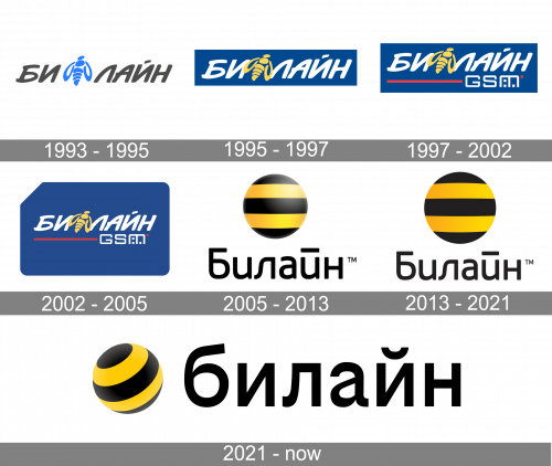
The Beeline logo has always been based on the “Bee” part of the company’s name. The brand was trying to adopt a very detailed and traditional image of an insect throughout the first years but then decided it was better to go in different directions, and that was the right choice.
Meaning and history
The Beeline logo has always been based on the “Bee” part of the company’s name. The brand was trying to adopt a very detailed and traditional image of an insect throughout the first years but then decided it was better to go in different directions, and that was the right choice.
1993 — 1995

The very first Beeline logo was introduced in 1993 and featured a brand’s name in Russian, written in a rounded italicized sans-serif typeface with smooth arched lines. After the “Bee” (“Би”) part of the lettering, there was an image of the bee placed vertically. The logo featured a gray and light blue color palette, which looked modest and strict.
1995 — 1997
In 1995 the color palette was switched and now the white lettering with the yellow bee was placed on a calm blue background. The style of the inscription and emblem remained the same, it looked clean and neat.
1997 — 2002

In 1997 the red underline was added to the composition, and it finished with the white “GSM” tagline in a geometric sans-serif.
2002 — 2005
The design was slightly tweaked. The bee grew a bit grayer, and it was placed inside a stylized SIM card.
2005 — 2013

A completely new approach to visual identity was introduced by the brand in 2005. Now there are two versions of the logotype — in Russian and in English — which is written in black and placed under a circular emblem.
The emblem is a simple circle with a striped yellow and black pattern, resembling the color of the bee.
There are two versions in use by the company today — a glossy and three-dimensional one, and a flat badge, which looks even more confident and modern.
2013 — Today
The Beeline logo was only slightly tweaked. For the majority of the customers, the change wasn’t probably obvious – you can notice it only if you compare the two versions side by side. The circle lost some of its gradient, thus becoming a little flatter. What’s more notable, the circle has grown larger.
2021 — Today
In 2021, the striped ball was rotated into a rotated, diagonal position. It was also made comparably smaller to the text. The latter, for its part, was turned into a collection of lowercase letters and placed on the right of the emblem. It was also a more typical, typographic font this time.
Font and color
The Beeline inscription is executed in a simple yet very elegant sans-serif typeface, which is pretty similar to such fonts as Gilam Regular and Anteb Alt Semi Light with smooth lines and neat contours. In the Russian version of the logotype, the line above the letter “Й” is elongated, which adds style and recognizability to the whole badge.
The black and yellow color palette of the Beeline logo is not only a tribute to the bee but also a reflection of the energy and progressive approach of the company. It evokes a very confident and friendly feeling, representing happiness, growth, and strength.


