BBC pioneered in high-definition TV in 1936 and gained worldwide leadership and recognition instantly. It is the world’s oldest and largest broadcaster with an almost 21,000 staff.
Meaning and history
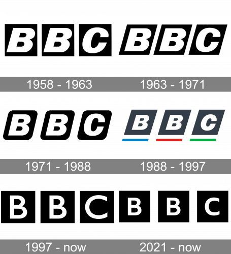
The iconic BBC logo has been familiar to people all over the globe since the end of the 1950s when it was designed by Abram Games. Since then the monochrome emblem with three black blocks has never left the visual identity of the corporation, being its signifier, and inalienable symbol.
What is BBC?
BBC, or British Broadcasting Corporation, is one of the world’s largest and oldest broadcasters, with a perfect reputation and revenue of more than 5 billion sterlings per year.
1958 – 1963
The very first block logo was introduced by the British Broadcasting Corporation in 1958 and featured three black squares with “BBC” bold and italicized letters on them. The letters were enlarged and looked solid and bright due to the strong monochrome contrast and the balance between the clean geometry of the blocks and the traditional lines of the letters.
1963 – 1971
The redesign of 1963 gave some inclination not only to the letters, but also to the blocks, so the squares were switched to parallelograms, while the letters were enlarged and cleaned.
1971 – 1988
Though the logo, designed in 1971 was official only till 1988, it was still in use by the corporation as the secondary one, until the beginning of the 1990s. It was a softened modification of the previous version, with the rounded angles of the blocks and the letters drawn in a smaller size.
1988 – 1997
The redesign of 1988, held by Michael Peters, brought a fresh look to the BBC logo, by coloring the inclined block into dark gray, and adding three horizontal lines under the emblem, with the first “B”-block underlined with blue, second — with red, and the third with the green line. The letter contours on this logo were also refined and made a bit stronger and sharper, now the official tule face of the corporation was Helvetica Neue.
1997 – Today
Today the British Broadcasting Corporation uses the logo, designed by Martin Lambie-Nairn in 1997. The blocks became black and square again, as in the original version, created by Abram Games. As for the letters, they got thinner and more sophisticated contours, being executed in a medium-weight Gill Sans font, which made the whole composition fresher and more elegant.
2021 – Today
In 2021, they changed the logo in a few small things. Firstly, the intervals between the black squares were enlarged slightly. Secondly, the letters inside them were made slightly smaller than before. And that’s about it.
BBC News logo
The news logo features the company’s name, each letter placed in a square box, and uppercase “news” underneath. The name is written in white letters on a red background.
BBC Video logo
The latest one featured Italic “BBC” in rhomboid boxes with colored underlines, and capitalized “Video” below.
BBC Films logo
The films branch is represented by the same boxed “BBC” with lowercase “Films” underneath.


