Banco Popular is the name of one of the largest and most reputable banks in Spain, which was established in 1926. Being in the 6th place among the best Spanish banks, Banco Popular ceased all operations in 2018, after its acquisition by Santander.
Meaning and history
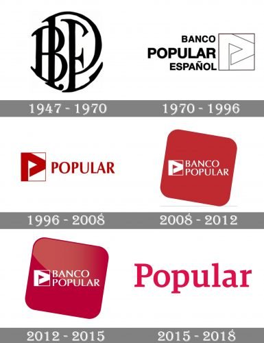
Throughout the years, the famous Spanish bank has been shortening and simplifying its identity. It all started from Banco Popular Español in 1947, which was renamed into Banco Popular in 1996, and to simply Popular in 2015. The logo of the financial organization also got more and more minimalist, following the world’s latest trends, but without losing its individuality.
1947 – 1970
The very first logo, which bank used for more than twenty years, was designed in 1947 and featured a rounded BPE monogram in black, which was usually placed on a white background. The elegant handwritten typeface boasted massive yet smooth serifs and arched contours.
1970 – 1996
In 1970 a completely different logo was introduced. The modern insignia was composed of a sans-serif wordmark in three levels and a delicate geometric emblem on its right. All three parts of the lettering were written in one typeface, yet the “Popular” has its letters enlarged.
The emblem of the bank featured a white square with a very thin black outline and a stylized letter “P” executed in straight lines in a triangular shape, also outlined in thin black. The letter resembled a flag or an arrow and symbolizes progress and growth.
1996 – 2008
After the name shortening, the logo was redesigned again in 1996. It was the same graphical emblem, but in red and white, and a wordmark, consisting of only the “Popular” part, executed in red sans-serif.
2008 – 2012
In 2008 the word “Banco” was added to the visual identity. The emblem and the inscription were now colored white and placed on a solid red square with rounded angles. The square was slightly inclined, which added friendliness and playfulness to the logo.
2012 – 2015
The redesign of 2012 made the logo more dynamic by adding some gradient shades and gloss to the surface. Red color gained a new tone, which is more “expensive”, and the contrast with white of the wordmark became brighter.
2015 – 2018
With the last redesign in the bank’s history, the logo was simplified to just “Popular” logotype, which was executed in red and written in a title case. It was the most laconic and modest among all the versions, yet still elegant and memorable.
Font and color
The typeface of the Popular inscription in the last design was completely different from those the bank used before. The wordmark was executed in a modern serif font with massive yet smooth serifs. The typeface of the Banco Popular logotype is very similar to such fonts as Tangent Bold and Asian Demi Bold.
The red and white color palette, which was glued to the brand since the 1979s, is a reflection of power and confidence, along with attention and warmth the bank gave to its customers.


