Azores Airlines is a prominent airline based in the Azores, an archipelago in Portugal. It is owned by SATA Air Açores, a regional airline group. The company operates both domestic and international flights, connecting the Azores with destinations in Europe, North America, and Africa. With its modern fleet and commitment to customer service, Azores Airlines has established itself as a reliable and popular choice for travelers exploring this breathtaking island paradise.
Meaning and history
Azores Airlines, founded by the Government of the Azores, is the flagship airline of the Azores archipelago in Portugal. Established in 1941, it has a rich history of connecting the remote islands to mainland Europe and beyond. The airline has achieved significant milestones, including modernizing its fleet with the introduction of Airbus A321neo aircraft, enhancing passenger comfort and fuel efficiency. Azores Airlines has expanded its route network, offering connections to major cities in North America, Europe, and the Azores. Despite the challenges posed by the COVID-19 pandemic, the airline has adapted its operations and implemented health and safety measures to ensure passenger well-being. Azores Airlines remains committed to providing quality service, promoting tourism in the Azores, and maintaining its position as a vital transportation link for the region.
What is Azores Airlines?
Azores Airlines is a Portuguese airline based in the Azores archipelago. It operates both domestic and international flights, connecting the islands of the Azores to various destinations in Europe, North America, and Africa. The airline offers a range of services to passengers, including scheduled flights, charter flights, and cargo transportation.
1998 – 2002
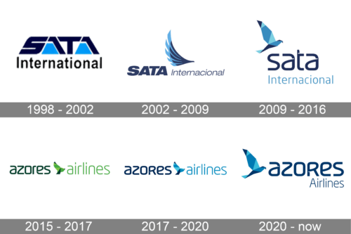
The original logo of Azores Airlines was designed at the end of the 1990s when the air carrier was called SATA International. The badge was executed in a color palette, composed of two shades of blue and a white background. The upper level of the logo featured a stylized uppercase “SATA” with massive characters, while the bottom level comprised a title case dark-blue “International” in a traditional sans-serif typeface.
2002 – 2009
The redesign of 2002 completely changed the concept of the air carrier’s logo, and now the composition was built around a sans-serif lettering in dark blue; with the first part enlarged and emboldened, and an elegant emblem in a shape of a wing, drawn in two shades of blue.
2009 – 2016
In 2009 the logo of the airline became more modern and cool, although the color palette was kept the same. The lettering was rewritten in a designer futuristic font with the top level in the lowercase, and the bottom — in the title case. The wordmark was accompanied by a graphical emblem, depicting a bird with a geometric pattern in two shades of blue.
2015 – 2017
In 2015 the air carrier was renamed Azores Airlines, and the logo was redesigned. The new badge kept the style and the graphical element of the previous version but placed the wordmark and the emblem in one line and switched the color palette to a green one.
2017 – 2020
The blue shades came back to the Azores Airlines badge after the redesign of 2017. It was the same badge, as the one introduced in 2015, but set in the color palette, used by the air carrier in the 2000s.
2020 – now
The redesign of 2020 has kept the typeface and color palette of the previous badge but slightly refined the composition. Now the “Azores” part is enlarged, and placed in the center of the badge, with the bird in two shades of blue set on the left of it, and a light-blue tagline in the title case of a traditional sans-serif typeface set under the main part.


