Avianca is a renowned Latin American airline that has been in operation since 1919. It is the national carrier of Colombia and offers flights to numerous domestic and international destinations. Avianca is known for its extensive network, providing connectivity across North, Central, and South America, as well as Europe and the Caribbean. The airline prides itself on its top-notch service, modern fleet, and commitment to passenger comfort and safety. Avianca has received accolades for its in-flight experience and frequent flyer program. With a rich history and a strong presence in the region, Avianca continues to be a leading airline in Latin America.
Meaning and history
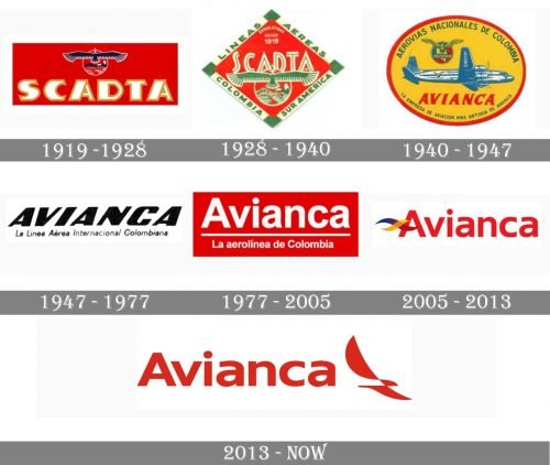
Avianca S.A. has been known as the flag airline carrier of Colombia since 1919. It filed for Chapter 11 bankruptcy in 2019. The Avianca logo has undergone multiple modifications over its more than 100-year history.
1919 (SCADTA)
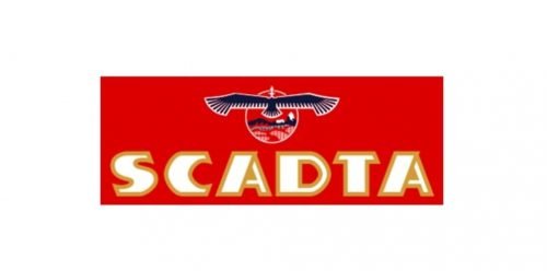
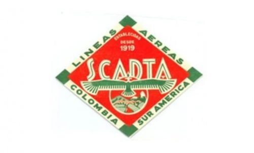
Avianca’s predecessor was a Colombo-German airline company called SCADTA (Sociedad Colombo-Alemana de Transportes Aéreos). It was founded in late 1919.
While the SCADTA’s logo went through at least two profound modifications, it always preserved the depiction of a strong bird with its wings spread wide. On the original emblem, the bird was featured above the name of the brand. It was reminiscent of the Andean condor depicted on the National coat of arms of Colombia.
Below the bird, the characteristic local landscape could be seen.
1928 (SCADTA)
This version was richer in detail than its predecessor. The bird and the landscape moved below the word “SCADTA.” The lettering “Lineas Aeread Colombia sur America” appeared – it now formed the border around the emblem. The palette grew lighter due to the addition of milk-white and light green as well as the fact that the dark blue had disappeared.
1940 (Avianca)
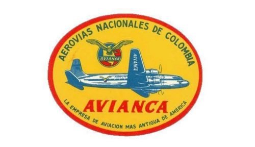
SCADTA merged with the regional Colombian airline SACO to form a new company named Avianca (Aerovías Nacionales de Colombia S.A.).
The original Avianca logo had a distinctive link to that of its predecessor – a bird in flight. This time, the creature was redrawn, though. Its wings were now spread not strictly horizontally but at about 45 degrees. There was also an aircraft below, as well as multiple other elements, including the map, the lettering, and the outline. All these made the design way too cluttered.
1947
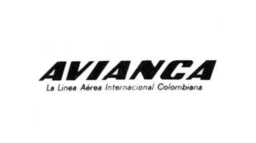
The problem was solved by reducing the logo to just the company name and the writing “La Linea Aerea International Colombinana” (which meant “International Colombian Airline”). Even the type grew simpler: on the previous logo, there were characteristic sharp thorns, while the current one had none. The overall style of the wordmark and the italics were preserved, though, which created at least a weak link to the previous design.
1977
The italics were straightened, and a horizontal line appeared on the logo separating the company name from the explanatory words “La aerolinea de Colombia” (The airline of Colombia”) below.
2005
Two playful wavy elements were added to the wordmark.
2013
The emblem was moved to the left and was redrawn. Now, the Avianca logo features a distinctive red-and-white color scheme.


