AT&T, the largest wireless provider in the US with more than150 millions of subscribers, has serious ambitions and considers itself the world leader. Which is, in fact, not that far from the truth.
Meaning and history
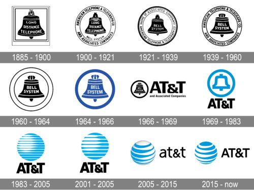
Looking at the history of the AT&T visual identity, you can see how the company was growing and evolving throughout its history, as its current logo is a modernized and stylized version of the very first emblem, created for American Telephone and Telegraph Company in 1885.
1885 – 1900
The original logo created for the company at the end of the 19th century was composed of a bell image in black, enclosed in a triple square frame. The white “Long Distance Telephone” wordmark was placed right in the bell, written in a traditional typeface, with all the letters italicized.
1900 – 1921
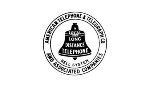
The frame turned a circle in 1900, and the additional lettering was added to the emblem’s perimeter. As for the main part of the logo, the bell, it got a “Local” inscription placed on its upper part, and the “Bell System” in black arched along with the frame, under the image. The “1900” datemark was placed under the badge.
1921 – 1939
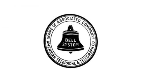
The lettering on the emblem was slightly changed in 1921, making the whole inscription on the bell shorter. Now it was composed of just “Bell System” lettering, while the wordmark around the emblem’s perimeter featured a pretty long “American Telephone & Telegraph Co (Name Of Associated Company)” inscription.
1939 – 1964
The typeface of the lettering on the AT&T logo got bolder and stronger in 1939. Though the composition remained untouched, all contours of the elements were refined and now made the whole image look more confident and serious.
1960 – 1964
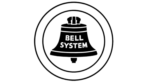
The redesign of 1960 completely simplified the Bell a system badge; with all the additional lettering, written around the circular frame of the medallion, removed from the composition. Now it was just the black bell with the name of the company, placed against a plain white background and enclosed into a double frame.
1964 – 1966
In 1964 the logo got another refinement, with the black and white color palette turning blue and white. The double frame of the rounded medallion was switched to a thick blue one. As for the main element of the logo, the stylized bell with the two-leveled white inscription on it, it remained untouched, except for just the color.
1966 – 1969
The name of the company was shortened to “AT&T” in 1964, so the logo was changed accordingly. The circular frame of the emblem became solid and bold, and the enlarged logotype was placed on the right from it. The wordmark was set in two levels with a large “AT&T” placed above a small “And Associated Companies” in a traditional sans-serif typeface. The color palette of the visual identity was still monochrome.
1969 – 1983
The first colorful version of the logo was created for AT&T by Saul Bass in 1969. It was a stylized version of an iconic bell emblem, where the elements were redrawn with thick blue outlines, and the bold black logotype was placed under the circular image.
1983 – 2005
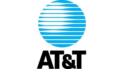
Saul Bass keeps the light blue and black color palette unchanged but created a new emblem for the company in 1983. The iconic bell in a circular frame was replaced by a stylized globe image where the solid blue circle had a horizontal striped pattern with the stripes emboldened on their left. The new badge got a nickname “Death Star” and stayed with AT&T for many years, becoming a basis for the current company’s emblem.
2001 – 2005
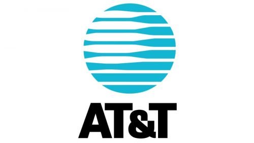
The logo was redesigned again in 2001, keeping the composition, but making it a bit more minimalist — the number of the stripes on a blue globe is reduced, and the main color is muted. As for the bold black lettering under the emblem, it remained almost untouched.
2005 – 2015
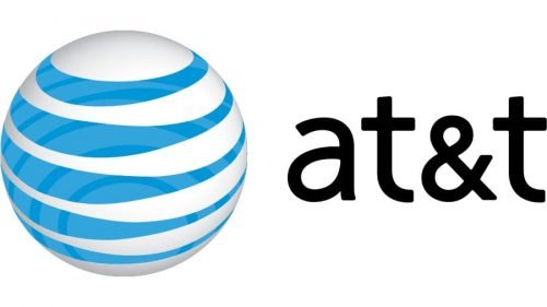
After the AT&T merger with SBC in 2005, the visual identity of the company was redrawn by the Interbrand design bureau. The concept of the new image was built around the previous versions of the badge’s, though now it was a three-dimensional sphere with white as the main color, and blue used for the horizontal stripes on it. The logotype was also changed and now featured lowercase lettering in a bold yet delicate sans-serif typeface.
2015 – Today
The redesign of 2015 made the AT&T logo flat again and brought back the capitalized lettering. As for the color palette, it remained the same, but with the light blue color as the main one. The new emblem was introduced by Interbrand and shows the company’s value of roots and traditions.
As we all know, the first phone was created in 1873-1875 by Alexander Graham Bell and was patented in 1877. Bell Telephone Company was a monopolist in the production of telephone sets for many years (the first telephones were not even on sale – they could only be rented from the seller).
Symbol
Modern AT & T symbol representing 3D image of the globe mostly symbolizes the brand’s global ambitions. Indeed, in terms of the number of subscribers, this brand is truly a leader even despite numerous splittings (including forced ones). Besides, AT&T technologies are constantly being improved, which contributes to the company’s expansion on new markets (including those with virtually no competition). AT&T’s decision to go beyond the US borders was a forced measure, but at the same time, it was the beginning of a new path, with a new logo.
Emblem
Modern AT&T logo turned from the monochrome one in 1984 into a formal two-colored one (or three-colored to be correct). Now the voluminous globe consists of blue (light blue) and white stripes, while at the intersections, the blue stripes intensify to blue. This gives the logo volume and depth.
AT&T, which was a subdivision of the company and later became a subsidiary, was established in 1885 with the aim of developing and improving the so-called long-distance communications, but it soon took over Bell Telephone Company. AT & T was the US telephony monopolist until 1974, when state antimonopoly authorities decided to oppose this monopoly. The company was forcibly divided into several parts, and 10 years later it received a ban on the use of its former logo.
Font
The modifications in the logo led to the changes in the AT & T’s corporate font. One of the important changes that happened in 1984 was the change in the location of the signature. If earlier the text was placed under the image, now the image has shifted to the left, and the text is placed on the same level as the logo. The transition from capital letters to lower-case letters was also fundamental. This change was also quite symbolic - the brand has gained so much power in the global scale that it can afford to use small letters in the logo.
Color
If initially AT & T logos were monochrome (black and white), modern emblem uses color. This transition mostly indicates the desire to be more visible and attractive to customers.
What is the AT&T logo?
The famous logo of AT&T is composed of a light blue and white emblem, depicting a stylized globe, and heavy uppercase lettering in black, with the capital characters executed in a simple yet bold geometric sans-serif typeface. The goose on the logo is drawn in a thick blue curved line, making up a cool striped element.
What did AT&T originally stand for?
The name of the company AT&T, is an abbreviation, standing for the original name of the organization, American Telephone & Telegraph. The company got its current short name in 1964.
How do I create an AT&T logo?
If you want to create a logo, inspired by the AT&T badge, you should use one of many available online logo-design applications, or follow a more traditional way and get graphic design software, which requires some basic knowledge to use properly.
Who designed the original AT&T logo?
The iconic “swirling” globe appeared on the AT&T badge in 1983. It was the creation of Saul Bass, who also worked on the last version of the logo with the bell, used by the company from 1969 to 1983. As for the current version of the AT&T badge, it was refined by the Interbrand design bureau.
What did AT&T originally stand for?
AT&T is an abbreviation, which stands for American Telephone & Telegraph Company , established in the United States in 1885. Even though, today the company is much more than its initial fields of activity, the name remains the same, as a tribute to the heritage and history of the corporation.
How do I create an AT&T logo?
The AT&T logo is pretty simple to repeat, if you are familiar to one of many available graphics editor. The blue sphere with white stripes across it can be created in 10 minutes. If you are new to the software tools, you can find tutorial videos on YouTube, with the step-by-step guides, on all the possible languages.
Who designed the original AT&T logo?
The last bell AT&at logo, introduced in 1969 was designed by Saul Bass, who later turned it into a prototype for the current badge, the first globe emblem, which saw the light in 1983. As for the current version with the voluminous sphere and arched lines, it was designed by the famous Interbrand bureau in 2005.


