Ariel, a renowned brand in the laundry detergent market, is owned by Procter & Gamble, a global conglomerate known for its vast array of consumer goods. This brand has cemented its place as a leading detergent due to its innovative approach to tackling tough stains and providing customers with clean, fresh-smelling laundry. Ariel operates across various continents, including Europe, Asia, and Latin America, adapting its formula to meet the specific laundry needs of different regions and water types.
Meaning and History
Ariel, the groundbreaking laundry detergent, was introduced by Procter & Gamble in 1967. The inception of Ariel marked a significant milestone in the cleaning products sector, heralding the era of enzymatic detergents capable of removing stains at lower temperatures. This innovation not only enhanced cleaning efficiency but also contributed to energy conservation by enabling cold-water washing.
Over the years, Ariel has been at the forefront of laundry detergent innovation. Its introduction of liquid and tablet forms of detergents, in addition to the traditional powder, has catered to a wide range of consumer preferences and laundry practices. Ariel’s commitment to sustainability has been evident in its compacted formulas and packaging initiatives aimed at reducing waste and environmental impact. The brand has consistently invested in research and development to improve its products’ cleaning power while ensuring they are safe for consumers and the environment.
Today, Ariel stands as a symbol of cleanliness and innovation in the laundry industry. Its products are trusted by millions worldwide, a testament to its enduring commitment to quality, efficiency, and environmental stewardship. Ariel continues to lead with its cutting-edge technology and sustainable practices, securing its current position as a favorite among households seeking effective and eco-friendly laundry solutions.
What is Ariel?
Ariel is a leading laundry detergent brand known for its effectiveness in removing tough stains and its wide range of products suitable for different laundry needs.
1967 – 1980
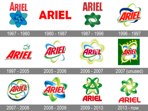
The 1967 logo features the “ARIEL” text in a bold, red font. The major addition to this logo is the atomic structure symbol behind the text. This structure consists of a central circle with four orbiting ellipses, resembling a simplified atom model. The atomic symbol is in shades of blue and teal, which may represent the freshness and purity associated with the brand’s products. This design suggests a scientific approach to cleaning and emphasizing the advanced technology used in Ariel products at the time.
1980 – 1987
This logo maintains the brand name “ARIEL” in bold, uppercase red letters. The font style appears more modern with a dynamic cut on the letter ‘A,’ giving it a sharp and progressive look. The background is plain, highlighting the simplicity and directness of the brand message during this era.
1987 – 1996
The 1987 Ariel logo has undergone a notable transformation. It now includes a graphic element that features a stylized, green, atom-like shape with a swirl in the center. This design is placed bottom of the red, bold, and capitalized “ARIEL” text. The green color and the organic shape of the graphic suggest freshness and nature, which align with the ecological values or cleaning power of the product. The contrast between the red text and the green background creates a visually striking image that would stand out on product packaging and advertisements.
1996 – 1997
This version of the logo features a significant design shift. The “ARIEL” text is encased within a dynamic, three-dimensional ribbon that swirls around in blue and green, reminiscent of fresh, clean water and nature. The font is bold and italicized, indicating speed and effectiveness, and it retains the vibrant red color, which contrasts nicely against the swirl’s lighter colors. The green and blue swirl motif suggests an environmental or eco-friendly aspect to the brand, which aligns with the product innovations or marketing strategies of that time.
1997 – 2005
This logo features the brand name “ARIEL” in bold red capital letters, with a slight italicized effect to suggest movement and efficiency. The ‘I’ in ARIEL is dotted with a yellow atom-like symbol, representing the cleaning power at the microscopic level. The design is straightforward and aimed at highlighting the brand’s impact and reliability, introduced in 1997.
2005 – 2006
The 2005 Ariel logo maintains the bold red capital letters for the brand name but introduces a dynamic blue and green swirl around the text. The swirl suggests a powerful cleaning action, with the green representing a fresh, natural approach and the blue symbolizing water and purity. The logo’s colors are brighter, creating a more modern and energetic feel compared to the previous version.
2006 – 2007
This version of the Ariel logo, introduced in 2006, centers around a green and blue flower-like symbol made of water and leaf elements, cradling the brand name in the middle. The “ARIEL” text remains in red but is now superimposed on a white bubble-like shape, emphasizing the brand’s connection with cleanliness and the gentle yet effective nature of the product.
2007 (unused)
The 2007 logo for Ariel features the brand name in its signature red font, now adorned with fifth golden stars above the ‘I,’ suggesting a superior quality rating. The backdrop is a stylized white stain remover starburst with blue and green trails, giving the impression of a powerful clean. This design iteration emphasizes the brand’s promise of excellence and stain-removing capabilities.
2007 – 2008
This logo features a three-dimensional white circle encapsulating the word “ARIEL” in red, bold, sans-serif typography. Surrounding the circle are swooshes of green and blue, suggesting a sense of motion and cleanliness. The green swooshes are highlighted with a lighter green, giving a sparkling effect, while the blue swooshes has a darker blue shadow. The design conveys freshness and efficacy, which are qualities associated with the brand’s cleaning products.
2008 – 2009
The 2008 logo for Ariel simplifies the previous year’s design by removing the white circle background. The “ARIEL” lettering remains in a bold, red font but now floats freely on the design. The green and blue swooshes intersect behind the text, creating a dynamic X shape. The blue is a vivid sky blue, and the green retains its bright lime hue. This logo maintains the impression of vibrancy and cleanliness.
2009 – 2013
This design represents a significant change from the previous logos. It introduces a green atom-like structure with elliptical orbits, suggesting the molecular efficiency of the product. In the center of the atom figure, the “ARIEL” text appears in a flat, red, blocky font. The orbits are adorned with small yellow dots, representing electrons, to emphasize the scientific and effective cleaning power of Ariel.
2013 – Today
The Ariel logo consists of a dynamic, three-dimensional atom-like symbol composed of three orbiting rings around a central glowing nucleus, suggesting molecular structure and movement. The rings are rendered in a gradient of vibrant green shades, implying freshness and cleanliness. Below this symbol, the brand name “ARIEL” is written in bold, uppercase letters, with a red color that stands out and is easily recognizable. The font is modern and straightforward, contributing to the logo’s overall contemporary and clean aesthetic, which aligns with the brand’s association with cleanliness and efficiency in laundry products.


