Whatever modifications the Arbys logo has gone through, it has always stayed consistent in its central visual metaphor – the hat shape.
Meaning and history
What is the Arby’s logo supposed to mean? The hat shape didn’t have a deeper meaning but was used rather as an element of style – when the quick-service chain was established in 1964, westerns were extremely popular. So, it seemed like a good idea to use a cowboy hat design as the base for the logo.
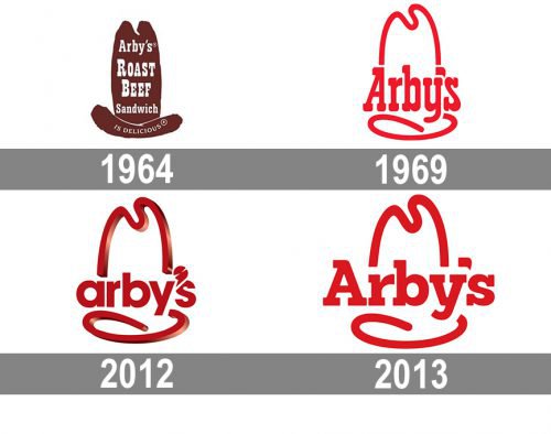
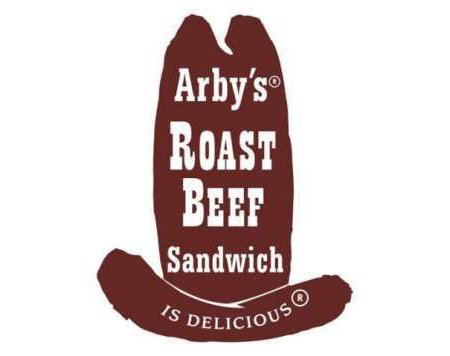
The original logotype was introduced in 1964. Over the tall brown hat, the text “Arby’s Roast Beef Sandwich is Delicious” was placed. Its first part was given in blocky slab-serif letters, while the text “is Delicious” featured thin capital letters.
1964 – 1969
The classic, most known logo was adopted in 1974. It featured a stylized red hat outline with the lettering “Arby’s.” Because of its simple, yet eye-catching and recognizable design, the logotype proved to be rather successful, so the company didn’t dare change it for several decades.
1969 – 2012
The most long-lasting logo of the brand was introduced in 1969 and stayed with the famous company for almost four decades. The logo was fully based on the iconic original version, but in a modern and minimalist interpretation. It was a scarlet-red contoured cowboy hat with a smooth and bold “Arby’s” inscription, set in the same color, and executed in a narrowed typeface with massive serifs on the ends of the letters’ lines.
2012 – 2013
 For about a year, the chain used a logotype based on a glossy 3D version of its predecessor. The modifications included a slightly longer top outline, a new type, a lowercase “A,” and a new apostrophe looking like a meat slicer, which went well with the “Slicing Up Freshness” slogan. The letters were flat, which created a conflict with the shiny 3D hat.
2013 – present
At the end of 2013, the emblem was reverted back to 2D. It now looks more like the classic hat logo from 1969 than the 2012 version. Moreover, as it got rid of some of the old-fashioned elements of its predecessor, the logo is more in line with contemporary design trends.
Due to a new, not condensed font, the overall shape is now wider and less tall, which makes it better suited for social media avatars. Also, the letters are now more legible, even at smaller sizes. The old speech bubble apostrophe that could be seen on the classic logo is also back.
Font
The name of the type featured on the Arbys logo 2017 is Sanchez Black. We should point out, however, that the type has gone through several modifications (take a look at the “b,” for instance) to fit the overall logo design.
Color
Vivid, eye-catching, and simple, the shade of red featured on the Arby’s logo is great in attracting customers. Moreover, according to psychological research, red tends to make people do things faster (including having a meal!), so it’s one of the most popular colors when it comes to fast food chain design.


