AMC is an abbreviation for American Motors Corporation, which was established in 1954 and was specialized in the production of affordable vehicles until its discontinuation in 1988. At the end of the 1970s, the brand was bought by Renault, so even after the defunct of AMC, its special and recognizable style could be seen in some of the Renault models of the 1980s.
Meaning and history
The visual identity of the American Motors Corporation was moderately patriotic, based on the tricolor of the national flag of the United States Congress though used it in a modern and stylish way. The logo of the brand was redesigned just once, in 1970, completely changing the geometry of the badge but keeping the iconic color palette and mood, showing the company’s value of its roots, motherland, and philosophy.
1954 – 1967
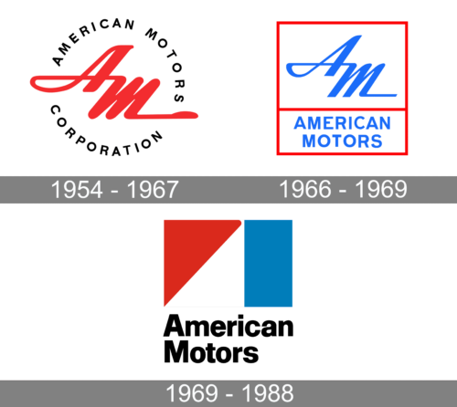
The very first logo for the AMC was created in 1954. The circular badge was composed of three parts — the thick red outer circle, a white one in the middle, and the inner, smallest one, in blue. The red part of the badge was a plain one, while the white contained a blue bold “American Motors Corporation” inscription in rounded capitals. As for the middle of the emblem, it had a stylized elegant “AM” monogram in white on it. Both letters of the monogram had their lines Ali gated and spread to the sides, closing blue and red outlines of the circle.
1966 – 1969
The logo is a two-tiered rectangular emblem, outlined in a thin red border that frames the design. The upper section features the stylized initials “AM” in a bold blue hue, with the letters joined by a flowing, horizontal stroke that suggests motion.
The font used for “AM” is dynamic. Below, the words “AMERICAN MOTORS” are spelled out in capital letters, in a more straightforward and classic typeface, contrasting with the artistic flair of the initials above.
The entire logo is set against a clean white background, which makes the blue and red colors stand out, embodying a palette that resonates with the brand’s national identity.
1970 – 1988
The redesign of 1970 elevated the colors of the badge, making them brighter and a bit darker, and completely changed the style and composition of the whole emblem. The new AMC insignia featured a white square with the “American Motors” lettering in black sans-serif typeface placed along the bottom line of the emblem. The main part of the badge was taken by a geometric structure, composed of a solid red triangle on the left, a vertical blue rectangle, and white space between the figures.
Triangle in the refreshed AMC logo stood for growth and success, while the rectangle represented the stability and solidness of the company. As for the black lettering, they added professional touch, showing AMC as a reputable and authoritative brand.
Font and color
The lettering from the last AMC badge, designed in 1970, was written in the title case of a bold and slightly narrowed sans-serif typeface, which was pretty close to such well-known fonts as NeoGram Black and Samplex Black, with the clean and neat contours of their elegant bold letters. The smooth lines and rounded angles of the inscription balanced the straight lines of the graphical part of the AMC insignia, adding harmony and excellence to the logo.
The main color palette of the American Motors Corporation visual identity is blue, red, and white, the most famous tricolor crest used by many large companies across the globe. Red is a color, reflecting passion and strength, while white adds tenderness, loyalty, and caress, and blue points to the company’s reliability, protectiveness, and trustworthiness. All together these three shades work as a great eye-catcher and accompanied by black lettering they represent the power and professionalism of the brand.


