Alamo Bowl is among rather well-known college football bowl games. It has been held annually since 1993 in the Alamodome in San Antonio, Texas. It is an NCAA Division I FBS game.
Meaning and history
What is Alamo Bowl?
Alamo Bowl is the American football Bowl game, held between the college teams every year. The Bowl was established in 1993 in Texas, and until today all the games are played in San Antonio. The Bowl belongs to the NCAA Division I.
1993 – 1997
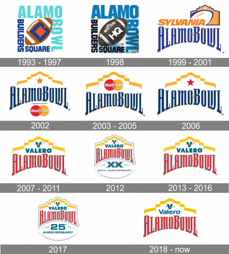
The very first Alamo Bowl logo, designed in 1993, stayed with the Bowl for four seasons. It was a diagonally placed rugby ball in brown and white, with the stylized letter “B” in blue and orange on it. The rugby was enclosed into a square frame, composed of four words, executed in two different styles: the turquoise “Alamo Bowl” in large bold capitals, in the upper right corner, and the dark blue “Builders Square” in the small cape, in the bottom right one.
1998
 The Alamo Bowl logo has gone through numerous modifications. Some of them have been connected with the change of the sponsor. The original logo of 1993 featured a football housing the lettering “HQ.” The football was placed inside a square formed by the text “Builders’ Square” (in black) and “Alamo Bowl” (in blue).
1999 – 2001
The Alamo Bowl logo from 1998 was executed in a new delightful color palette, based on orange and blue. The upper parts of the badge featured a bold italicized “Sylvania” inscription followed by a white rugby ball placed on a background repeating the contours of the building, with a delicate white five-pointed star on it. The “Alamo Bowl” logotype was arched under the upper level, executed in a custom sophisticated serif typeface with narrowed tall letters. The blue inscription had its two parts placed close to each other and only separated by an orange five-pointed star in a thin white outline.
2002
The redesign of 2002 made the Alamo Bowl logotype bolder and heavier, keeping the blue and yellow color palette, but using a lighter shade of blue or its narrow tall letters. The inscription was set under the yellow waving ribbon in yellow, and a solid five-pointed star, also in yellow, but its darker shade. Under the lettering, the sponsor’s logo was placed, and in 2002 it was MasterCard’s red and yellow iconic badge.
2003 – 2005
The redesign of 2002 changed the upper part of the badge, as the main sponsor of the bowl was changed. Now it was MasterCard corporate logo set above the elegant blue logotype. The two circles in red and orange were covered by an orange ribbon, repeating the contours of the building from the previous version. It was a cool and professional badge, which looked confident and fancy.
2006
The MasterCard logo was replaced by a plain five-pointed star in 2006. The star was executed in classic red and was set on a white background with no contrasting outline or any other additions. The logotype on this version got its letters enlarged and emboldened, and the orange star got its shadow more visible now, hence more volume was seen on the badge, making it all lighter and more vivid.
2007 – 2011
In 2007 the Alamo Bowl got a new sponsor — Valero, so the logo was redrawn again. Now except for the addition of the bold turquoise Valero corporate logo to the top part of the badge, the blue color palette of the Bowl logotype was switched to red, and the contouring of the elegant and chic letters became light blue. In this new color scheme the logo looked completely different from all the previous versions.
2012
For the 20th anniversary of the Bowl, the special logo was introduced in 2012. It was the badge from 2002, but enclosed into a thin silver frame, repeating the contours of the elements, and a graphical addition, set under the main logo. The addition features a stylized horizontally placed rugby in white and silver, with the extra-bold “XX” in dark turquoise and gray, and the “20th Anniversary” underlining it, and executed in a wide modern sans-serif font.
2013 – 2016
The badge from 2002 came back in 2013, but with a slight alternation in colors. The bright red was replaced by a darker and calmer version, and it changed the complete look of the badge, making it more stable and professional. All other elements remained untouched.
2017
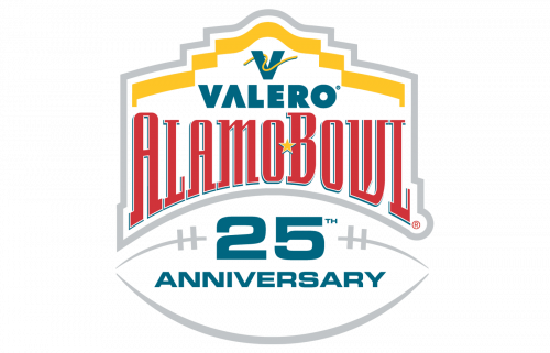
For the 25th anniversary of the Bowl; another special edition of the logo was introduced in 2017. It was the same concept, as with the badge of 2012, but this time the upper level on the rugby ball was taken by the enlarged “25” in turquoise and gray, and the underlining “Anniversary” in all caps of a bold sans-serif typeface was set in the same shade of turquoise as the numbers and the “Valero” logo.
2018 – Today
The 2018 logo, which is a version of the 2007 emblem, combines the arched name of the bowl with the lettering “Valero” (Valero Energy Corporation sponsors the bowl).


