The Sugar Bowl is one of the three second-oldest bowl games in the US. The first game was played in 1935. Today, it is an annual college football bowl game played in New Orleans, Louisiana.
Meaning and history
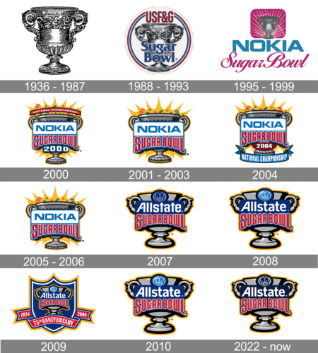
Birthed from the vision of the New Orleans Mid-Winter Sports Association in 1935, the Sugar Bowl emerged as a beacon of American college football. Its creation aimed to harness the fervor for college football, catalyzing tourism and economic growth in New Orleans. The Sugar Bowl’s timeline is dotted with monumental achievements and unforgettable football showdowns, often playing a pivotal role in crowning the national champions. Presently, as a key fixture in the College Football Playoff, the Sugar Bowl upholds its legacy of excellence and prestige, drawing legions of fans annually and continuing to be a vital part of New Orleans’ cultural and economic fabric.
What is Sugar Bowl?
Sugar Bowl is the intercollegiate football bowl game, which is affiliated with the Big Twelve Conference. The first game of the bowl was held in 1935, and since then its held annually at the Caesar’s Superdome Stadium in New Orleans, Louisiana.
1936 – 1987
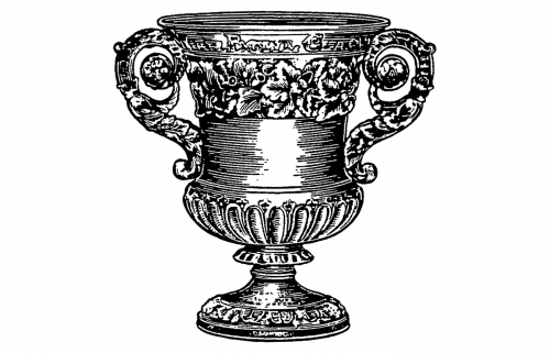
The original Sugar Bowl emblem was drawn in 1936 and stayed untouched for more than 50 years. It was a traditional and very realistic drawing of a Silver cup with floral designs along the neck and elegantly curved handles. The image was set in monochrome, executed in thin black strokes of different lengths.
1988 – 1993
The emblem from 1936 got enclosed into a triple red white and black circular frame and gained a bold blue “Sugar Bowl” logotype written over it in a traditional serif font. The top part of the badge was decorated by the slightly narrowed sans-serif “USF&G” abbreviation in dark red, which cut out the frame.
1995 – 1999

The first sugar bowl championship took part in 1995, under the Nokia sponsorship. The logo of the bowl was based on two different insignias — the minimalistic blue Nokia logotype in its corporate style, and the dark pink emblem with the cursive “Sugar Bowl” inscription. The emblem featured a square with rounded angles, which had a gray ornate cup image on it and numerous thin and sharp rays in light pink coming up from the bottom part of the emblem.
2000
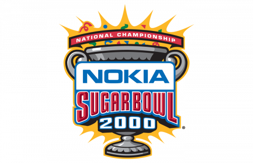
The image of a silver bowl was brought back to the Sugar Bowl logo in 2000 but in a more modern way. Now it was set in solid gray, with an arched white and blue banner over it. The cup was outlined in sharp yellow with numerous peaks and small colorful elements. Above the cup, there was an arched red ribbon with the white uppercase “National Championship” inscription. As for the main logotype, it was set over a white and blue banner, with the Nokia insignia set above the red outlined “Sugar Bowl”. The banner was underlined by a white and blue “2000” datemark.
2001 – 2003

In 2001 the logo was redesigned, keeping the Nokia logotype as one of the central elements of the badge. Now the blue lettering on a white background was set above the bold gradient red “Sugar Bowl”, with its bottom border arched up. The banner with the wordmarks was placed over the silver-gray image of a cup, which was set on a bright yellow background with colorful confetti in different shapes.
2004
With the redesign of 2004, the banner with the lettering is a bit narrower and underlined by bold white “2004” outlined in blue and set over a dark red background. The whole composition was complemented by a blue ribbon, arched from the center under the drawing, with the narrowed uppercase “National Championship” in white sans-serif capitals.
2005 – 2006

The logo from 2001 was brought back to the Sugar Bowl visual identity after the National Championship was over. The image, composed of a silver cup, a white and blue banner with the Nokia logotype, and a red arched inscription with the game’s name was kept in its original state for another season.
2007

The gray cup with a thick yellow outline remained untouched in 2007, while the banner with the logotypes got changed. The first and main thing of the year was a new sponsor — Nokia got replaced by Allstate. This, the white Allstate logo in the corporate style was now set on blue background above the voluminous red “Sugar Bowl” lettering in massive sans-serif capital letters in a thin white outline. The blue rounded medallion with the Allstate emblem drawn on it in thin white lines was set on the upper part of the badge, glued to the top border of the logotype banner.
2008
The Sugar Bowl logo has been heavily affected by that of the Allstate Insurance, which has been the main sponsor since 2008. At the very top of the 2009 version of the logo, you can the two hands, which have been borrowed from the Allstate Insurance logo. The lettering “Allstate” in white below also reminds about the sponsor. You can also see the word “Sugarbowl” (without the space) in red. It is given in a narrower typeface. On the background, there is a large grey two-handled cup.
2009
To celebrate the 75th anniversary of the Bowl the new logo was designed in 2009. The iconic silver cup now has another sponsor’s logotype set on it and got placed on a solid blue background of a fancy classic crest with a triple white blue and gold outline. The crest was decorated by a curved red ribbon with the white “75th Anniversary” in a sophisticated serif tour face and a “1934 — 2009” datemark written over it, set at the bottom part of the badge. The “Allstate” corporate logotype with an emblem replaced the geometric uppercase “Nokia” on the banner.
2010
In 2010 the badge designed in 2008 came back as the official logo version of the Sugar Bowl football game. It is the iconic silver cup with a two-leveled banner with the inscription and a light blue and white emblem of the bowl’s sponsor, Allstate company.
2022 – Today
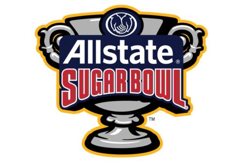
The redesign of 2022 has slightly enhanced the color palette of the Sugar Bowl logo, with the roundel and the background behind the lettering now set in one shade of blue, deep and dark. The badge became flatter, but also brighter and more professional, even though all the main details remained absolutely untouched.


