Meaning and history
 The Peach Bowl was played for the first time in 1968. It was organized by the Lion’s Club of Atlanta.
What is Peach Bowl?
Peach Bowl is the name of an American intercollegiate football bowl game, annually held on the Mercedes-Benz Stadium in Atlanta, Georgia. The first game of the Bowl was played in 1968.
1968 – 1985
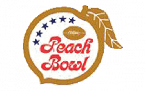
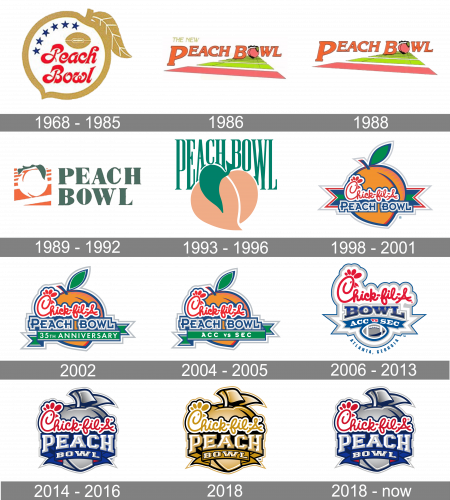
The original Peach Bowl logo was created in 1968 and stayed with the league for a bit less than five years. It was a simple yet memorable badge with the smooth cursive lettering in bright red set on a white background of the badge, which thick golden framing featured a shape of a peach. Above the inscription, on its left, there were six solid blue five-pointed stars, placed vertically along with the frame, and finishing near the horizontally located golden rugby ball. The smooth elongated lines of the red letters were curved and pointed, balanced by the gold leaf on the peach.
1986
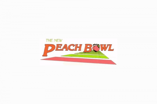
The Peach Bowl logo from 1986 was composed of a “road” formed by green and pink panels, and lettering written above it. The inscription was set in two lines, with “The New” in small capitals of a lightweight italicized sans-serif typeface, while the “Peach Bowl” featured bold peach-pink letters with some lines elongated, and the “O” replaced by the image of a peach.
1988
The redesign of 1988 only removed the lime green “The New” from the top part of the logo, keeping all other elements in their places and their original state. The badge was used for several seasons.
1993 – 1996
The redesign 1997introduced a modern and fresh logo, executed in a green and peach-pink color palette, and set on a white background. It was a stylized narrowed green inscription in a very elegant serif typeface, paced under a horizontally stretched green ribbon with the “29th Annual” inscription in peach capital letters of a simple sans-serif typeface. The inscription had a green, white, and peach drawing of fruit, set under it. The image looked very modern and clean, executed in thick and smooth lines with clean contours.
1998 – 2001
A completely new logo was introduced in 1998, with the Chick-Fil-A brand becoming a sponsor of the league. It was a bright orange peach overlapping a wide and sharp ribbon in blue and green, with a white and gray outline. The fruit image had a sponsor’s logotype in their custom handwritten font in red and white, and the square and brutal “Peach Bowl” inscription in the uppercase, written in blue and gray under it. The smooth red lines of the upper level perfectly balanced the sharp and straight contours of the bottom one.
2002
For the 35th anniversary of the bowl, the new logo was created in 2002. The wide ribbon was removed from the background of the peach, and the new, thinner one, was placed over it now. It was a solid green banner with clean sharp contours and a white “35th Anniversary” uppercase inscription in a simple sans-serif typeface. The Chick-Fil-A logotype became larger and got its bright red lines emboldened, no sow it was even more eye-catching than on the previous version of the badge.
2004 – 2005
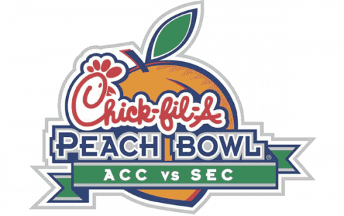
The color palette of the Peach Bowl visual identity got a bit muted in 2004. That gave the logo a more professional and confident look, showing the league as a serious competition. Another change was made to one of the wordmarks — the white “35th Anniversary” from the green ribbon was replaced by the “Acc vs Sec” in the uppercase of a modern and cool sans-serif font. No further changes followed that year, and the logo stayed untouched until the beginning of 2005.
2006 – 2013
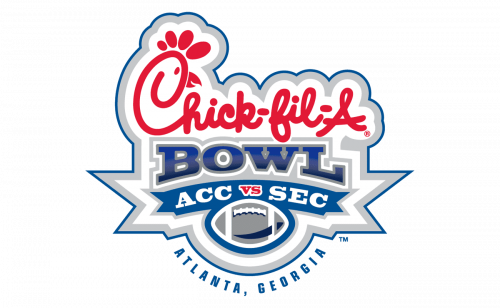
In 2006 the logo turned blue and white, with the “Chick-fil-A” inscription being the only bright element of the badge. It was a fresh and powerful badge with ice-cold sharp details, in light gray and several shades of blue. The rugby was set horizontally in a gradient silver color palette at the bottom of the logo, under the arched blue ribbon with the “ACC vs SEC” and a gradient blue-to-black “Bowl” in a massive serif font.
2014 – 2016
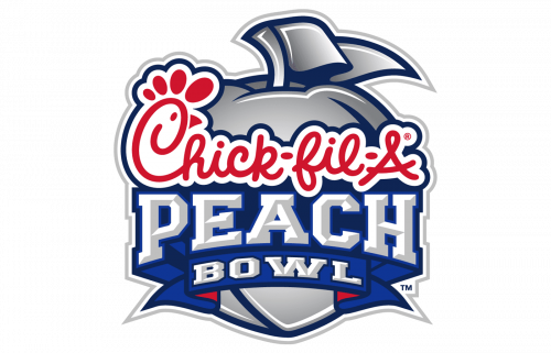
The color palette of the Peach Bowl visual identity got a bit muted in 2004. That gave the logo a more professional and confident look, showing the league as a serious competition. Another change was made to one of the wordmarks — the white “35th Anniversary” from the green ribbon was replaced by the “Acc vs Sec” in the uppercase of a modern and cool sans-serif font. No further changes followed that year, and the logo stayed untouched until the beginning of 2005.
2018
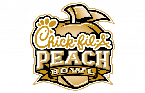
The golden badge for the Bowl was introduced in 2018. It was exactly the same design concept as on the previous badges, but with each element colored in gradient gold, and outlined in black. The “Chick-fil-A” logotype was also written in gold cursive on a white banner, repeating the contours of the lettering.
2018 – Today
At the end of 2018, the Bowl comes back to its logo version designed in 2006, keeping the colors palette and the style of all elements untouched. The silver, blue and red badges of the Bowl look powerful and confident, reflecting expertise and reliability.


