Aeroperú is an airline company that specializes in domestic and international flights. With a unique ownership structure, it is jointly owned by private investors and the government. The company operates its flights from its main hub located in Lima, Peru’s capital city. Additionally, Aeroperú serves various destinations within Peru, as well as international routes to North and South America, Europe, and Asia. With a fleet of modern aircraft and a commitment to safety and customer satisfaction, Aeroperú continues to be a prominent player in the aviation industry today.
Meaning and history
Aeroperú is an airline founded in 1973 by the Peruvian government. Throughout its history, the airline has achieved several significant milestones. In 1983, Aeroperú became the first Latin American carrier to operate the Boeing 767 aircraft, marking a major advancement in its fleet. The airline expanded its international routes and gained recognition for its commitment to safety and customer service.
However, Aeroperú faced challenges in the late 1990s. In 1996, one of its flights tragically crashed due to instrument failure, resulting in the loss of all passengers and crew on board. This incident led to increased scrutiny and financial difficulties for the airline. Despite efforts to recover, Aeroperú ceased operations in 1999.
Currently, Aeroperú no longer operates as an active airline. However, its legacy in Peruvian aviation remains significant, as it played a crucial role in expanding international connectivity and promoting air travel in the region.
What is Aeroperú?
Aeroperú was a former airline based in Peru. It operated from 1973 to 1999 before ceasing operations. It offered domestic and international flights, connecting Peru with various destinations in South America, North America, and Europe.
1973 – 1985
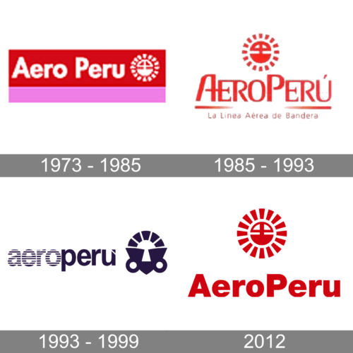
The original logo was created for AeroPeru at the beginning of the 1970s and featured white lettering written over a rectangular banner in red and pink. The inscription was followed by an abstract white emblem in a circular shape, with an interesting symbol outlined in a ring formed by several short strokes.
1985 – 1993
The redesign of 1985 has switched the color palette of the AeroPeru logo, and now all elements were set in red against a plain white background. As for the composition, it now featured a stylized inscription with two short lines under it and a massive emblem above it. The bottom part of the badge had a title case “La Linea Aerea de Bandera” tagline.
1993 – 1999
In 1993 the color palette of the AeroPeru logo turned from dark blue to white, and the style got significantly changed. The new concept was built around bold lowercase lettering in a geometric sans-serif typeface, with the first part featuring a striped pattern, and the second — set in solid lines, with a small triangular cut-out in the right bar of the “U”. The inscription was followed by a redrawn emblem, with the rounded top part, formed by short lines, and a triangular bottom with two rings on the sides.
2012
In 2012 the company decided to come back to the original concept and switched the color palette back to red and white. They also brought back the original emblem, refining and strengthening its contours. As for the lettering, it got rewritten in a bold geometric sans-serif typeface.


