

The most interesting stories about how the logos of famous Hollywood studios were created.
DreamWorks Pictures
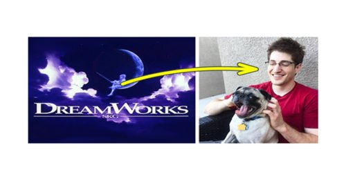
It was assumed that the logo of the DreamWorks studio would depict a fisherman sitting on the moon. The job was entrusted to the artist named Robert Hunt, but he decided to make one more sketch – a logo with a boy instead of a man. The second option was approved.
By the way, Hunt drew a boy on the moon from his own son. William became a composer and currently works in the music industry.
Columbia Pictures
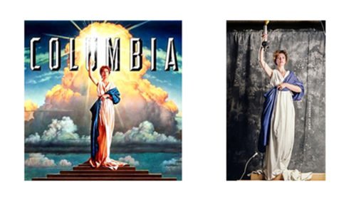
The lady with a torch – the personification of America and the Columbia Pictures studio – appeared on the logo in 1924. Interestingly, there never was one particular prototype for this lady, the image was always collective.
Modern version of the logo appeared in 1992 and belongs to the brush of the artist named Michael J. Dees. Ordinary American housewife Jenny Joseph was chosen as a model for the new logo, but the features of her face were significantly changed.
Metro-Goldwyn-Mayer
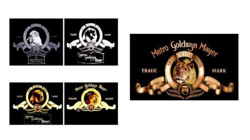
The idea of the logo was born in 1924 by Howard Dietz. Everything is simple: one of the sports teams of his alma mater – Columbia University – was called “Lions”.
Since then, five different lions have appeared in the MGM intro: Slats, Jackie, Tanner, the unknown lion and Leo. The latter is the hero of the modern logo. And, of course, it is important to note that not a single lion was hurt during the shooting.
Paramount Pictures
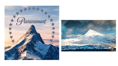
The original logo of 1914 had 24 stars – it was the number of actors and actresses who signed contracts with the studio at the time. But the modern logo depicts only 22 stars. Why? The number is still a mystery.
Warner Bros.

It might seem too simple: the logo is composed of a shield with the initials of the company’s founders – the Warner brothers. The trick is this is not their real last name.
Parents of the future founders of the studio emigrated to America from the Russian Empire (from the territory of present-day Poland) and had the last name Vonskolaser. The names Harry, Albert, Sam and Jack also sounded differently: Hirsch, Aaron, Shmul and Yitzhak.
Walt Disney
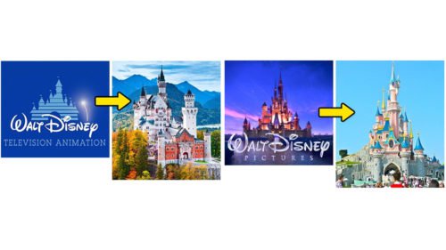
A fairy-tale castle has always been on the logo of the world’s most famous animation studio. Initially, it was German Neuschwanstein which served as a prototype. But in 2006, it was replaced by Cinderella’s Castle from Disneyland in Paris.
Pixar
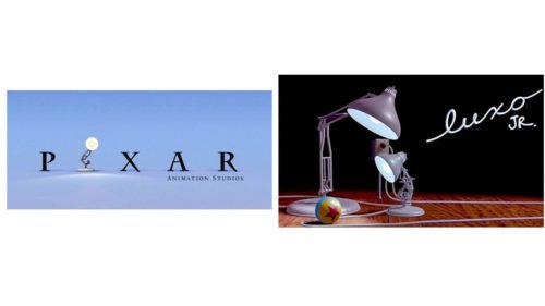
The Pixar logo appeared due to the studio’s successful premiere. The audience liked the small lamp Luxo from 1986 short film of the same name so much, that it was decided to put it on the logo instead of the letter “I”.
Castle Rock Entertainment
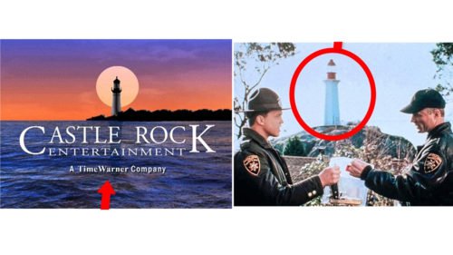
Today, this studio already belongs to Warner Bros. Yet, back in 1980s, Castle Rock Entertainment started its business with the adaptation of Stephen King’s novels.
The company was named after the fictional town of Castle Rock, in which the events of various films often took place. The screenshot from the movie “Needful Things” shows the lighthouse depicted on the logo.
Lionsgate
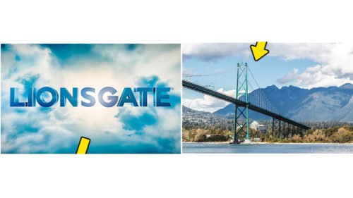
If you start with the name of the studio, then you can expect to see a lion and a gate on its logo. But it’s an interesting fact: neither of these has a direct relation to this company. In fact, Lions Gate is a bridge in Vancouver – it is where the founder of the studio, director Robert Altman, was born.
Scott Free
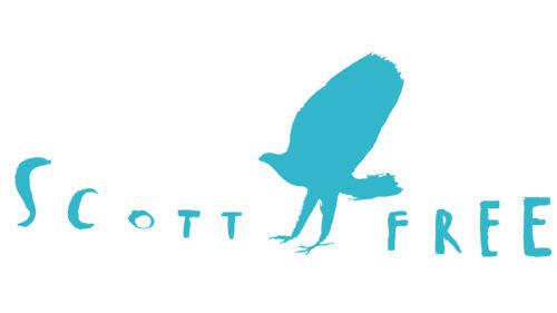
As you know, the producer Ridley Scott owns a film studio. Its intro is a cartoon clip in which a person turns into a bird, as if gaining freedom. The execution is interesting: the artist draws each movement separately, and then makes separate photos. The author of this masterpiece is Italian illustrator named Gianluigi Toccafondo.


