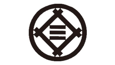
The company’s first logo, which was adopted in 1893, reflected its connection to Mitsui Bank. Ten years later, as the company was renamed from Tanaka Seizo-sho to Shibaura Seisaku-sho, it introduced another emblem featuring the character for “Shiba”.
Meaning and history
The history of Toshiba dates back to the end of the 19th century when the colony was established under the name Shibaura Seisaku-sho, and since that time it changed its name two more times before stopping in Toshiba in 1950. As for the visual identity, for the first fifty years of the company’s existence, it was redesigned six times and always featured interesting abstract badges with geometric drawings or stylized hieroglyphs on them, and only in the 1960s, the brand started using a simple wordmark as the primary version of the logo.
1893 — 1904
The original logo was designed for Shibaura Seisaku-sho in 1983 and boasted a circular badge with a rhombus in it. Inside the rhombus, there were three parallel horizontal lines. The emblem was executed in black and placed on a white background with the lines of the circle and the rhombus featuring the same thickness.
1904 — 1919
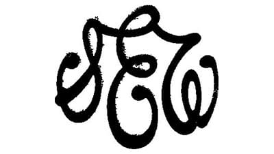
The stylized geometric logo was replaced by an elegant cursive monogram in 1904. Three curved smooth letters were written in black and connected with their elongated lines, emboldened in their ends.
1919 — 1925
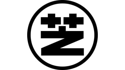
The redesign of 1919 brought back the circular badge, but changed the inner part of it, placing the “Z” line symbol on its bottom part and two solid crosses above it. The image looked strong and confident, evoking a sense of expertise and authority.
1925 — 1939
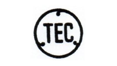
The Tokyo Denki or Tokyo Electronic Company was established in 1925, with its emblem introduced in the same year. The badge also featured a black circular frame but the abstract symbols were replaced by the “TEC” inscription executed in a bold rounded sans-serif typeface. Three rounded short lines were coming out of the circular frame to the center of the emblem.
1939 — 1943
In 1939 Shibaura merged with TEC, forming Tokyo Shibaura Denki, and the new emblem was created, basing on the emblem of both brands. The logo for the new company was composed of two monochrome circles, which were slightly overlapping. The left circle had a “Z” with two crosses inside, and the right one — a vertically oriented inscription in Japanese.
1943 — 1946
The new logo was designed in 1943, and it was a very minimalist and sharp emblem, composed of a shut Ikra image, enclosed into a circular frame. Though the badge stayed with the brand for only three years, it was one of the most modern and stylish badges in its history.
1946 — 1950
In 1946 the logo of the company was changed again and now it featured just one circle, which was placed on the right of the previous emblem, the vertically placed Japanese inscription in a rounded frame with three rounded curves coming out of the frame to the center.
1950 — 1984
The name of the company was changed to Toshiba in 1950, and the new insignia was introduced. It was a cursive smooth lettering in black with the horizontal bar of the letter “T” elongated and arched, covering the other letters as an umbrella. It was an elegant and sleek logotype, which was used by the company for almost three decades.
1969 — 1984
In 1969 another version of the Toshiba logotype was created. Written in all capitals of a square sans-serif typeface with clean strict shapes and lines. The typeface of the new logo is Microgramma Bold, modern font with a strong and confident sharp yet. This version of the emblem was available in a monochrome color palette and still can be seen on some of the brand’s products.
1984 — Today
The redesign of 1984 brought a new bright image to the Toshiba visual identity, coloring its logotype in red and changing its typeface to a more narrow and solid sans-serif, Eurostile Bold.
Font
The original Toshiba wordmark sported a beautiful italic script, yet later the company switched to a simpler, easy-to-read design.
Color
Since 2002, the main color of the Toshiba logo has been red. Below the red wordmark, the “Leading Innovation” tagline is given in black.
Script symbol
One of the most known old Toshiba symbols is a black script logo. Here, the name of the company is given in a cursive font resembling handwriting. The most recognizable of all the letters is the initial “T.” Its upper bar, which is actually more of a curve here, stretches to the right and covers half of the word.


