

![]() NatWest Logo PNG
NatWest Logo PNG
The logotype of one of the largest banks in the UK, NatWest, has gone through a series of updates, yet has been rather consistent in its core.
Meaning and history
![]()
The Natwest bank was established in 1968 under the name National Westminster Bank through the merger of three financial institutions. And the Trinity has become the main theme of the new bank’s emblem. The graphical part of the Natwest visual identity was created in 1968 and hasn’t been changed since then, which says a lot about the bank’s values and character.
What is NatWest?
NatWest is the name of a British bank, which was established in the end of the 1960s, and by today has heron into one of the largest commercial and retail financial institution in its country. The name of one of the Big Four Banking companies is a derivative of the National Westminster Bank.
1968 – 1993
![]()
The logo, introduced in 1968 was composed of a geometric emblem and a wordmark, set on its right in three levels, in monochrome. The emblem is a flat image of three cubes, connected and forming a triangle. When drawn in 2D, the cubes’ sides look line straight and solid arrowheads, pointing in three different directions and separated by white thick lines.
As for the wordmark, it was written in a title case of a traditional sans-serif typeface, with clean bold lines. In the 1990s the lettering was shortened to NatWest and got placed under the emblem.
1993 – 2003
![]()
The redesign of 2003 has simplified and strengthened the NatWest badge, bt shortening the name of the company and placing it under the geometrical emblem, which in its turn got enlarged. Both the color palette and the typeface of the lettering remained the same, but the new disposition and larger sizes of the elements added stability and power to the badge, creating a perfect look for the reputable Bank.
2003 – 2014
![]()
The redesign of 2003 brought a new color palette to the Natwest logo. The white wordmark was placed on the right from the red emblem inside a purple horizontally stretched rectangle. The emblem was slightly smaller, while the inscription featured solid large letters in a thin sans-serif typeface.
2014 – 2016
![]()
The colors were switched again in 2014. The purple went to the lettering, while the emblem remained red, and the background became white. Both the inscription and the emblem were enlarged and started looking progressive and modern. The lines of the wordmark were thickened and became solid and strong.
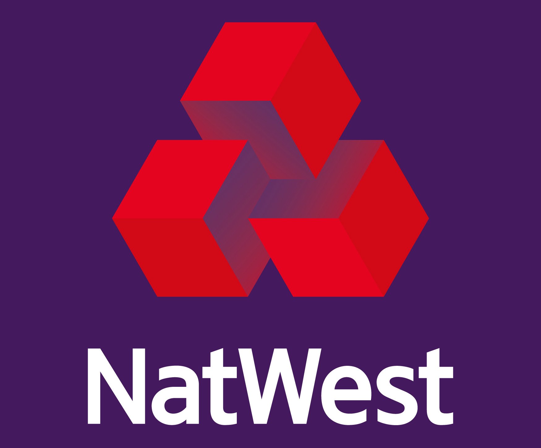
2016 – Today
![]()
The wordmark was moved under the emblem in 2016. The typeface and color palette remained untouched, while the contours of the symbol have been refined. Today there are two versions of the logo — with a three-dimensional emblem, and with a flat one. The cubes in the first emblem became gradient and got their edges from white to red, while the 2D image kept three solid arrowheads and added red contouring to the white parts.
Evolution of the symbol
In the 1990s, the word “NatWest” was added to the symbol. The 2003 design is the first one to use the color palette including red, purple, and pink. In 2014, the emblem became a single color, while the lettering grew a bit bolder.
Current emblem
In 2016, the new version was introduced, in which the arrows turned into 3D cubes. The wordmark was placed below the emblem. To create the illusion of three dimensions, two more shades of red were added. While arrows add dynamism, cubes imply solidity.
Interestingly enough, the current cubes were actually inspired by one of the earliest designs created in 1968 and buried deep in the archives. The emblem was updated by the London office of Futurebrand.
Font
![]()
The typeface used on the wordmark is very close (although not exactly similar) to the Interstate Regular font developed by Tobias Frere-Jones and published by Font Bureau. In addition to it, the bank often used a custom typeface called RN House Sans in its advertisements.
Color
![]()
The current Natwest logo combines purple with pink and two shades of red against the white background.


