LG is based in South Korea, but its products are sold in more than 75 countries all around the world. The product range includes white goods, electronics, and chemicals, to name just a few.
Meaning and history
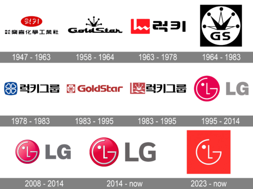
LG is the company, which was born as a result of a merger of two Korean brands, Lucky and GoldStar, so the beginning of its visual identity history can be dated by 1947, a year when the Lucky company was established.
1947 – 1963
The logo, used by the brand from the end of the 1940s, featured a horizontally-oriented oval emblem, placed above the bold black lettering in Korean. The emblem was set in solid red, with the shortened name of the brand in thin white lines. This badge stayed with the company for longer than a decade.
1958 – 1964

The GoldStar brand was launched at the end of the 1950s and had its first logo composed of a very elegant cursive wordmark and a geometric crow-shape emblem above it. Both elements were executed in a monochrome color palette and the thin straight lines of the graphical part brilliantly balanced the smooth thick letters.
1963 – 1978

The original logo of Lucky was composed of a red and white emblem and a black inscription in Korean on its right. The emblem featured a solid red square with a stylized white letter “L” on it. The horizontal bar of the “L” was drawn in a zig-zag line. As for the logotype, it was executed in bold lines with smooth angles and straight edges.
1964 – 1983

In 1964 a completely different concept of the logo was introduced. Now it was a black-and-white emblem, with the white roundel inscribed into a solid black square. In the roundel there was a stylized depiction of a crown, with five peaks and enlarged black dots on their ends. The image was accompanied by the bold geometric “GS” abbreviation, placed at the bottom of the badge.
1978 – 1983

The redesign of 1978 created a different image for the South Korean brand. The new badge boasted a blue and white emblem, with a depiction of a stylized clover, placed on the left from the bold black name of the company, written in Korean. This logo stayed with the brand for just five years.
1983 – 1995
In 1980 the GoldStar logo was redesigned and changed its color palette to dark red and white. The emblem remained untouched but now it was placed on a white circle and enclosed in a solid red square. Two capital letters “GS” in the same shade of red were placed under the grown. The wordmark was also redrawn and now was executed in a modern sans-serif typeface with bold soft lines.
1983 – 1995

Two companies and their logos merged in one in 1983. The logo for Lucky-GoldStar was composed of a square red emblem with the Lucky “L” on it and a white GoldStar crown placed above the zig-zag bar. The logotype was written in Korean and featured black color and straight sleek lines. The company kept its name and emblem until 1995.
1995 – 2014
The name “Lucky-GoldStar” was shortened to LG in 1995, and this is when the new era for the company began. The new logo featured a circular red emblem and a light-gray wordmark on its left. The lettering was executed in a bold Helvetica font and looked simple and modest near the bright and creative image. The red (closer to fuchsia) circle had three white symbols on it — the “G” drawn around the inner perimeter, “L” placed in the center, and a solid white dot, located on the left from “L”. The composition of symbols created a stylized face image. This badge has become iconic and stays with the company for many years by now.
2008 – 2014
The logo was slightly refined in 2008, by making the emblem three-dimensional and elevating the color of the lettering to a darker shade of gray. The face-circle gained some gradient shades and a glossy surface, which made it look sleek and fancy. The white of the symbols turned into silver and softened a contrast between the logotype and the emblem.
2014 – Today
The redesign of 2014 brought back the flat execution of the emblem, switching its fuchsia red color to burgundy, which added more elegance and chic to the LG visual identity. As for the lettering, it changed its typeface to a more modern one, though kept dark gray as the main color.
2023 – now
In 2023 the LG logo was redesigned again, keeping the iconic emblem, but changing the color palette and simplifying the composition. The new logo features a solid square in bright scarlet red, with thin white lines, making up the recognizable face, formed by the letters “L” and “G”, and a solid white dot. The new logo is completely flat, with clean solid shades and shapes.
Symbol
The center of the logo is a circle, inside of which stylized letters “L” and “G” are placed. There’s a round dot inside the circle. The overall effect is that of a smiling human face looking at you. Next to the circle, there is the name of the company in a simple, minimalistic type.
3D emblem
There are two versions of the LG emblem. Being almost identical in shape, they differ in the way the colors are distributed. According to the company, the introduction of the 3D symbol was supposed to strengthen the visual impact of the emblem and to help convey the LG’s core values.
Font and Color
The type used in the original LG logo came from the Helvetica family of fonts, it was the Helvetica Black type. In 2015 the company’s wordmark was given a facelift, which was most obvious in the shape of the “G” letter. Also, both the characters grew larger in comparison with the red circle next to them. The letters became slimmer and more readable.
There are three elements in the LG logo color scheme. The brightest color is the dark shade of red that the company refers to as “the unique LG Red color”. Designers from the Korean corporation explain that it is the main color of the emblem and it is supposed to convey the idea of friendliness. In addition to this, it serves the purpose of emphasizing the company’s commitment to deliver the best.
Inside the red circle, there is a stylized name of the company given in white. There’s also the LG Grey color used for the characters next to the emblem. It is a rather dark shade of grey, very similar to the color of wet pavement. The hue used in the newer version is a bit lighter than the one used in the previous logo.


