The full name of Kodak is Eastman Kodak Company. The US company specializing in imaging products used to be the photography monopolist in the previous century.
Meaning and history
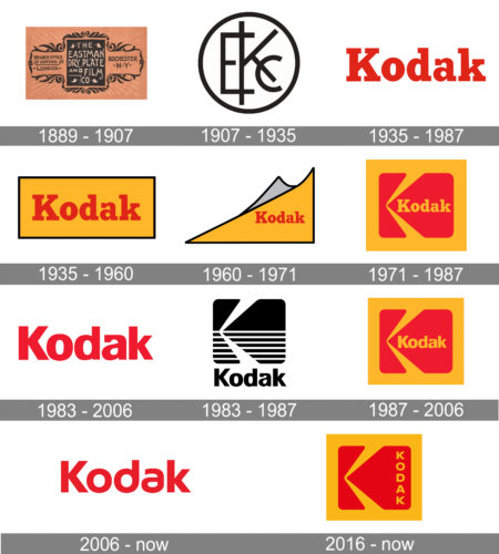
It’s amazing how some companies manage to find their unique style and design at the very beginning of their paths. Kodak is one of the brands which stuck to one of its original logo versions and keep elevating and modernizing from redesign to redesign. Though the company was established under the name The Eastman Dry Plate Company, its iconic red and yellow logo was introduced in 1935 after the rebranding to Kodak.
1889 – 1907
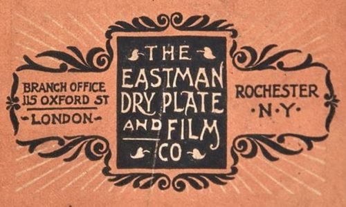
The initial logo was created for The Eastman Dry Plate Company in 1889 and featured a chic art-design styled badge with an ornate black framing of a peach-shade background and a bold black square with white lettering, set in the middle. The additional emblem featured a light beige rhombus with the stylized black “K” on it.
1907 – 1935
The company was renamed Eastman Kodak Company in 1907 and the logo was changed in the same year. The new badge featured a strict sans-serif monogram, where all three letters were executed in straight lines with geometric cuts. The black monogram was enclosed in a black circular frame, which softened the edges of the symbols and made the image complete.
1935 – 1987
The new logo featured a bright red color, which later became the key color of the brand. The designers used a bold font with slab serifs. The color and font choices made the company appear strong and determined. The company found that perfect brand image and continued to perfect it over the years.
1935 – 1960
The name Kodak became official in 1935, followed by the visual identity redesign. The new emblem stayed with the brand for many years and became a basis for the current badge the whole world knows. The Kodak emblem from the 1940s was composed of a horizontally oriented yellow rectangle in a thin black frame with a bold red logotype in a title case set in the center. The inscription was executed in a bold and elegant typeface with smooth lines and massive square serifs.
1960 – 1971
The main shape of the logo was switched from rectangle to triangle in 1969, with an addition of a small gray element, added to the top part of the badge. The top-curl logo was complemented by a bold red let the ring placed on a yellow background and executed in the same style as on the previous logo version.
1971 – 1987
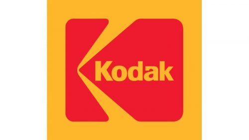
In 1971 the predecessor of the current Kodak logo was created. The new emblem featured a solid yellow square with an enlarged red “K” stylized as a camera placed in profile and a yellow “Kodak” inscription on its right part.
1983 – 2006
In 1983 the company goes minimalist and makes the simple red wordmark its official logo. Executed in a strong and neat sans-serif typeface, the logotype had its letter A” modernized, which made the whole nameplate unique and recognizable. L red remained the main color of the brand’s palette, though yellow was replaced by white, which also created a rear contrast with the inscription.
1983 – 1987
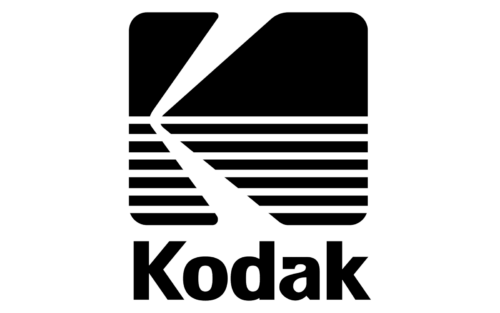
This logo is very different from what the company had earlier and even after. It was mainly due to a black and white color that replaced the red and orange colors. The shape of the emblem reminded of a logo created in 1971. It was a square shape that had two rays coming in, creating the letter “K”. The bottom half of the square had a striped pattern, which added dynamics and interest to the logo. The brand name was printed underneath this square emblem in black. They used the same bold, sans-serif font as in the alternate version introduced the same year.
1987 – 2006
In 1987 the brand comes back to the logo version from 1971 but changes the typeface of the yellow lettering to the new one, introduced in 1987. These two logos were being used by Kodak for almost twenty years.
2006 – Today
The minimalist Ted logotype was redrawn in 2006, switching the typeface to a smoother and a more progressive one. Now only two “K”s had their vertical bars straight and angular, all other letters featured rounded and smooth bottom parts. The new typeface was created by the Identity Design agency.
2016 – Today
In 2016 the brand starts using its “camera” logo again, by changes the style and the location of the wordmark. Now the yellow lettering is placed vertically along the right part of the red image. It is written in all capitals of a simple yet confident sans-serif typeface and looks professional and serious.
Font
The current version of the Kodak logo features an attractive bold type. The design of the “K” character was taken from the iconic 1971 insignia created by Peter Oestrich.
Color
In 1935 the red-and-yellow color combination appeared in the Kodak emblem for the first time. The red-and-black alternative adopted in 2006 survived not more than a decade, and eventually the company decided to return to its iconic palette.


