One of the world’s best-known MMORPGs, Wizard101 was published by KingsIsle Entertainment.
Meaning and history
The game was released in 2008 in three languages: English, Spanish, and French.
2008 – now
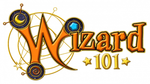
The Wizard101 logo is heavily inspired by all things magical. In the rather complex emblem, you can see various details alluding to the world, where nothing is impossible.
The logo is dominated by the large letter “W,” which looks pretty unusual, with its sharp elements and creative turns. What’s even more important, two of the top ends of the letter hold stylized depictions of the moon and a star, while the lower-left end holds a swirl pictogram. These elements allude to astrology and alchemy, which are often associated with magic.
The complex gold net in the background also contributes to this effect. The number “101” is gold either (the most “alchemic” color) and has stars on both sides. Apart from their “astrological” link, the stars are also often depicted as part of the sorcery process (in books or cartoons, for instance), so this symbol is pretty natural here.
The rest of the wordmark is rather creative as well, but it doesn’t bring about any new symbolic allusions.
The logo can be used against a white background or, alternatively, placed over the background of the night sky, where it looks especially enchanting and where the moon and the star pictograms appear even more natural.
Font
The glyphs were drawn specifically for the Wizard101 logo as none of the existing types could provide all the things this theme could require. This is one of the rare cases when the serifs are totally appropriate as they remind us of the times, when the majority of people believed in magic to such an extent that they considered it normal to burn “witches.”
Colors
One of the main colors here is gold, the color of the precious metal, which inspired alchemists centuries ago. The orange of the wordmark echoes the gold but also introduces a unique touch. When these colors are seen against the dark blue and black of the title screen, they do create a thrilling effect.


