

![]() Walgreens Logo PNG
Walgreens Logo PNG
Started as a tiny corner drugstore, Walgreens has grown into the second-largest pharmacy store chain in the United States.
Meaning and history
![]()
Walgreens is the second-largest pharmacy chain to be established in the U.S. market. Already in 2010, the company managed more than 7.5 thousand pharmacies located in all U.S. states, and today its number exceeds 9 thousand.
The main activity of the company is the production and sale of medicines and medical products. In addition, in the U.S. market operate specialized Walgreen’s stores, the range of which is represented by general consumer products, personal care products, vitamins, and vision correction products.
What is Walgreens?
Walgreens is the name of the second-largest chain of pharmacies in the United States; which was established in 1901, and by today has more than nine thousand locations across the country, with expansion plans to European countries.
1921 – 1929
![]()
Originally, the Walgreen wordmark was made of black, artistic serif letters with a lot of disproportioned, soft forms. Beneath the writing ‘Walgreen Co’ made from these letters in uppercase, there was also a white illustrative ribbon which said ‘drugs with a reputation’ in a more usual font.
1924 – 1925, 1928
![]()
That was the secondary version of the previous logo, and it was mostly the same. The ends of the ribbon were a bit longer, and the lower text had a different style, but that’s it.
1929 – 1931
![]()
In 1929, they replaced the old font with a new cursive one. The upper text looked hand-written, and they used lower- and uppercase letters there, all colored black. The lower text used a bolder typeface than before, as well as only capital letters. The ribbon also was flattened.
1931 – 1932
![]()
This iteration used the wordmark ‘Walgreen’s’ based on the style used in the previous logo, but with some changes and with the additional possessive ending.
1931
![]()
That’s another version of the previous design with some minor font changes.
1932
![]()
This is the third version of the main emblem with the paler gray coloring.
1933 – 1938
![]()
The 1933 wordmark uses the same look as the previous main iteration (1931-1932), but without the possession ending (just ‘Walgreen’). The coloring this time is blood-red with black outlining. There is also additional text in the bottom that says ‘drug store’ in a simpler typeface, while a grey cup with a snake coiled around it (the symbol of medicine) stands behind the wordmark.
1938 – 1948
![]()
This version uses a similar inscription to the one used prior, although with a lowered ‘W’ and a shorter tail on ‘g’. They also returned to black coloring and got rid of all the other elements.
1946
![]()
In 1946, Walgreen made a special emblem for the Christmas season. It depicted their usual wordmark (written as ‘Walgreen’s’), followed by a smaller, more usual writing saying ‘your Christmas gift shops’ below. Both text parts were in white and were located on the right side of a black rectangle. Its left side was occupied by Christmas bells.
1948 – 1960
![]()
The wordmark used in this next emblem has been updated to a cursive style, but the letters were also tilted to the right. Moreover, there is the inscription saying ‘drug stores’ in capital sans-serif letters right below the main writing.
1948 – 1955
![]()
This secondary logo uses the same main wordmark, but with an additional possessive ending (‘Walgreen’s’) and without the ‘drug stores’.
1955 – 1960
![]()
In 1955 they changed that version by making it paler and also getting rid of the apostrophe (but not the letter ‘s’).
1960 – 1981
![]()
Strangely, the second version of the secondary logo was made the next main emblem, but with a darker appearance.
1981 – 1991
![]()
The 1981 Walgreens logo update brought about a new element – a depiction of a family.
1990 – 1992
![]()
They simply took the old 1960 logo and added the usual ‘drug stores’ description below.
1992 – 2005
![]()
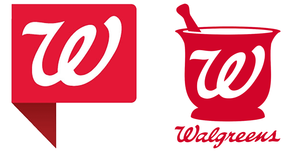
In 1992 the company introduced a more prominent logo, with red wordmark and a depiction of a mortar and pestle. In 1983 the mortar went red and was placed above the emblem.
The company states that the preferred version of their logo is the brandmark paired with the tagline, which should be placed below. However, in some circumstances the brandmark may be used by itself or the position of the tagline may be changed.
One more interesting version is the Walgreens icon. It is officially nicknamed “Corner W icon” and is used in the situations where a smaller visual element would be more advantageous. It can be used either by itself or together with a headline. The icon exists in two color schemes: white and red or white, red, and blue. Also, it may appear in a color-gradient version.
2005 – 2020
![]()
The Walgreens logo has preserved the cursive script, while the mortar had disappeared. The letters have been streamlined and broadened.
If you have ever seen the logo that Rochester-based Wegmans began using back in 2008, you could have noticed the similarity to the Walgreens’ “Flying W”. That was the reason that made Walgreens sue Wegmans in 2010. However, Wegmans stated they actually used one of their old logos that was created much earlier than the Wegmans’, in the 1930s.

2020 – Today
![]()
They continued to use their long-time wordmark, but with a slightly paler shade of red this time.
Font
![]()
The Wegmans logo features a beautiful script. Due to it, the wordmark looks as it has been handwritten.
Color
![]()
The primary colors are red and white (for the background). For the tagline, black, green, and blue are used.


