Virgin Atlantic is a British airline with its head office in Crawley, England. The history of the company started in 1984.
Meaning and history
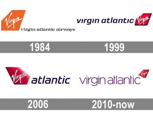
The visual identity of Virgin Atlantic has always been very consistent. Its badge, composed of a right emblem and a logotype, only had a major change of its color palette once, in 1999, and all the following versions were just slight modifications, not more.
1984 – 1999
The original logo for Virgin Atlantic’s was designed in 1984 and featured an orange geometric emblem with white lettering on it and a lowercase serif inscription placed on the right from it. The contours of the emblem repeated the shape of the airfoil. The iconic “Virgin” logotype in a corporate handwritten typeface was placed diagonally on the airfoil and looked bold and friendly.
1999 – 2006
In 1999 the renewed logo was introduced by the company. Now the emblem was colored red and had a bold black outline, as well as a new location — it was moved to the right from the logotype. As for the wordmark, it was shortened to “Virgin Atlantic’s”, with the “Airways” part removed, and written in a modern italicized sans-serif typeface, using a new purple color. The font added some strength and style to the image, and the new color palette brilliantly reflected the progressive and energetic chorister of the company.
2006 – 2010
The redesign of 2006 made the emblem look three-dimensional by adding some gradient shades to its red background and removing the black outline. The contours of the labor gun” logotype were cleaned and strengthened and now it looked stricter and more professional. As for the other wordmark, a purple one, it was shortened again and now featured only “Atlantic”, as the airfoil was moved to the left part of the logo again, and “Virgin” on the emblem replaced “Virgin” in the nameplate.
2010 – Today
In 2010 the Virgin Atlantic logo was refined again. The airfoil emblem was made smaller and gained its bottom line slightly softened and curved. It was now placed on the top right corner of the insignia, making the logotype a center of the composition. The inscription in the lowercase is again composed of two parts “Virgin Atlantic” and features the same purple color but in its lighter shade.
Font and color
The lowercase inscription on the Virgin Atlantic logo is executed in a very delicate and neat lightweight sans-serif typeface, which looks elegant and airy, though its full rounded shapes add a modern feeling and style to the overall image. The typeface of the emblem looks close to such fonts as Korto Light and Latinka Extra Light.
The purple, red, and white color palette of the Virgin Atlantic visual identity is a representation of power and loyalty of the air carrier and its creativity in terms of comfort and design. The bright colors use their intense and calm shades, which add a sense of luxury and quality to the logo.


