Vakifbank is the name of the Turkish financial company, which was established in 1954 and today is considered to be one of the largest banks in Turkey with almost one thousand offices, where the employees of the bank provide their customers with financial, corporate, mortgage, and credit services.
Meaning and history
VakifBank is a reputable company with a long and intense history. Throughout the years, the bank has grown into one of the leaders in its region and gained millions of clients. In terms of visual identity, the bank was pretty constant and has undergone only one major redesign, which happened in 2008. And, frankly speaking, not much has changed with this redesign.
What is Vakifbank?
Vakifbank is the name of one of the top 3 banks in Turkey, which was established in the middle of the 20th century. Today the bank operates not only in Turkey but also has its offices in different countries, including the USA.
1954 – 2008
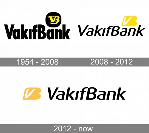
The initial Vakifbank logo was executed in a black and yellow color palette with a plain white background. The bold and slightly narrowed sans-serif lettering was set in the title case, with “V” and “B” in the uppercase. The two parts of the nameplate were set with no additional space between each other. The bright and heavy emblem was placed above the right part of the inscription. It was a solid black circle with a stylized yellow “VB” monogram in thick wide lines on it.
2008 – 2012
The Vakifbank logo was first redesigned in 2008, keeping the original idea and color palette, but adding progressiveness and style to both parts of the logo. The inscription was now set in a slightly italicized full-sized sans-serif typeface with smooth and slightly elongated lines of some letters. The black wordmark is complemented by a bright eye-catching emblem, which is formed by the stylized massive yellow letter “B” and a thin white “V” placed over its left part.
2012 – Today

In 2012, they moved the yellow emblem to the wordmark’s immediate left, while also making it visibly paler.


