 University of Michigan Logo PNG
When renovating its logo, the University of Michigan wanted it to be classic yet simple, so that it would communicate tradition and authority without any design fads. And its signature mark is exactly like that.
Meaning and history
The UM, as the university is usually referred to, has been functioning since 1817. Founded in Detroit, twenty years later it moved to Ann Arbor.
Since its establishment the University of Michigan has had several identity marks. The first one was the official seal. It has undergone a number of changes and now it is a two-color emblem of a round shape featuring some traditional heraldic elements. It includes:
- a shield with a book and the Lamp of Knowledge on it;
- the rising sun in the background;
- the motto “Artes, Scientia, Veritas” (“Arts, Knowledge, Truth”) on the banner underneath the shield;
- the year of the foundation “1817”;
- the name if the institution around the border in a serif font.
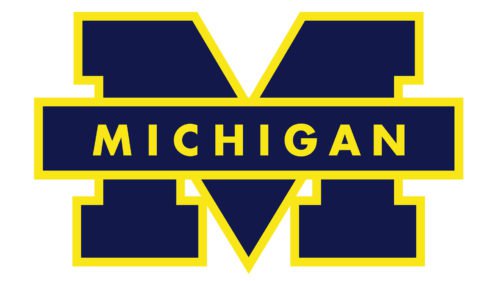
As the University of Michigan logo the seal was supplanted by the block “M” symbol in the 1960s. The University keeps it for some official purposes.
What is the University of Michigan?
The University of Michigan is the name of an American educational institution, which was established in 1817 as the Catholepistemiad, or the University of Michigania. One of the oldest public research universities in the United States, today UMich had almost 50 thousand students and more than 6 thousand academic staff.
1817 – 2012
2012 – Today
The Block “M” Symbol
The block “M” which stood for “Michigan” made its appearance in the late 1800s. At first it was used to represent the University’s football team. In 1907 during a football match thousands of students raised blue and yellow flags so as to form the block letter “M”. Since then it has become an icon emblazoned practically on everything. The symbol remains unchanged, apart from slight modifications.
Now the block “M” stands for the entire University being its official logo.
Font
The Victors font used for the logo is the University’s own design. They chose the serif typeface to empathize the longevity of the institution. Despite the fact that the typographical trend has gone out of date the emblem looks modern. The letterform ensures strong recognition.
Colors
The official colors are Michigan or Azure Blue (HEX 00274c) and Maize or the yellow of ripe corn (HEX ffcb05).


