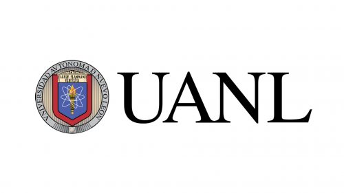
UANL is an abbreviation, standing for one of the largest public universities of Mexico, Universidad Autónoma de Nuevo León, which was founded at the beginning of the 1930s, and named after its location, Nuevo León, a Mexican state, situated on the North of the country.
Meaning and history
Universidad Autónoma de Nuevo León is a university, where traditions mean a lot. The classic approach to education, eternal values, and willingness to open the world of new knowledge to the students — this is what UANL is about. Of course, like every educational institution; the number one target of UANL is giving opportunities and helping young people to develop their skills and progress.
What is UANL?
UANL, or Universidad Autónoma de Nuevo León, is a Mexican public university, which was established in 1933. Today this is the third-largest educational institution in its country and has one of the most complete and diverse educational programs. UANL is the oldest university in Northeastern Mexico.
19?? – Today
In terms of visual identity, the University is also pretty traditional, and still uses the badge, designed in its early years. The badge features a combination of a graphical emblem and light uppercase lettering, which is placed on the right from the emblem. Although, the colorful UANL medallion can often be seen on its own too.
The UANL emblem is a circular medallion with a gradient background in golden-beige, a pretty thick silver framing, and a traditional blue shield in a bold red outline, set in the center of the composition. The upper part of the shield features a light gold shade, and the main, blue part of it contains an image of a torch, surrounded by thin white orbits, which makes it look like an atom.
As for the lettering, one of them is written around the silver frame of the medallion and is executed in a classic serif typeface, with all capitals in black. The second wordmark is placed on the right from the emblem and set in two levels, with the enlarged “UANL” abbreviation, underlined by a medium-thickness gray line and a full inscription in the smaller size of the letters. Both parts are executed in one typeface and one light shade of gray.
Overall the UANL logo looks very traditional and calm, evoking a sense of professionalism and value of roots and history. The blue, gold and red color palette of the badge is also something timeless and classic, reflecting such qualities as reliability, confidence, and glory.
Font and color
The bold and elegant UANL abbreviation from the official logo of the university is set in a traditional serif typeface with sharp massive serifs at the ends of the letter lines. The closest fonts to the one used in the UANL badge are Dutch 801 Std Roman, Times Ten Roman, and Hebrew Vilna Std Bold.
As for the color palette of the UANL visual identity, it is based on a combination of red and blue, set on light gray, for the emblem, and solid black for the lettering. Blue is the color of quality and knowledge, while red accents the passion for learning and dedication. Black and gray details on the logo of the Mexican university stand for professionalism, confidence, and a traditional approach to education.


