

Chips are crunchy treats that are loved by both children and adults. They are thin, fried slices with the addition of spices and flavors. The most popular today are potato and tortilla chips because potatoes are the main product for creating these delicacies. Today, there are both classic potato and various other versions of chips.
The history of this snack goes back to the 19th century, when at one resort in America they came up with the idea of treating guests to thinly sliced potato slices, deep-fried. All vacationers liked this product so much that later they began to prepare it in almost all restaurants.
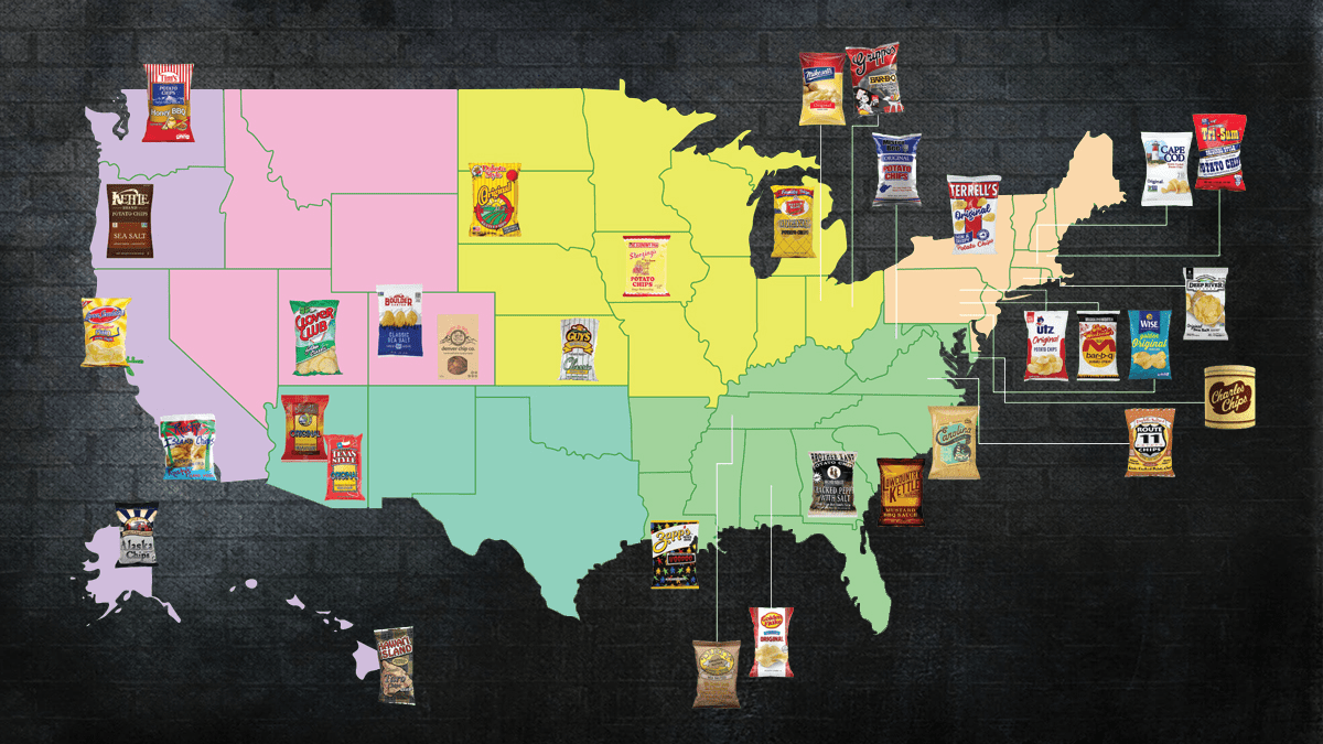
Today, we will review chips manufacturers in the United States. You will see that some states have brands that have over 100-year history, while others have companies that are just starting their path. You will also learn about their logo, so you can recognize a chip brand when you come across it.
Golden Flake
![]()
For a century, the snacks sold under the Golden Flake brand were produced in Alabama. The brand was founded in 1923 in the basement of a grocery store in north Birmingham. Bryant’s show helped make Golden Flake a cult brand in Alabama. It even had a flavor, Golden Flake’s Sweet Heat Barbecue, tailored to local tastes. The Golden Flake factory in Birmingham also became a popular tour destination. Unfortunately, the original manufacturing factory ceased to exist in 2023.
Golden Flake potato chips, tortilla chips, corn chips, and other snacks are represented by a golden and red logo. The red color of the inscription is supported by a red border around the curvy base. The emblem is designed to catch the attention and reflect the energy and joyfulness that tasty snacks bring.
Alaska Chip Company
![]()
As can be guessed from the name, Alaska Chip Company stole the heart of Alaska. Their original flavor is known as Alaska Chips. Other favorite tastes include Jalapeno Volcano Chips that keep one warm on cold Alaskan days and Chilkoot Chips. Its exceptional potato chips capture the essence of Alaska’s flavor and are just as adventurous and fun as its inhabitants. Owner, Ralph Carney, attributes the chips’ rich flavor to the hearty Alaskan potatoes that were used in their production.
A very picturesque logo with a traditional red barn and grain storage and not far away. Stunning green fields, snow-covered mountain peaks, and golden rising sun create a very relaxing atmosphere. At the same time, there is an endless horizon for exciting adventures that can be even better with a pack of crunchy and tasty Alaska Chips. A full name is added as a banner underneath and leaves no doubt about the brand’s specialty.
Poore Brothers
![]()
The activities of Poore Brothers include the production, processing, and distribution of chips, snacks, and other food items since 1986. Poore Brothers Jay Poore, who along with his brother, Don, founded the company, wanted their potato chips to be kettle-cooked because it gives them more potato flavor and crunch. It produces intriguing and original kettle-style potato chip tastes. Sweet Maui Onion, Three Cheese Jalapeno, and Bacon and Jack Cheese flavors are favorites among Arizona locals and visitors.
A cactus image at the forefront as well as the Green Mountains range in Southern Arizona have always been part of the Poore Brothers’ identity. The name is printed in white lettering on a red banner, which makes the logo eye-catching. The cactus is also a prominent character and a perfect South Western stereotype that tells about the roots of the company. The overall image looks powerful, fun, and playful at the same time.
Boulder Canyon
![]()
The Boulder Canyon brand was founded in 1994 by brothers John and Mark Maggio and offers mouthwatering chips. Its kettle-cooked potato chips are the fastest-growing brand in the country in the natural food category. They are manufactured at the same facility in Arizona as the Poore Brothers chips. The brand is promoted as a healthy snack option. It uses olive oil and avocado oil as well as other organic ingredients.
The logo of the company presents the great outdoors where Boulder Canyon chips and other snacks are enjoyed. It depicts a mountain range as well as the establishment date above the name. The latter is printed in a bold font with barely noticeable rounded serifs. The red color palette of the logo creates an image of a leader in the market as well as the energy-filled times.
Frito-Lay
![]()
The primary products of Frito-Lay’s manufacturing plant in Casa Grande, Arizona are tortilla, corn, and potato chips. Every day, it processes roughly 500 thousand potatoes to make potato chips. Operating mostly on recycled water and renewable energy, the plant is considered very eco-friendly. As a major player in the snack market, Frito-Lay developed many recognizable snacks as well as creative new flavors. From Classic Lay’s to mouthwatering Frito-Lay’s Kettle Cooked Mesquite BBQ, there is something for everyone.
The company created a vibrant and energetic logo for its Lay’s brand. A bright red ribbon wraps around a golden sphere that instantly brings images of crunchy and flavorful potato chips. The brand name is printed in contrasting white right on the ribbon. It underwent some changes throughout the years, but the idea was kept the same.
California Chips
![]()
There’s no denying that California has a thriving snack culture, and chips are no different. As far as the locals are concerned, California Chips is the only company in California that makes potato chips. It is a subsidiary of Zapp’s Potato Chips. California Chips is proud to use locally sourced ingredients. Through exciting partnerships with regional chefs, California Chips has expanded its chip assortment to include creative and distinctive tastes. Its meticulous attention to detail delivers perfectly spiced-up, crispy chips that entice consumers to come for more.
A sunny and happy scene represents the California Chips. It has a blue sky, sun up high, seagulls, and a palm tree painted in an oval shape. A light beige frame matches the beige color of the banner running across with the name. The overall image is a perfect reflection of the happy and exciting atmosphere in the state.
PopChips
![]()
Popchips is a popular American brand of corn and potato snacks that are promoted as alternatives to potato chips. It is a scrumptious variety of potato chips that are manufactured with natural ingredients. Popchips are potatoes that have been precisely cooked by using pressure and heat to pop them instead of traditional frying. This allows them to create a healthier alternative without the extra fat from frying. Just like regular chips, PopChips have various delicious flavors and satisfying crunch.
The brand decided to go for a rather simple and minimalistic logo design that is typically accompanied by colorful and dynamic packaging design. It consists of the brand name printed in all lowercase characters. The “Pop” portion is slightly enlarged and has the “O” overlap the other letters and resemble a round chip. The other half plays with negative space between the “h” and “p” to write an “i”, which adds a creative and unique touch.
Jackson’s Chips
![]()
Originally founded as Jackson’s Honest Potato Chips, Jackson’s is a leading company that makes kettle-style potato chips. It sets itself apart from its competitors by frying the potatoes in healthier oils, the coconut and avocado oils, and using only organic sweet potatoes. With roots in Colorado and an aim to fulfill a family need, Jackson’s sweet potato chips brought something exciting to the healthy food alternatives. They are available in over 10,000 locations throughout the globe.
The brand had a successful and thought-through logo design. Although it consists only of a name, it is printed on a half circle that resembles a chip, which gives it some dynamics and symbolism. Typically, the name is printed in red, which grabs attention and creates a powerful image. On the packaging, the lettering is done in white and placed on vibrant colored bases, a different one for each flavor.
Deep River
![]()
Based in Connecticut, Deep River Snacks is a family-run enterprise that was started at the beginning of the new century. Its chips and other snacks are made entirely of natural ingredients, are gluten-free, and meet kosher dietary requirements. Moreover, it is dedicated to producing a snack that is environmentally friendly and sustainable. The variety of flavors includes New York Spicy Dill Pickle, Sea Salt & Vinegar, Zesty Jalapeno, Mesquite BBQ, and others.
A bold font with slab serifs is a perfect choice for a chips company that offers bold flavor options. The name is printed on a horizontal rectangular banner in all caps with the first and last characters being slightly enlarged. The top of the logo arches to include local scenery and the company’s slogan above it. The bottom of the logo protrudes down and has “Snacks” printed in smaller font.
Herr’s
![]()
James S. Herr bought a potato chips company Herr’s in 1946. It now generates around $300 million in sales annually. Supermarkets and pizzerias in Delaware always have bags of Herr’s tasty, crispy potato chips. They are as much a staple of the local menu as crab cakes, cheesesteaks, and Capriotti’s turkey sub. In fact, Herr’s produces a million pounds of potato chips per week. Another fun fact is that Herr’s has a chipmunk mascot named Chipper.
The color palette of Herr’s logo and bold lines is what catches the attention. A red banner that is higher on one end than on the other features only the brand’s name. The latter is printed in all caps in white and has flared serifs and a thin black outline to make the inscription stand out. The simplicity of this logo makes it not only memorable but also visible on colorful packaging.
UTZ
![]()
The manufacturer of Utz Potato Chips is a local favorite. Utz chips are currently available as far north as Maine and as far south as North Carolina. They currently hold a 40% market share in Baltimore and Washington, DC. It all started with a family business in 1921 when Bill and Salie Utz began manufacturing and distributing potato chips.
Utz logo can be seen in stadiums and even movies, which strengthens an association of a little girl with blue hair with tasty chips. She is dipping her hand into a bag of chips. Her delighted and happy expression makes it very tempting to try a bag of Utz snacks oneself. The brand name is printed in all lowercase characters using a matching blue that looks perfect with bright red details.
ARA Foods
![]()
The only producer of the incredibly successful snack item in the US, this family-run business proudly refers to itself as “The Home of the Plantain Chip.” The ARA Food company has been selling cracklings, pork rinds, and sweet white and yuca potato chips since 1975. As a Miami-based company, it distributes its savory snacks across the nation under its own brand and under private label for other businesses.
The company’s logo looks grand and very impressive, mainly thanks to the golden stylized top line. It has “ARA” printed in a symmetrical manner as a continuous line. The name is underlined by a line of the same color with “Food Corp.” added right underneath in white or light gray. A rather minimalistic design gives the logo a timeless and luxurious appearance.
Brother Kane
![]()
Using potatoes from their family farm, this Atlanta-based company began selling potato chips after first specializing in peanuts. You need look no further than Brother Kane’s Home Style Jalapeno Chips if you’re searching for some potato chips to add some fiery touch to your snack. The assortment also features Baby Back Ribs, Buffalo Wing Bleu Cheese, and Sweet n’ Tangy BBQ flavors. If you want to get your hands on Brother Kane chips, you would need to look for them in vending machines or order online.
The logo of the brand creates a perfect setting for the “Straight From Our Family Farm” chips. Besides a name printed using a bold font with slab serif and placed on an arched banner, there is an illustration at the top. It features an old-fashioned barn with a grain storage building next to it. The logo is done in black and beige, which further creates an image of a brand with a long history.
Hawaii Island Gourmet
![]()
The original Atebara Chip Company was established in 1936 by Raymond Atebara in Hilo, HI. It was Hawaii’s first manufacturer of chips. They are the ones who first introduced Taro Chips, often known as Hawaiian Kalo. The company debuted new chips in 1979, with flavors like purple sweet potato chips and shrimp-flavored chips. After the Tamimi family acquired the Atebara Chip Company in 2002, they created Hawai’i Island Gourmet. The name demonstrates the brand’s commitment to the local community and products.
The company went for a rather simple, yet very friendly design for its logo. The name is printed using a sans-serif font with rounded ends and curved strokes. The red color of the inscription gives it energy and pops against the background. The white base and shadow behind it look like the logo is a sticker on a package, while its diagonal placement adds dynamics and interest.
Teton Valley
![]()
Although a third of the potatoes grown in the US come from Idaho, there are no major potato chips manufacturers. The Teton Valley company is committed to maintaining the entire process of creating, delivering, and manufacturing its chips in the wonderful state of Idaho. Teton Valley Brands are manufactured without hydrogenated oils, artificial colors, flavors, preservatives, or processed salt, in contrast to traditional chips. The outcome is a chip that is naturally browned and has a strong potato flavor.
The company has a classic black-and-white logo with a brand name as the main element. The first line is printed using a serif font and all caps. It arches at the bottom and has an abstract drawing of the Idaho mountains in the center. The logo should withstand the test of time, while a local element should attract more audience and make the logo recognizable.
Mrs. Mike’s
![]()
Mrs. Mike’s produces classic, open-kettle style potato chips with a delicious potato flavor that are cooked in cholesterol-free vegetable shortening. Butch Mordick acquired Mrs. Mike’s Potato Chip Company in 1971. Despite having a nationwide consumer base now, the company’s headquarters remain in Freeport, Illinois. Mrs. Mike’s Potato Chips are consistently fresh, crisp, and thinly cut.
A fun and playful logo has been created for the brand. It features an energetic yellow and green that goes well with the slogan “Always Fresh”. The name is written using a cursive font and looks almost like a signature of the brand’s owner. The design goes very well with the colorful and bold packaging of Mrs. Mike’s products.
Jay’s Foods
![]()
Founded in 1927 in Illinois, Jay’s Foods has a production facility located in Jeffersonville, Indiana. It is currently owned by Snyder’s Lance. A wide variety of high-quality snacks, including its renowned Jays Potato Chips, are produced and distributed by Jays Foods. About 55% of Jay’s business consists of potato chips. It is interesting to note that originally the company’s founder, Leonard Japp Sr., named the chips “Mrs. Japp’s Potato Chips,” after his wife.
A round blue emblem with a gradient that gives it volume and enhances the design serves as the base of the logo. It carries the brand name printed in contrasting white. The designer used a cursive font that gives the logo a classic and sophisticated appearance.
Sterzing’s
![]()
Southeast Iowa is home to Sterzing’s Potato Chips, a producer of kettle-fried potato chips. Since its founding as a sweets shop in the 1930s, the renowned chip brand has been closely monitoring the cravings for light bites in the area. Although the company has changed hands several times, it stayed true to its values. People who have grown up with the chip are the main source of demand.
The company went for a monochrome red color palette for its logo, making it look strong and active. The color also reflects the brand’s passion for its products and stimulates one to try Sterzing’s snacks. As for the font, it chose to combine a handwritten, old-style cursive typeface with a bold, serif font. It creates a nice contrast and reflects the deep roots of the brand.
Guy’s Snack Foods
![]()
Guy’s Snacks is a long-standing food brand in Kansas City. Founded as Guy’s Nut and Candy Company in 1938, Guy’s Nut and Potato Chip Co. currently produces eleven different potato chip varieties. The most well-known flavor is barbecue. In fact, Guy’s claims to have developed the latter before its competitors. Despite being sold several times to new owners and even undergoing bankruptcy, the company is going strong once again.
An elaborate and colorful logo is just as fun and creative as the snacks sold under the brand. The key colors are bold, powerful, and energetic. The brand name takes the center position and its yellow color pops against the black backdrop. Meanwhile, a sunrise scene above the green hills reminds of the adventurous road trips and exciting times with a back of Guy’s snack.
Jim Beam
![]()
One of the most popular bourbons sold worldwide is Jim Beam. With over a 200-year history, it is not surprising that the idea to create Jim Beam Bourbon Whiskey Potato Chips came up. These chips are the result of a collaboration between a whiskey producer and a chips manufacturer. The potato slices are actually cooked in real bourbon to soak in the exceptional flavor.
A package with an exciting combination of two classic dishes features a logo of the famous Jim Beam bourbon brand. It is a red seal with golden ribbons behind it. The “Jim Beam” inscription curves above in black serif font. The name of the potato chips company, Burts, is added at the bottom using a significantly smaller font.
Zapp’s
![]()
Zappe transformed a former Faucheux Chevrolet dealership in Gramercy, Louisiana, into a potato chip production facility with his $150,000 funding. Zapp’s chips have a wonderful, crisp bite since they are kettle-cooked in peanut oil. It has been the only kettle-cooked chip with a Cajun crunch and all the flavor of Louisiana since 1985. Some of the flavors that will give you a true taste of this state include Voodoo, Spicy Cajun Crawtator, Jalapeno, and Original.
Although one can see Zapp’s logo printed in red, yellow, and other colors, it is never mixed with any other brand. a distinctive cursive typeface is what gives it that unique look. to add more interest, the company had the name printed on a diagonal, which perfectly reflected fast growth and success from the very start. There is another small detail – a crab holding a golden chip.
Humpty Dumpty
![]()
George Robinson and Norman Cole established the Humpty Dumpty Potato Chip Company, Inc. in 1947 in Scarborough, Maine. The company produced chips with flavors like Ketchup, Clam Chip, Dill Pickle, Sour Cream and Onion, and Roasted Chicken, among others. Old Dutch Foods purchased the business in 2006. The potato chip line Humpty Dumpty underwent a rebranding following the acquisition. However, Old Dutch Foods kept distributing all of its chip flavors in the United States under the Humpty Dumpty brand.
The character from a nursery rhyme inspired the company’s name, so seeing him as part of the logo is not surprising. He is fun and cheerful and makes one feel that they will enjoy the same mood when they have a bag (or two) of Humpty Dumpty chips. The rounded font and uneven placement of characters further enhance such an impression. A bold and powerful color palette makes the logo stand out on any background.
Charles Chips
![]()
Effie Musser established Charles Chips in 1942. Through a distributor, she was able to sell potato chips. The brand takes its name after Charles Street in Baltimore, Maryland. Following a couple of bankruptcies and resale deals, the brand is now back in business. Fans of Charles Chips may also purchase the same iconic tin containers filled with crunchy chips from the official website.
A brown base with a beige inscription instantly creates a very friendly, inviting, and relaxing atmosphere. It tempts everyone to get comfortable and enjoy a bag of chips in company or alone. The brand name is printed using a cursive font and set on a diagonal. A small star instead of a dot above the “i” adds a magical touch.
Tri-Sum
![]()
Tri-Sum, which was initially established as the Leominster Potato Chip Company in the town of Leominster, Massachusetts in 1908, can rightfully make a claim to being the manufacturer of “America’s First Potato Chip”. The same family still owns and operates the potato chip company, and they still use the original recipe. Sour Cream and Onion, Barbecue, Plain, or Salt and Vinegar are some of the flavors available. You won’t find a better old-fashioned flavor, taste, or quality in potato chips than in Tri-Sum “Original” Style Potato Chips.
The logo of the brand is quite simple, yet it reflects the roots of the company. There is a horse with carriage, which the founder originally used to sell the chips. The name is printed in yellow with a blue shadow and has thick slab serifs that add weight and make the brand look strong and confident.
Better Made
![]()
In 1930, Better Made was established in Detroit, which at the time was known as the “potato chip capital” and was home to over 40 regional brands. An almost century-old company maintains a deep connection with the community. The most beloved flavor in the state of Michigan is its Barbecue flavored potato chips. The brand name reflects its original goal – to make a better potato chip.
A red emblem with the company’s name printed in white capitalized letters takes the center position in the logo. It is sometimes set on a white or yellow background, but what catches the attention is a maid girl above the emblem. It shows that the company has already made everything and the customer can simply enjoy the final scrumptious product.
Old Dutch Foods
![]()
Since its modest origins as a fragile potato chip business operated out of a garage in Minnesota back in 1934, Old Dutch has gone a long way. Currently, Old Dutch operates six chip factories: two in Minnesota and another US state, and four in Canada. In addition to standard potato chips, the company also sells ripples potato chips, Dutch crunch kettle chips, premium tortilla chips in the style of restaurants, and much more.
An iconic windmill symbol is not only associated with the Old Dutch brand but also reflects its long history. There is a lot of red and vivid yellow, which creates a very energetic and powerful image that is easy to spot on the isle or across the room. The logo shows that the brand values traditions, but never stands still like a windmill.
Old Vienna of St Louis
![]()
Established in 1936, the Old Vienna Snack Company was based in St. Louis. It folded in 1996 following numerous ownership changes and 60 years of offering some of the best snacks in Missouri. Fortunately, the brand made a strong comeback. It gained recognition for its spicy and heavily seasoned red riplet chips. Wisconsin Cheddar and Sour Cream Riplets offer a zesty Wisconsin Cheddar and sour cream flavor if you’d prefer less heat.
The first half of the brand name is printed in large, capitalized letters of a red color with slab serifs. It is arched above the rest of the name to create an association with the arched bridges in Vienna. At the same time, a large ship on a sky blue semi-oval shape placed in the center reminds everyone about the water adventures one can have in St. Louis.
Weaver’s Potato Chips
![]()
Approximately thirty percent of Nebraska’s potato crop is being used to make potato chips. The Weaver’s Potato Chips brand has been offered on the market since 1932. After 75 years, this longstanding Lincoln snack company was forced to close. Just like any good company, it had its loyal fans. Some people think that Weavers Sour Cream and Onion Chips will always be the best.
The logo of the company looks quite simple as it features only the brand name on a rather random rounded shape of red or dark blue shade that served as the base. At the same time, the emblem was always embellished by a cute and friendly chipmunk dressed in a red cardigan. He held wavy chips in both of his hands, which made it clear what the company makes even if you never came across it before.
Vegas Chips
![]()
Based in North Las Vegas, Nevada, Vegas Chips was a snack food producer. It was established in 1987. Before it ceased operations, the company was even listed on a public stock exchange. The most frequently consumed potato chips from the Vegas Chips brand were Kettle Cooked ones. As with many companies that go out of business, there are a lot of people who miss the taste of Vegas Chips they got used to since their childhood.
The brand name is printed in a bold red color using all caps to match the energy of the city. There are also two lines above that say “Amazing” and “Flavorful” in two different fonts, creating a very tempting and appealing image. The yellow color of a base in the logo is a perfect match for the “Las Vegas has an average of 310 sunny days annually” claim on the package.
Blair’s Death Rain
![]()
New Jersey is known for its Blair’s Death Rain Chips and Sauce. Blair Lazar’s Guinness World Record sauces and snacks have been delighting over 60 million taste buds since 1989. Jolokia Pepper is considered the hottest variety of these fierce and fiery potato chips. One can see how hot a particular pack is by looking at the “temperature” level on the bag. If you are in New Jersey or can get your hands on a bag of these chips, these chips will make you “feel alive” as the package claims.
The logo for its chips line is styled in a similar way as for Blair’s Sauces & Snacks. It has a hot pepper placed at the very bottom and the name handwritten in white above. The base of the emblem is a black sphere that is on fire. It is a perfect representation of what one should expect when they open a pack of Blair’s Death Rain chips.
Southwest Heritage Mill
![]()
Southwest Heritage Mill began operations in New Mexico. Southwest Heritage Mill was established with a commitment to producing high-quality, natural chips using locally sourced ingredients. The company focuses on traditional methods to ensure their products remain unique and authentic. Their chips are made with all-natural ingredients, providing a healthier snack option. Southwest Heritage Mill offers a variety of flavors including traditional salted, chili lime, green chile, and other regional favorites. The chips are cooked in small batches to maintain their distinct taste and crunch.
The Southwest Heritage Mill logo consists of several elements. First, there is the name, printed in a rustic red font, highlighting the brand’s commitment to tradition and quality. The logo has an oval shape with a soft yellow background, symbolizing the richness of Southwest agriculture. To the left of the name, there is a stylized green plant with a spiral design, representing growth, sustainability, and the natural ingredients used in their products. The overall design of the logo is simple yet effective, conveying a sense of authenticity and a deep connection to the land, which are core values of the brand.
North Fork Potato Chips
![]()
Mattituck’s Martin Sidor Farms began operations in 1910. North Fork Potato Chips was established in 1983 after Martin and his wife decided to manufacture chips when potato farming became difficult. It’s one of the few farms left in the nation that makes its own chips along with growing potatoes. The chips are made with all-natural sunflower oil and kettle-cooked. These days, North Fork offers Sweet Potato, Sour Cream & Onion, Salt & Vinegar, Rosemary & Garlic, and other flavors in addition to the traditional salted potato chip.
The North Fork logo consists of several elements. First, there is the name, printed in a decorative red font with a shadow that gives it extra sophistication. Second, there is a large, red monogram with the founder’s last name initial. It is placed on a black circle with three petals that resemble rippled chips. This design gives the logo a vintage and highly esteemed look.
Gourmet Chip Company
![]()
In 2011, the Gourmet Chip Company of North Carolina began with a dream of creating hand-made chips with tastes that were wildly creative and unique. For instance, you can grab a bag of Belgian Salted Chocolate or Lavender Honey Blue Cheese chips. Even though the business is relatively new, it has achieved enormous success and is growing throughout the nation. Every time a bag of Gourmet Chips is opened, the inherent flavors of carefully chosen, freshly harvested chipped potatoes, proprietary frying method, and seasonings to produce a mouthwatering tale.
Although the flavors of the chips created by this company are quite exotic and unexpected, its logo is quite the opposite. The designer did not create anything extraordinary. Instead, the company name is printed in two lines using a basic sans-serif font. The upper line slightly arches above the second for some dynamics. There is one small unique detail though – an article “The” is printed at the top using an elegant small serif print.
Carol Widman’s Candy
![]()
Although there is no chips manufacturer in North Dakota per se, Carol Diman’s Candy Company makes something exceptional. These are potato chips, known as Chippers, that are covered in chocolate. It is quite an unexpected combination that gained fame at its home and beyond. The family-owned business has existed since 1885 and has been part of the North Dakota state since 1949.
The brand’s logo looks yummy and its brown color creates a warm, comfortable, and inviting atmosphere. The logo consists of a handwritten name and a box of candies. There are decorative lines that frame it and create an illusion of a sign that has the inscription move a bit to make space for the candies. It is very suitable for a company that makes sweets and chocolate potato chips.
Grippos
![]()
In 1919, Angelo Grippo launched Grippo’s. Located in a single-room office, the Grippo’s Cone Company produced rolled sugar cones. Later, its direction changed. Today, this is the only family-run snack food company in Cincinnati, Ohio. In fact, the Grippo family has five dedicated generations producing and serving the best, freshest snack items and potato chips. They have no preservatives and are made on an every day basis.
The logo of the company features its name printed using a characteristic bold, cursive font. The inscription is set on a diagonal to create an image of a growing and dynamic company. The inscription is typically done in blue which is set on a red background on the package. However, it is also possible to see brown, white with a blue outline, and other color palettes that match the package design.
Kettle Brand
![]()
In 1982, Cameron Healy established Kettle Brand in Salem, Oregon. With nothing more than a van to its name, it was a small business at first. It is so much more than “regional” now that it has grown to such an extent. The popular brand’s original flavors comprised Green Onion, Red Chili, and Yogurt. These days, there are even more daring flavors to choose from, such as hoisin-infused Korean barbecue, limited-edition Special Sauce, and Apple Cider Vinegar.
The font choice as well as the placement of the letters is what makes this logo look unique. The letter “K” is printed larger than others and has its top diagonal stroke swoop over a large portion of the name. Both letters “E” are printed slightly smaller and placed higher than other characters to create an interesting design. All the characters have streaks on them to create an illusion that it has been worn out by time.
Wise Foods
![]()
Wise Foods is one of the many potato chips manufacturers in the state of Pennsylvania. In 1921, Earl Wise established Wise in Berwick, Pennsylvania. The man worked at a grocery store and had an excess of potatoes that he turned into chips. Now, the company makes an astounding 23 million packs of potato chips per month, which are distributed throughout 15 states. The East Coast is where you’re most likely to encounter them. Moreover, the New York Mets have these as their official potato chips.
Although “Wise” was the last name of the founder, he found it a smart move to take advantage of the owl which is associated with wisdom. A round, yellow owl head with blue eyebrows and eyes became a symbol of the brand. The name is printed underneath or next to it in white with a blue background or outline to match the blue elements in the owl image and create a trustworthy brand image.
Lowcountry Kettle Potato Chips
![]()
When Andrew Trumbull and his coworker, Clayton Wynne discovered that there is no chips company in South Carolina, the duo set off to create a snack that speaks to the palate of the Holy City. This is how they established Lowcountry Kettle Potato Chips in 2015 in a nutshell. One unexpected advertisement came from Southern Charm cast member Jennifer Snowden, who posed with a Spicy Pimiento Cheese bag on Instagram. In a matter of hours, the new company had multiple online orders that helped the company have a good start.
The Lowcountry Kettle logo is typically featured on vibrant-colored potato chips bags. It says “Lowcountry Kettle” in large uppercase characters with flared serifs followed by “Potato Chips” printed in a much smaller font in the corner. There is a decorative element separating these two parts of the name that adds a traditional and sophisticated touch to the overall image.
Dakota Style Chips
![]()
Chips prepared from potatoes farmed on the property, fried in an open kettle, and hand-seasoned—led a farming couple in Clark, South Dakota to launch a kettle chip business in 1985. When they first started, they used a small fryer, cooked the snacks by hand, and then personally brought them to the Clark stores. Since then, the business has grown and advanced significantly. Its array of intense tastes seems never-ending, spanning from the traditional Original to a spicy Jalapeño and natural smoke flavor – BBQ Mesquite
The company’s logo features a combination of a full name with a stylish monogram. The first is done in a bold red color with a black outline and instantly grabs the attention. The monogram is added right underneath and has two decorative lines on either side to underline the full name. If it was not for the monogram, the logo would not look as unique and grand.
Brim’s
![]()
The year 1982 saw the start of Brim’s Snacks’ production activities in a modest structure near Memphis, Tennessee. They started off producing and selling pig rinds before expanding to include other snacks. Brim’s snacks have gained a lot of popularity, especially with budget-conscious shoppers. The brand offers a chip flavor that accurately captures the barbecue traditions of the state: genuine Memphis BBQ-style ribs.
The company’s logo is bright and energetic thanks to a sunny yellow background that seems to be drawn with a wide marker. It sets a good backdrop for the white lettering with a red outline that spells out the brand name. Like many companies, Brim’s had its name printed on a diagonal to add some dynamics. The “Snack Foods” is added in smaller, lowercase letters in the lower right corner.
Bob’s Texas Style
![]()
As the name suggests, these chips are meant to reflect the spirit of the big Texas state. Bob’s Texas Style Potato Chips originated in Brookshire, Texas, in 1983. The brothers sold the company to a business partner after just three years due to the chips’ immense popularity among customers. back in 1998 Although the brothers Don and Jay Poore already established the Poore Brothers brand, Bob’s Texas Style Potato Chips was purchased back. Bob’s Texas Style is owned by Inventure Foods, which was acquired by Utz in the summer of 2017.
The logo of the brand pioneers the national colors with a stylized flag that features a small star and three stripes of blue, white, and red color. It is positioned above a red banner that has “Texas Style” printed in a white font with high-contrast strokes, serifs, and a shadow for an enhanced look. The “Bob’s” part is added above on a very small black plate, which further stresses that these chips were made specifically for Texas.
Clover Club
![]()
In the 1930s, Hod and Clover Sanders founded their business, Clover Club Crisps. At first, the couple spent literally every cent to buy the potatoes and oil for making their chips. They even had to give away Clover’s piano. It was well worth it. From being a small chip company with three employees, it has grown into a $50 million annual revenue behemoth. The Clover Club Potato Chip bags bear an imprint of the company’s history.
It would not be right to not include an image of a clover leaf in the logo of a Clover Club. It is done in light green and placed above the name. The latter is split between two lines and features a bold, sans-serif font and all caps. The red color of the inscription represents the energy and passion that the founders put into the brand.
Madhouse Munchies
![]()
In 1996, Jim Ehlen left the financial markets to pursue his dream of the ideal potato chip and started Madhouse Munchies. Like other Vermont-based food products, Madhouse Munchies potato chips are naturally delicious, made with gourmet ingredients, and relatively healthy. Mesquite BBQ, Sea Salted and Vinegar, and Creamy French Onion flavors are the public’s favorites.
In the center of Madhouse Munchies brand logo is a cartoon drawing of a red house with a fun yellow room. There is a blue sky behind, a slightly crooked white fence, and green grass that create a more realistic image. The name is printed around this emblem in a yellow that matches the room and lit windows. The logo also includes the company’s slogan which adds a touch of perfection to a rather funky logo.
Route 11
![]()
Produced since 1992 in Mount Jackson, in the northeastern region of the state of Virginia, these attractively twisted potato chips are available in roughly ten varieties. Besides rather traditional chips flavors, Route 11 offers Dill Pickle, Mama Zuma’s Revenge, and Chesapeake crab—a homage to regional tastes. Thanks to its small size, Route 11 can also purchase potatoes locally when they’re in season and use the peelings to feed a local herd of cattle as part of its zero-waste sustainability efforts.
The company created quite unusual logo for a chips manufacturer. It uses a beautiful shield shape of a black color, which enhances its grand look. The number is printed in the center on a white strip. Meanwhile, the words “Route” and “Chips” are added at the top and the bottom, creating a somewhat symmetrical image. Such a design is surely easy to remember and recognize.
Tim’s Cascade Snacks
![]()
Tim’s Cascade Style Potato Chips was founded in 1986 by Tim Kennedy and his business partner Jeff Leichleiter. The company produces both conventional and kettle-cooked chips. It continues to work with some of the same local Washington farmers that they first contracted with. Tim’s is a proud product of the Pacific Northwest. The inventive tastes were the ones that turned consumers into passionate fans of a brand.
The logo of the brand has the founder’s first name printed in large characters with serifs. The rest of the company’s name is printed underneath using a smaller font. The inscription is framed with two horizontal red lines on top and bottom. For a unique and bold touch, the designers added a rising sun of matching red color with spikey sunrays. On a package, they are typically replaced by vertical alternating white and red lines.
Mister Bee
![]()
West Virginia has been enjoying Mister Bee hips since 1951. Leo and Sara Klein formed the Mister Bee Potato Chip Company, distributing freshly prepared treats by hand every morning. Leo ran the company until his death in 1979. The Klein family owned it until they encountered financial troubles in 2010. After being purchased by new owners in 2015, Mister Bee is currently known as the West Virginia Potato Chip Company.
The Mister Bee logo is done in a black-and-white color palette to give a classic and timeless appearance. The name is split between two lines and uses a minimalistic, sans-serif black font that has a white outline to make it stand out. The main character in this logo is a detailed drawing of a bee standing on its feet and holding a loudspeaker in one hand and a cane in the other.
De-Lish-Us
![]()
Wisconsin was the birthplace of several smaller businesses, but Red Dot was the sole major potato chip manufacturer for quite some time. Waupaca’s Delicious was among the minority. During a session around a kitchen table in 1938, they named their business “Delicious.” The De-Lish-Us Potato Chips that would later be produced in millions of batches were created by brothers Vic and Fred. These days, Wisconsin is home to solely Delicious potato chips.
The company created a very elegant and majestic logo thanks to the use of a beautiful cursive font to write its name. It is printed using a deep blue color and placed on a bright, sunny shade of yellow that instantly creates a happy mood. There are also red and white streaks that give the logo a feeling of movement and energy.
Jackson Hole Chip Company
![]()
In 2020, Cooper Kahlenberg founded JacksonHole Chip Company, but not because he has always been a potato chip fan. Actually, it’s somewhat of the contrary since there weren’t any excellent ones. The Jackson Hole Chip Company focuses on making natural, homemade, small-batch potato chips. It offers six distinct chip varieties, including the traditional sea salt, BBQ, and salt & vinegar, as well as truffle butter, jalapeño cheddar, and Funk (tangier and tarter take on BBQ).
The logo of the chip company uses a red base that has the shape of a shopping cart with no wheels or a handle, which creates a neat association. The company name is printed in two wavy lines to add more interest to the emblem. It is also worth mentioning the bear character featured on every bag of Jackson Hole Chips. It is standing straight and holding the key ingredients for making a particular flavor.


