TLC is al the name of one of the Discovery tv-channels, which was established in 1972 as a source of educational content for kids and adults. Today the channel is broadcasted in North America and Great Britain and has a wide range of programs and series dedicated to science, traveling, and even cooking.
Meaning and history
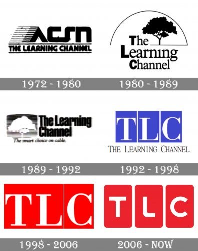
The TLC visual identity has undergone several redesigns, starting with the very first version of 1972, when the channel was called “Appalachian Community Service Network. The Learning Channel”, and finishing with the laconic and bright TLC era, with its first logo created in 1992.
1972 – 1980
Original logo, created for ACSN in 1972, featured a stylized futuristic logotype on the bottom level of the badge, and a bold rounded sans-serif “The Learning Channel”, placed between two parallel horizontal lines, on the bottom part of the emblem. The “A” in “ACSN featured its left bar extended and drawn with a horizontal striped pattern, which added a sense of movement and speed, reflecting the progressiveness of the company.
1980 – 1989
The name of the channel was officially changed to “The Learning Channel” in 1980, and the logo was also redesigned. The new emblem was light and fresh, featuring the three-leveled wordmark placed on the left from the beautiful image of a tree, covered with a thin arched line.
1989 – 1992
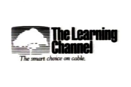
The tree remained the main graphical element of the channel’s visual identity but was redrawn in 1989. Now it was a white silhouette placed on a gradient gray striped square, located in the left from the bold narrowed wordmark in black. The emblem was accompanied by a delicate italicized slogan “The best choice on cable”.
1992 – 1998
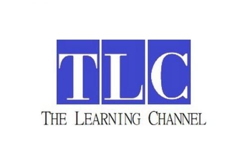
The predecessor of the iconic TLC logo we all can see today was created at the beginning of the 1990s, and featured a structure of three vertical rectangles in blue color, placed very close to each other and containing one of the wordmark’s letters. The full inscription was placed under the blue and white emblem, executed in a sophisticated serif typeface with all the letters capitalized, but the first ones — enlarged.
1998 – 2006
The full wordmark was removed from the channel’s logo in 1998, and the blue color of the rectangles was switched to red. It made the whole picture look more powerful and contemporary, evoking a sense of passion, strength, and energy. The monochrome version of the badge was also in use by the brand, but mainly for its official documentation.
2006 – Today
The redesign of 2006 brought a sleeker and a more modern version of the iconic TLC logo, softening its angles and changing its classy serif font into a smooth sans-serif. The color palette remained the same — red and white for the primary version, and monochrome for the secondary one, though due to the reduced thickness of the letter-lines, the emblem started looking brighter and more memorable.
Font and color
The modern and cool TLC wordmark is executed in a rounded medium-weight sans-serif typeface, where the corners of the letters are softened, and the cuts of the edges are straight and distinct. The font of the logo looks pretty close to Havelock Complete, but with some lines shortened and modified.
As for the color palettes, the red and white combination is considered to be one of the strongest and reflects the power and confidence of the company, along with its authority and experience. It also points to a high quality of the channel’s content and its progressive approach.


