The logo of Australia’s leading telecommunications operator and provider of mobile phones and devices has a long history as well as the company itself.
Meaning and history
Telstra is the most famous telecommunication company in Australia, which has a long and intense history dating back to the beginning of the 20th century. Telstra has a long history in Australia, having originated with Australia Post as the Postmaster General’s Department after the federation in 1901. Telstra evolved from a state-owned enterprise into a fully privatizedone In the 1970s.
What is Telstra?
Telstra is the name of the leading mobile network provider in Australia, which was established at the end of the 1970s. Today the telecommunication operator has more than 18 million subscribers across Australia, which makes it the largest in its country.
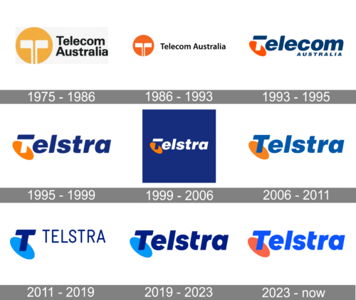
1975 – 1986

Telstra Corporation Ltd. has been operating in Australia for more than 40 years and was called Telecom Australia at the beginning of its activities. Its first emblem dates back to 1975. It included an orange circle with a sign in white color inside it which looked like both a stylized antenna and the letter “T” and the wordmark “Telecom Australia” in black.
Later, there has been several revamps of the brand identity.
1986 – 1993

The yellow in the roundel emblem became orange. The two words of the company’s name were now placed within a single line. There was more generous space between the letters.
1993 – 1995

The most significant modification has probably been the one that took place in 1993, when the circle with the “antenna” turned into a more contemporary “antenna dish”.
1995 – 1999
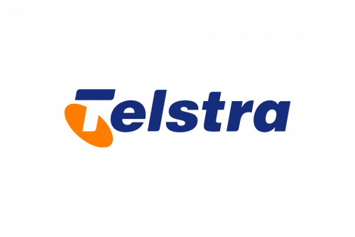
The first Telstra business logo appeared in 1995 when Telecom Australia was renamed as Telstra Corporation. It preserved all the features of the previous logo ‒ the orange “antenna dish” with the letter “T” the stem of which was invisible and the dark blue color of the wordmark. What concerns the wordmark itself, it became “Telstra”.
1999 – 2006
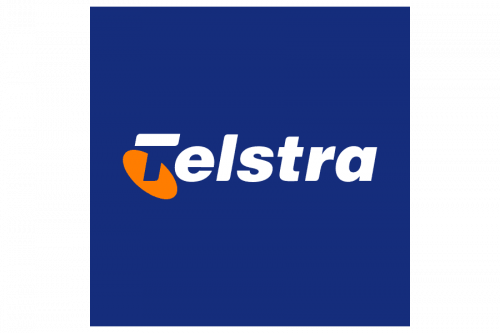
In the modification of 1999 the letters of the wordmark were made white, and the image was placed against a blue background.
2006 – 2011

This logo looks very much like the old Telstra logo of 1995, but the stem of the letter “T” became visible and the whole wordmark is in bright blue color. This symbol is still seen on some phones and buildings.
2011 – 2019
At present the company uses the 2011 version. The Telstra new logo continues in the same shape but features a different color combination. It is not orange-blue now. Multiple bright colors are used to make the insignia look sensitive, warm and people-oriented.
The wordmark is still included in the Telstra Australia logo, but the company mostly uses just the T-and-oval part.
2019 – 2023

Very similar logos have already been used by the company since 1995. This logo is just a modification of the earlier versions. The name is printed using a dark blue color, which has been used for the initial in the previous logo and featured in earlier versions as well. When it comes to the oval antenna, it is done in sky blue color, just like in the previous emblem. The logo turned out recognizable, while a blue color is not only a widely used color in the communications industry, but also a color that gives a feeling of trustworthiness, security, and reliability. It is an excellent design for a well-established company.
2023 – Today

The shape and font used in the logo have not changed. The company simply played with the color palette. It brought back the orange, which has been used by the company for around half a century. In addition, the blue color became more vivid and looked perfect against the orange.
Font and Color
The graphical badge of Telstra has one letter in it, the stylized bold uppercase “T”, executed in a heavy designer sans-serif font with softened contours and a slight inclination to the right. It is a hand-written letter that has no commercial font analogs.
As for the color palette of the Telstra visual identity, it is based on two shades of blue, both bright and intense, but one is closer to sky blue, and the other is deep and dark. Blue is the color of stability and protection, the color, that is most often used by designers to represent technology-related companies.


