The largest wireless network provider in Indonesia, Telkomsel is a subsidiary of Telkom Indonesia, which owns 65% of its shares. The other holder, Singapore Telecommunications Limited, owns 35% of the shares through its subsidiary Singapore Telecom Mobile Pte.
Meaning and history
The starting point in the history of Telkomsel as an independent brand took place in the spring of 1995 when it was incorporated in Jakarta, Indonesia.
Here’re some of the most significant achievements in the brand’s history:
- Telkomsel introduced rechargeable GSM pre-paid services in the fall of 1997 becoming a pioneer in this respect among Asian wireless providers.
- the brand launched a 3G service in the fall of 2006, earlier than any other wireless network provider in Indonesia.
- in the spring of 2009, in collaboration with the local division of Apple, the company unveiled the iPhone 3G in Indonesia provided with individual price programs for its customers.
- in 2012, the number of active users exceeded 100 million. Today, the brand boasts a customer base of over 172 million people.
Let’s take a closer look at the Telkomsel logo and analyze its meaning and style.
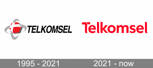
1995 – 2021
The earliest logo of this provider consisted of an emblem and a wordmark. The former was supposed to resemble an atom with two grey rings. In the middle, they intersected and formed a cross. This they colored white and surrounded with a red hexagon to match the colors of Indonesia.
The wordmark was just a collection of black sans-serif letter tilted to the side. They were tall and fully capital, but nothing special besides that.
2021 – Today

The 2021 design was more mundane. It was a normal red company name written in the usual sans-serif letters, except the corners were rounded or cut to look softer and more elegant. Besides that, there was also a small white cut on the letter ‘T’, but that’s it.
Symbol
The logo can be broken into three main parts: the pictorial part, the wordmark, and the small logo of the parent company, Telkom Indonesia.
The pictorial part features a hexagonal shape in red with a dark grey shade, which gives the logo some depth. The hexagon is placed inside two crisscrossing rings in grey and white. To the right, the lettering “Telkomsel” in an all-cap italicized type can be seen. The color of the text, black, creates a contrast with the white background, which helps to make it even more legible.
Emblem
Below, you can see the logo of Telkom Indonesia. The reason why it has been placed here is pretty simple – Telkomsel is a subsidiary of Telkom Indonesia. The pictorial part features a grey and white ring placed over a stylized palm, which is given in red. To the left, the company name in black can be seen.
Interestingly, both the logos are somewhat similar in style. The similarity includes not only the palette but also the shapes – both have rings in grey and white. So, they merge rather well. The old version of the Telkom Indonesia logo featured different colors, blue and yellow. The palette was the result of the evolution of the previous blue-dominated emblem. Due to the different color scheme, the old logo looked out of place when paired with its subsidiary’s logo. The new logo, which was adopted in 2013, has resolved the problem.
Font
The lettering “Telkomsel” is given in a simple sans serif font. The fact that the letters are italicized adds more visual harmony between the text and the emblem as they both feature sloped lines.
The typeface looks very close to Kropotkin Condensed Bold Oblique developed by Sugargliderz or TeX Gyre Heros Bold Italic by GUST e-foundry. One more type looking very much like the one on the Telkomsel logo is Rude Condensed Bold Italic developed by DSType.
Below the main emblem, you can see the text “by Telkom Indonesia” in smaller letters. Here, a different type is used. It is a sans serif type, like the main one, but it’s not italicized.
Colors
The brightest color of the palette is a classic shade of red, which looks vivid in contrast with grey and black. The background is white. An alternative version of the emblem features the red background. While the larger letters are black on the primary Telkomsel logo, the alternative one sports white text.
The red looks very close to hex: #E81E28. The coordinates of the light grey appear to be not far from hex: #A3A3A3, while the darker shade of grey can be hex: #303030 or just black (you can come across both versions).


