AIS (Advanced Info Service Public Company Limited) is the best-known GSM mobile phone operator in Thailand boasting the largest number of the customer.
Meaning and history
The company was established in 1986. Originally, it was a computer rental firm but launched an analog 900 MHz mobile phone service four years later. In 1991, it was listed on the Stock Exchange of Thailand.
1986
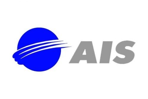
Technically speaking, the original AIS logo looked nothing like the current one neither in terms of the typography nor in terms of the palette. And yet, you can clearly get the feeling that they share something in common. That is the dynamic “wave” message symbolizing communication and connection, as well as moving fast across a large space.
In the case of the earliest logo, this feeling came from the three stylized “orbits.” They went around a blue circle representing the Earth. The “orbits” symbolized the invisible signal transferred around the globe and making it possible to communicate for the individual in different countries.
Next to the globe, there was the abbreviated name of the company. On the one hand, it was italicized, which provided some motion. On the other hand, it was a rather heavy sans with rectangular ends, which somewhat contradicted the “signal” message.
2011
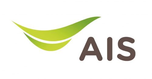
Unveiled in the fall of 2011, this emblem conveyed roughly the same message using a much more effective and refined visual “language.”
The massive, solid globe was replaced by a light and dynamic swoosh. The swoosh also symbolized the “signal” and “speed” but it did not sacrifice the beauty. Apart from the shape of the emblem, the updated color also worked towards the same purpose. It was lighter and more unique. The gradient also took away some of the emblem’s weight.
The type on the AIS logo grew lighter, too, which better fitted the “communication” and “traveling at fast speed” themes. Also, the rounded ends added a friendly touch.


