Telcel is the name of a large Mexican telecommunication company, which was established at the end of the 1980s, and by today has grown into one of the leaders in the American market, with its services covering more than half of the country.
Meaning and history
Telcel, established in the 1980s under the name RadioMóvil Dipsa, is a company, which offers voice and data wireless GSM/GPRS/EDGE and 3GUMTS/HSPA/HSPA+/4GLTE connectivity to almost 90% of the Mexican population, which is around 80 million subscribers.
The company, founded by Carlos Slim, and owned by America Movil, a huge Latin American corporation, is engaged not only in wireless communication services provided but also collaborates with other brands, creating gadgets and smartphones.
What is Telcel?
Telcel is a Mexican company with 25 years of experience in wireless telecommunications technology. Since 1989, Telcel has operated with a consistently high level of quality, innovation, and attentiveness to its customers, offering an unforgettable experience in service, entertainment, and network performance.
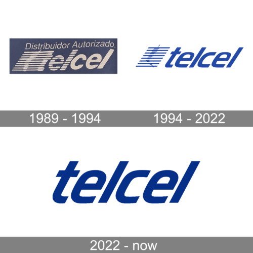
In terms of visual identity, Telcel has always been very modest and simple. The logo, designed for the brand at the very beginning of its history, has only been slightly modernized, keeping all the original principles as they were.
1989 – 1994
The original Telcel badge featured bold white lowercase lettering placed on a solid blue background. The inscription was executed in a heavy narrowed italicized sans-serif font with the first three letters having a horizontally striped pattern, and the “T” inscribed into a geometric ornament composed of white horizontal lines. The lines were crossing a stylized phone image.
1994 – 2022
The Telcel badge was redesigned in 1994, Kering the striped emblem and the lowercase logotype almost unchanged. The new version features blue elements, placed against a white background, with the shade of blue getting more intense, and the wordmark placed at a slight distance from the emblem. The typeface of the lettering was modernized and cleaned up.
2022 – Today
The features a logo with the word “telcel” in lowercase letters. The font is bold and sans-serif, giving the logo a modern and clean appearance. The color of the text is a deep, rich blue, which conveys reliability and professionalism.
The letters are proportionally balanced and spaced, suggesting a well-structured and thoughtful design. The use of lowercase letters throughout may imply accessibility and friendliness, positioning the brand as approachable and user-centric. The color choice of blue is often associated with communication, trust, and efficiency, which are qualities desirable in a company that this logo might represent, possibly one in the telecommunications sector.
Overall, the simplicity of the design ensures that it is easily recognizable and potentially versatile for various applications. It lacks any additional graphic elements or emblems, which suggests that the brand relies on the strength of its name and reputation rather than imagery. The straightforwardness of the typography is likely intended to ensure legibility across different media, from digital platforms to physical signage, maintaining brand consistency.
Font and color
The progressive lowercase lettering from the primary Telcel logo is set in a sleek slanted sans-serif font with softened and clean contours of the characters. The closest fonts to the one, used in this insignia, are, probably, Allotrope Medium Italic, or Newmark Hebrew Bold Italic, but with come contours modified.
As for the color palette of Telcel’s visual identity, it is based on a combination of blue and white, where blue stands for professionalism and reliability, and white symbolizes the trustworthiness and loyalty of the company to its subscribers.


