TD Ameritrade is an American brokerage firm, offering on online platform for assets trading. The company was established in 1971 and today is one of the country’s leaders in its segment.
Meaning and history
1971 – 2006
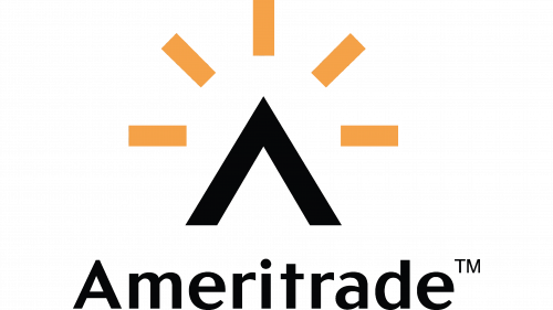
The original logo showcased a stylized “A” resembling a house roof, which created a link with the sphere in which the company worked. You could also see stylized sun rays. They added a positive mood. In a way, the old emblem symbolized the company’s promise: find a good house or office for their customers.
2006 – 2010
This version looked nothing like its predecessor. The sun and the roof were replaced by a green box housing a stylized “TD” monogram. The type was a heavy sans serif one. All the letters were capitalized.
2010 – Today
The TD Ameriprise visual identity is simple yet remarkable and bright. The logo is composed of a wordmark and an emblem, which is usually placed on the left or on top of the nameplate.
The wordmark is executed in a sans-serif typeface, which is similar to Frutiger UltraBlack, created by Adrian Frutiger. It is a bold and strong font, which perfectly reflects the powerful influential company.
The dark green color of the inscription is a symbol of money, wealth and financial success. A good choice for the company of such a profile.
The TD Ameritrade emblem, which is also used as the icon, on its own, is a bright green square with a white “TD” monogram on it. The capital letters use a custom typeface and are connected to each other in their upperparts.
The green of the emblem is light and fresh, it symbolizes energy and progress, but also has a financial connotation, as the green of the wordmark.
The TD Ameritrade logo is modest yet meaningful and eye-catching. It represents a strong company with a good reputation, shows its values of quality service and expertise.


