TalkTalk Telecom Group is a UK-based company specializing in telecommunications services. Primarily, they provide broadband, landline, TV, and mobile services. TalkTalk has a significant presence in the UK market, focusing on affordable and accessible services.
Meaning and history
TalkTalk Telecom Group PLC, established in 2003 as part of Carphone Warehouse, is a notable UK-based telecom company. Initially, it offered landline services before branching into broadband in 2006, capitalizing on the burgeoning demand for internet services. In 2010, TalkTalk demerged from Carphone Warehouse, marking a significant milestone as it became a standalone company listed on the London Stock Exchange.
This era saw rapid growth, with TalkTalk acquiring Tiscali UK in 2009 and Blinkbox from Tesco in 2015, expanding its portfolio to include television services. However, challenges emerged, notably a major cyber attack in 2015, impacting customer data and the company’s reputation.
TalkTalk’s strategy shifted over the years, focusing on core telecom services and divesting extraneous assets. In 2017, it sold its direct B2B business to Daisy Group and offloaded its mobile operations, consolidating its position in the broadband and landline segments.
In 2020, a significant ownership change occurred. Toscafund Asset Management and Penta Capital, two investment firms, acquired TalkTalk, taking it private. This move was part of a broader strategy to strengthen its market position, focusing on affordable and straightforward services, primarily in broadband and landline, targeting a broad UK customer base.
TalkTalk’s journey reflects the dynamic nature of the telecom industry, with its evolution from a small division of a larger company to a significant, independent player in the UK telecom market, adapting to technological advancements and changing market demands.
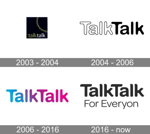
2003 – 2004
The logo features a minimalist and contemporary design with a playful twist. At its core is the company name, “TalkTalk,” rendered in a sans-serif, lowercase font that conveys approachability and simplicity. The text is set against a stark background, ensuring high visibility. Unique to the logo is the distinctive visual element above the first ‘a’ in “TalkTalk,” which resembles a dynamic, zigzagging line, suggesting the contours of a sound wave or perhaps a symbolic representation of communication and connectivity. The color palette is monochromatic, which gives the logo a modern and versatile look, suitable for various applications.
2004 – 2006
This logo presents the name “TalkTalk” in a stylized font with a bold and playful character. Each letter has a distinctive roundness, contributing to a friendly and accessible vibe. The ‘a’s are designed with a unique flair, their loops giving a sense of openness. In contrast to the previous logo, which featured a sound wave above the ‘a’, this design opts for a clean, unadorned look, emphasizing the brand name without additional graphics. The letters are thick with an outline, adding a visual pop that makes the logo stand out. The design is purely typographic, allowing the brand’s name to speak for itself, showcasing the brand’s focus on clear communication.
2006 – 2016
The “TalkTalk” logo here is vivid, using a gradient of blue and pink to symbolize dynamism and approachability. Unlike the previous monochromatic style, this version employs color to inject energy and modernity. The font is rounded, friendly, and sans-serif, which maintains the brand’s user-friendly image. There’s a playful air to the design, with the ‘k’s slightly tilted, adding movement. This logo departs from the outlined characters of its predecessor, opting for a solid, filled typeface that stands out with its color transition, reflecting a more contemporary and lively brand personality.
2016 – Today
The logo showcases the name “TalkTalk” in a bold, sans-serif typeface, followed by the slogan “For Everyone” in a lighter weight, conveying the brand’s message of inclusivity and accessibility. The design is straightforward with no embellishments, differing from the previous version’s playful tilt and gradient colors. This iteration returns to a simple, monochromatic scheme, emphasizing clarity and a no-nonsense approach. It suggests a brand that values straightforward communication, making technology easy and available to all, without distraction or complexity.


