Although the Sonic logo has undergone several amendments, it has preserved its overall shape. The rotated “O”, for instance, has been the distinctive feature of the wordmark ever since it was launched in 1991.
Meaning and history
The visual identity of Sonic the Hedgehog is known by kids and adults all over the globe. It was redesigned just once, in 1999, and the only thing that was changed was the color palette, while the simple clean contours of the emblem remained almost untouched. The logo, composed of two text-lines, might have looked simple and usual, but small elements and bright colors make it truly remarkable.
1991 — 1999
The original logo for Sonic the Hedgehog was created in 1991 in two variants — for the international market, and local, Japanese. The Asian version of the logo featured a dark blue “Sonic” lettering in all capitals with “The Hedgehog” tagline, written in the same color but with a different, simpler typeface. The upper level of the logo was executed in a custom sans-serif, where the letter “O” has its white negative space turned to the right, and the inner part of the “C” repeated its contours.
For the international version, the logo was made three-dimensional, by adding some gradients. Also, the inscription gained a thick orange outline, and its tagline was written in shadowed red letters of a traditional sans-serif font, placed on a wavy line.
1996
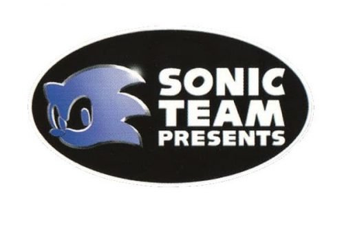
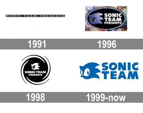
In 1996 the Sonic logo was redesigned. The new badge featured a solid black oval, which was horizontally oriented. On the left part of the oval, there was a glossy gradient purple image of the hedgehog’s head in a white outline. On the right part of the oval — a bold white inscription in three levels “Sonic Team Presents” executed in a modern and strong sans-serif typeface
1998

The redesign of 1998 made the badge monochrome and flat. The new concept was completely based on the previous one, but now the oval turned into a circle in a double sharp framing in white and black. The Sonic’s portrait was now drawn in white and placed above the two-level inscription, written in the same typeface as on the version of 1996.
1999 — Today
The redesign of 1999 switched the color palette of the Sonic logo, turning the main inscription yellow and outlining it in blue. The yellow color of the emblem has some gradients, which adds motion and dynamics to the composition. As for the tagline, it is now written in white and placed on a red horizontally stretched banner under the “Sonic” nameplate. The white letters are executed in a strict and bold sans-serif typeface with a thin blue shadow.
For the Asian version, the brand now uses the same style and color palette, replacing the Latin letters with the Japanese hieroglyphics.
Symbol
Almost immediately after the minimalistic first wordmark, two more complex versions appeared. Unlike their predecessor, they were three-dimensional and featured a less modest color palette including bright blue, pink, golden and dark blue, red, and yellow respectively.
The 2006 emblem
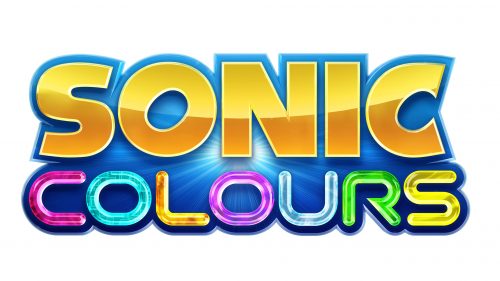
The typeface used for the word “Sonic” underwent a subtle modification, as the result of which the letters have grown bolder, while the outline has grown thinner. The palette has been reversed: now, the letters are yellow, while the outline is blue. The wordmark itself lost some of its volume, yet the 3D effect is still there.
The letters in the word “Hedgehog” now stand in a straight line. They have grown smaller and bolder. The colors here have been reversed, too: the text is white, while the background is red (and this is a different shade of red than in the previous versions).
Font
The word “Sonic” is given in a custom typeface based on Syntax Ultra Black. One of the distinctive features of the script logo is the rotated letter “O”. The same letter has also been used as the basis for the customized “C”. The word “Hedgehog” features a totally different typeface looking comparatively traditional. The font is a bold sans serif one.
Color
The 2006 version of the Sonic logo combines red, dark blue, yellow, and white. There are several shades of red and yellow, which is necessary for creating a 3D effect.


