It is common practice for most big corporations to use a logo that makes people associate their products with the brand they represent. Sega, a third parting game developing company, is no exception. When people see its logo, they think of video games.
Meaning and history
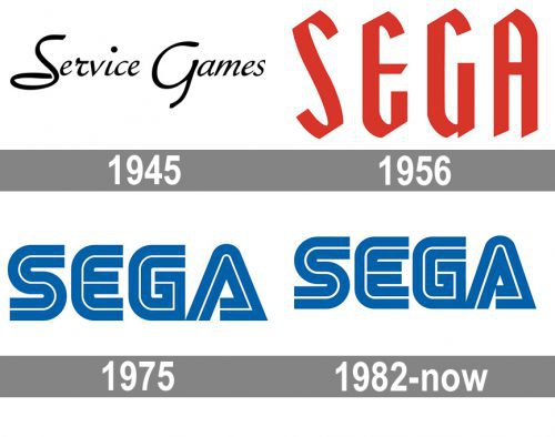
The Sega logo looks relatively simple at first sight. After a closer look at it you see that it is not at all simplistic. What is more important, it reflects the company’s history.
In the very beginning the company was called “Standard Games”. It may seem surprising, but the brand created in the Florida and engaged in the supply of military game goods like pinball equipment, was initially called the “Service Games of Japan”. Who could have thought in the middle of the twentieth century that Sega would become the world leader in the development of arcade-style computer games? 550 games created for personal computers have turned millions of young people into true fans of PC virtual reality.
A bit later it got a new name ‒ “Service Games”. The name everybody knows today, that is Sega, is its abbreviated version.
1945 — 1959
The logo history began in the 1940s. The earliest Sega symbol, as well as the later ones, was a wordmark logo. It featured the lettering “Service Games” in black . It was hand-drawn, which was in line with the style of the 1940s.
1956 — 1975
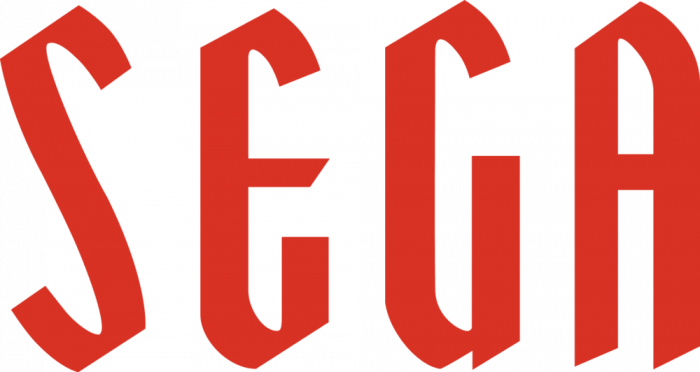
Since 1950s, the wordmark has been showing the word “SEGA”. From 1950s to 1976 it was red with a black outline or just red.
Due to the unique typeface invented presumably by Sega, that Sega logo is sometimes referred to as a spiral logo. It sometimes appears in black. There is no information about the precise date of its creation, yet, some examples of its use show that it already existed in 1958.
In the 1960s, alongside with the main logo, some products were marked with a “mysterious” Sega emblem. The letters were white with a blue outline and were on a black background.
1975 — 1982

In 1976 the company adopted a somewhat futuristic design. The font was blue with multiple white stripes. The current Sega symbol is primarily blue text on a white, sometimes black background. The letters are divided by a white line.
1985 — Today
The blue wordmark was slightly tweaked without changing its overall style.
But this emblem isn’t the only creation Sega is associated with. There are more than 100 variations of the Sega logo, with characters from their games incorporated in them. Yet, the basic design remains the same, due to which the company manages to keep its familiar look. Besides the main logos that are available in png and svg formats, there are logos with different effects.
Font
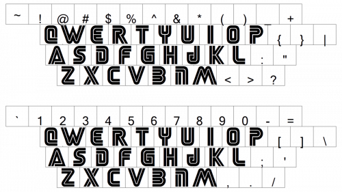
The current logo most probably derived from the Yagi Double typeface which was widely used at that time. Later the company introduced some modifications to the typeface. Thus, the letter “E” was elongated and squared off as well as the letter “G” to match it. The “A” became thinner.
Color
The official color of the Sega emblem is cobalt blue. It contrasts brightly with white, and the logo pops out at you.


