Rogers Communications has been known as a communications and media company headquartered in Toronto, Ontario Canada. It employs approximately 26,000 workers. Its main rival is Bell Canada. The two companies are often referred to as a duopoly, and they each hold a stake in Maple Leaf Sports and Entertainment.
Meaning and history
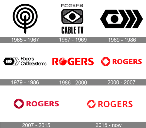
Despite all the modifications the Rogers logo has gone through, it has almost always been based on a circle. The circle, in its turn, originated from one of the earliest versions of the logo representing a telecommunications signal.
What is Rogers
Rogers Communications specializes mostly in wireless communications, cable television, telephony, and the Internet. In addition to this, it also provides telecommunications services and operates mass media channels.
1959 – 1965 – Aldred-Rogers Broadcasting
The company was founded in 1959 under the name of Aldred Rogers Broadcasting Limited. The earliest versions of the visual brand identity showcased the original name.
1965 – 1967 – Rogers Broadcasting
In 1964, Ted Rogers created an AM radio station called CFTR. The logo used during this period was a rather straightforward representation of the radio antenna and the signal. The antenna was represented by a black pole, while the signal was represented by three black concentric circles.
1967 – 1969 – Rogers Cable TV
One of the most important events in the early history of the company took place in 1967, when Rogers started Rogers Cable TV in collaboration with BARB.
The new logo contained more details. It was inspired by the TV screen. There was a black circle placed inside a white rhombus with rounded corners and a thick black border. The rhombus, in its turn, was placed inside a gray rectangle, also with a thick black border.
The word “Rogers” in thin letters could be seen above, while the lettering “Cable TV” in a bold font was placed below.
1969 – 1986
The logo looks different, yet it clearly draws inspiration from the previous versions. There is still a black circle at the center, while the combination of arrowheads on the right-hand side echoes the signal from the 1965 Rogers logo.
1979 – 1986 – Rogers Cablesystems
The need for a new logo emerged when Rogers became a single company with Canadian Cablesystems.
The emblem was made smaller. It also became lighter because the circle and two of the arrowheads were colored white. The new name, Rogers Cablesystems, could be seen to the right. It was set in a simple type. The letters were very close to each other. While this helped to make the wordmark compact, it also damaged legibility.
1986 – 2000 – Rogers Communications
While the logo was redrawn, the ball and the signal were still there. They were transformed into a modern, dynamic, and minimalist emblem. Also, they merged with the wordmark as the emblem now replaced the letter “o” in the word “Rogers”.
Even more importantly, the wordmark now was by far better legible. That’s because the mere number of the letters grew smaller, which allowed the designers to make the glyphs larger.
2000 – 2007
The roundel was moved out of the wordmark. Also, it was redrawn. The globe was replaced by a ring, which still had dynamic white lines. The logo was nicknamed Möbius strip.
2007 – 2015
The name was printed using a font similar to a modified version of Ocean Sans Standard Bold Extended with the strokes being rounded to one side. It was used in the last logo as well. The designers only made the color of the characters darker. Along with making the inscription darker, they also added depth to the round emblem. It became three-dimensional and acquired a more sophisticated look.
2015 – present
The ring was redrawn, to add a new accent to the meaning of the logo. The direction of the ring changed – it now was “rolling” forward. The font was updated, too.
Colors and font
During most of the brand’s history, the palette has been based on the combination of red with white.
Since 2000, the Rogers logo has featured a highly legible uppercase typeface without serifs.


