The Rexona logo has gone a long way since 1969 when it was first introduced – it has been modified around 10 times.
Meaning and history
Although Rexona is a very old brand — its roots date back to the beginning of the 20th century — it has become internationally recognizable only at the end of the 1980s, when the Australian brand was acquired by one of the largest companies in the global market of personal hygiene products, Unilever.
Today Rexona products can be found in supermarkets all over the globe, although in some countries the brand has different names, thus the spray and roll-on deodorants of the company are known as Rexena in Japan and Sure in the United Kingdom.
What is Rexona?
Rexona is the name of a self-care brand, specializing in the production of antiperspirant deodorants. The company was established in Australia in 1908 and bought by the British Unilever Group in 1989. Since the acquisition of the company, its products became available for sale all over the globe.
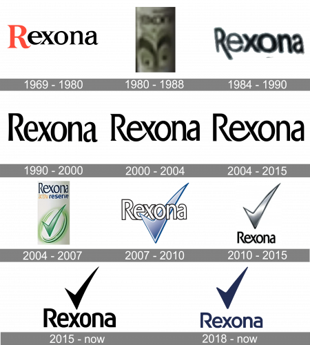
1969 – 1980
The original design featured the word “Rexona” in black with the initial in red.
1980 – 1988
The wordmark grew all black.
1984 – 1990
The serifs disappeared altogether.
1990 – 2000
The end of the “R” grew shorter, and there were several other modifications in the type.
2000 – 2004
The distinctive link between the “e” and “x” was introduced, the type was replaced by a serif one.
2004 – 2015
The serifs disappeared. The lettering grew blue. The tick mark was introduced.
2004 – 2007
The redesign of 2004 has placed the light green recons tick in smooth gradients into a vertically oriented oval frame, and put it under a two-leveled inscription, with the main logotype repeating the style from the previous version.
2007 – 2010
The tick moved up and changed its color to light-blue, but with transparent airy gradients and a voluminous texture. The emblem was now intertwined with the elegant black logotype, starting in front of the letter “E” with its short bar, and finishing behind the “N” with the long one.
2010 – 2015
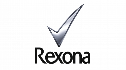
The tick moved even higher and was now positioned above the word “Rexona.”
2015 – Today
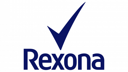
The type was simplified, the logo grew flat. In some countries, a blue version of the Rexona logo is used. Here, the tick is below the wordmark.
2018 – Today
The redesign of 2018 has darkened up the color palette of the Rexona logo, making the blue almost black. The lettering was also refined, with the characters getting shorter and wider, although keeping the style of the typeface from the previous badge of the brand. The tick got bolder and softer too, looking more stable and confident.
Font and color
The strong and elegant Rexona logotype is a reflection of style, confidence, and stability. Executed in a fancy custom typeface with slightly elongated and pointed tails of the thin sophisticated letters, it looks trendy and playful at the same time. The typeface was designed exclusively for the brand, but it is based on such fonts as Tschichold Condensed or EconoSans Pro 65 Medium, with the lines modified and “E” and “X” connected.
The monochrome color palette of the Rexona logo elevated the look of the whole image and makes it look powerful and modern. It also evokes a sense of professionalism and expertise which the brand puts in each of its products.


