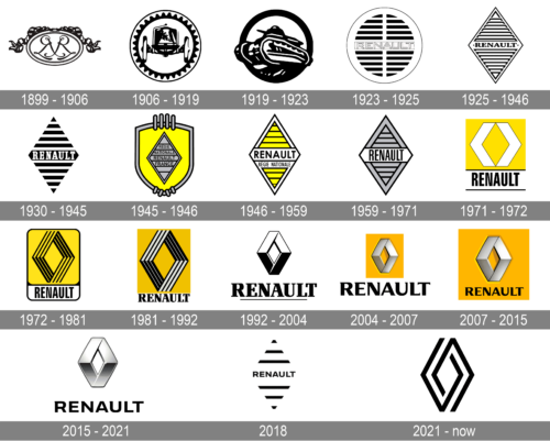
Renault is a brand of a famous French auto-maker, which operates since 1899. It was launched by three brothers, Louis, Marcel and Fernand Renault. Today it is owned by one of the world’s industry leaders, Renault-Nissan Alliance.
Meaning and history
The company was created in 1899 under the name Societe Renault Freres, but the first car was presented in 1897 and sold to a friend of the family a year later.
The brand got its first logo in 1900, next year after it was officially established, and during more than a century of its history the Renault logo design has undergone several significant changes.
The Renault logo is instantly recognizable across the globe. It got its famous shape in the 1920s and was modifying it until today.
1899 – 1906
The first Renault logo was a great example of its time, with its elegance and finesse. It was composed of the initials of three Renault brothers, engraved on an oval-shaped medallion with two ribbons.
1906 – 1919
The original logo was redesigned in 1906. Now the brand’s logo is showing a car image enclosed in a round frame gear wheel. The logo is more masculine and industrial.
1919 – 1923
During the World War I, Renault was constructing tanks, which was reflected on the new brand’s logo. The round brutal emblem stayed with Renault company for 4 years.
1923 – 1925
In 1923 the emblem was redesigned, celebrating the grille, in order to be placed on the car. It is a round icon with the wordmark in the center. The logo looks more modern and confident now.
1925 – 1930
The first diamond logo was designed. The company’s emblem gained angular forms and turned into a rhombus. The grille pattern remained as well as the brand’s nameplate. In 1946 Renault started using yellow color for its visual identity. And since then the color became synonymous to the brand.
1930 -1945
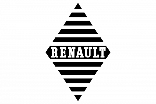
In 1930 the Renault badge was redesigned in a modern and confident manner, though keeping the geometric Diamond idea. The framing was gone, and black became the main color, being used for thick parallel lines, and the main central banner with the bold white inscription on it. The “Renault” logotype was written in the uppercase of a strong and elegant serif typeface with thick lines and massive serifs.
1945 – 1946
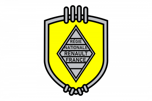
The redesign of 1945 redrawn the Diamond in gray with thin black accents and placed it on a classic shield with rounded lines. The crest was outlined in gray and had some geometric ornaments on both the top and bottom lines of the frame. As for the Diamond itself, it was a horizontal striped pattern and “Regie Nationale Renault France” inscription in black sans-serif, placed in four levels.
1946 – 1958
In 1946 the crest was removed from the Renault visual identity, keeping the iconic emblem as the single element again. The Renault Diamond was now drawn in yellow, white, and black color palettes which evokes a sense of joy, lightness, and happiness. The thin black horizontal lines were accompanied by a bold and modern sans-serif lettering in the uppercase.
1958 – 1967
The next redesign was held by the brand in 1959. The wordmark remained on its place but was executed in a finer lettering. The diamond war refined as well, it became narrower and more elegant and got a new name — Pointe de Diamanté, which means “diamond tip” in French.
1967 – 1972
In 1967 a completely new concept for the Renault visual identity was introduced by the designers. A bright yellow square had two white arrow-like figures, placed from angle to angle and creating a yellow rhombus in the negative space. The black narrowed “Renault” inscription in the uppercase of a traditional bold sans-serif was set under the yellow squared enclosed between two black horizontal lines.
1973 – 1982
In 1972 Renault hired a famous artist Victor Vasarely to redesign the logo. He created a three-dimensional emblem, which was dynamic and clean with its angular lines. The name of the brand was removed from the logo.
1982 – 1990
The redesign of 1982 refined the contours of the previous insignia and added some white touches to the Diamond, which made it look sleeker and more stylish. The shade of yellow was switched to a darker one, and the typeface of the logotype — to an elegant and stable serif, with thick distinct lines and massive serifs on their ends.
1990 – 2004
The brand’s visual identity was redesigned again in 1992. The symbol became stronger and more decent, its 3D shape became more visible now. Renault name appeared under the emblem, executed in a bold serif sans font. The logo was a foundation of the one we see today.
2004 – 2007
The emblem was slightly modernized and the wordmark got new typeface. The yellow square appeared on the logo as a background. The nameplate was executed in black, which gave a great contrast with a bright background and silver tone of the emblem.
2007 – 2015
The wordmark was designed by Eric de Berranger. It was powerful and elegant, combining both thick and thin lines.
2015 – 2021
The Renault logo is bolder and more modern. The wordmark in custom typeface is minimalist and stylish. The brand’s visual identity today is a reflection of progress and reliability of the company. It evokes a sense of trust and expertise, while the yellow adds playfulness and warmth.
2018
2021 – Today
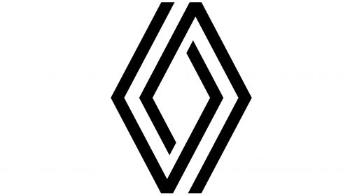
In 2021 the French automaking brand changed the design of its logo, making it minimalist and progressive. The logo is now composed of a monochrome Diamond, drawn in two thick lines, which created a feeling of chain weaving. The logotype is removed from the primary version but still can accompany the emblem depending on the needs of the brand.


